Even though I'm still in my early stages of this project, I wanted to figure out how I will bind my book because I have a feeling that assembling the project would take a bit longer than actually designing it. This is because I would have to purchase materials that I don't have, especially if I'm binding it with thread, so I want to make sure I've got everything in time.
I headed to YouTube and Vimeo to have a look at tutorials as I find it much easier to learn through watching people than flicking through photos.
I gathered a few videos and dip pen/calligraphy tutorials and time lapses to help me out the next time I experiment with my two sets. Even though I had a look at them before my second exercise I didn't really concentrate on how they held the pen and how much ink they added, so now I shall look at them all with fresh eyes in hope of improving my calligraphy!
This tutorial shows how to use a fountain pen rather than a dip pen, but the reason I've included it is because she talks about how to hold the pen and what the ideal angle it is to do so. The way she writes is similar to Blackletter which is another type style I'd like to explore.
Taking a closer look at her pen it resembles closely to the roundhand dip pen I have; she doesn't produce a strong contrast between thick and thin strokes, and the end of the fountain pen is straight rather than pointed.
Rather than it being a tutorial like the video above, this one is a time lapse where they show very clearly how they write the word "Flourish". Because the video is quite slow I can concentrate on how they hold the pen and just how delicate the results can be. The ink had to be topped up regularly, and they sometimes had to 'colour' parts in. There is actually quite a lot of ink on the paper because it's very 'shiny' so I'm guessing they had to leave it to dry for a while.
I was quite interested to see the guide they used because previous time lapse videos didn't necessarily show this.
Having been inspired by the storyboards I analysed, I wanted to research further into their composition methods to figure out how they made their scenes trigger emotions as well as create depth.
This basically means to have a point of perspective, and it's generally better to use more than one (they have advised to use three vanishing points).
Use grids
This will allow me to figure out where to place people instead of having them dotted randomly that it almost looks as if they're floating in mid-air. The grid will provide a sort of ground, and this will help me work with my perspective point as well.
Use foreground, mid-ground and background
This means placing objects at different 'levels' in order to create depth. For example if we were on the Westminster bridge looking at the Big Ben, the Big Ben will be in the far background, the cars on the bridge on the other side in the background, the cars on the our side in the mid-ground, and we're at the foreground.
Group multiple characters
This wouldn't necessarily apply to my illustration as I'm not doing a storyboard, but if I was I could make it easier by grouping multiple characters together and labelling them so I know where each one is as I move onto the next board.
Composition
I went onto Google and soon collected a small list of various compositions, drawing sketches beside them to help me to understand them a bit more.
However what I couldn't really understand was the golden ratio; it was quite difficult to see how it actually works, but I think it follows a smooth curve...
Shattered Glass Type
So this is how I did the "shattered glass" effect.
I first open up Illustrator and type out the words "Unbroken" (the album title) in the typeface Bebas Neue. I then selected it and Expanded it so that the type has turned into an object.
Because I'm doing a grungey-type cover I scrolled through google in search for suitable tutorials, but this time focusing more on photo manipulation. I found one here, and decided to try it out but making my own adjustments to it.
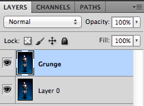
So I first downloaded the stock provided that I thought was suitable for a grunge effect in Photoshop, and duplicated the background layer. This is because I was going to do lots of editing on it so I didn't want to ruin the original image in case I went wrong. I called this duplicate "Grunge".
I did some experimenting with layer styles in Photoshop today because I wanted to start playing around with different typefaces (as the main focus is on typography after all). I used this tutorial that I found by typing "grunge type tutorials" and I thought it would be really good to use in future.
I took some screenshots because it's a bit of a habit now, and I also want to show you how I did it step-by-step. It wasn't really necessary as you could easily just look at the tutorial... But oh well!
I first start by creating a new document at 72dpi and 1800x1300px. I filled in the background layer with black and then created a new layer - Grunge Brushes - and just took a couple of the brushes and dotted them around, varying with different styles to create more texture.


