Showing posts with label typographic poster. Show all posts

Saturday, 16 February 2013

Tsunami Tides In My Eyes

Lyrics from Ed Sheeran - U.N.I

Ed Sheeran has the most beautiful voice I've ever heard; his lyrics are just so amazing and I always get a bit emotional when I listen to his songs.
I came up with the idea of creating a typographic poster featuring my favourite line from his song "U.N.I" because they explain what I'm currently going through. I wanted to do something that mixes type and illustration so voila! I painted a wave with watercolour and combined that with type.


Tuesday, 11 December 2012

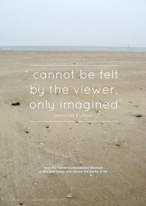
Margate Poster

Hello all!

I'm back again, and this time with a fairly old piece that I did in my first year at uni. Just thought I'd update this blog with all of my old posts from tumblr because I've decided to blog a lot more, so the next few posts would consist of my old work.


The Brief:
"Create a poster that is a (mainly) typographic response to your visit to the Turner Contemporary and Margate in general. This poster could be commissioned/used by the local tourist board to promote art in Margate in general and at the Turner contemporary in general. Please present this at A3 portrait format."


Find me at Tumblr | Facebook | DeviantART

Monday, 12 November 2012

Typographic Walk Poster - WIP

I had a massive panic attack today when I thought about how I'm lacking in material for my portfolio as I had lost all of my work from last year. So today is the first day that I'm going to go through all of my old projects and re-do them to make them look more professional.

Here's the first of my old projects: The Typographic Walk. I've changed this dramatically from the old version but... I like it, even though it's completely different. In my brief I actually had to use pieces of type from different places (like buildings, bins etc) and create a poster with all of the type, but because I had lost all of those photos I couldn't reuse them. This is the main reason I changed the whole thing; the photos of type were extremely pixelated.


Friday, 9 November 2012

Pet Peeves


This was the first time I had the choice to create my own design brief that mainly focuses on typography. I first thought that I’d use some lyrics but display them in an illustrative way, but then I decided to do something a bit more personal so that I could engage more with my viewers. 
So I listed all of the things that annoyed me and picked out ones that would specifically fit well with each others. I chose Helvetica Neue as my main typeface because of how minimalist the design was, as well as Impact and Pacifico. 
It was quite hard for me to choose the colours (as I initially was going to go for grey and white) so I went onto kuler.com and chose this colour scheme because it was bold and I was never thought that I would use this colour combination. It was quite exciting! 
I was inspired by vintage Carnival posters and the way they laid out their type. 
Please note that this brief was not a real project and was done for a uni project.