Showing posts with label typography. Show all posts

Wednesday, 22 January 2014

Never Give In & Never Give Up

The Brief 
The aim is to design the outer design of a travel mug using inspirational words integrating illustration where possible. We often look upon inspirational quotes to boost our motivation to get us through the week long of reports or essays we have in our workplace and yet they can even go to the lengths of providing us with the courage to pursue our life long dreams.

Background Information
I decided to go along with the idea of hand-lettering, as it was something that I haven't yet been able to experiment with in my previous projects. This grew out of my fascination with the works of Steve Simpson and Linzie Hunter, who were both key inspirations for this project.

The Design
Done in both Adobe Illustrator and Photoshop. I produced a tea-leaves pattern for the background to create a connection between the design and Twinings, a British-based tea company, and emphasised this through the use of a teapot and cup in the illustration. My colour palette choice is linked to soothing emotions with the red to give a vibrant appearance as well as that energy boost.


Important Notice:
Please note that Twinings did not in any way commission me to produce this piece, this is completely for university purposes only as I had to pick my ideal client to base this project on.


Digital Design


Thanks for viewing! Please visit my other accounts:

Wednesday, 11 December 2013

APP Words: Analysing Typefaces - Hand Lettering Exercise

[4] [5] [7] [9]

After watching some YouTube videos and looking at Sean Wes’ work I realized that I need to go back to basics with typography and start analysing different type styles, mainly focusing on how each letter sits on the baseline as well as the other lines (mean line and cap height). This will make it easier for me to draw letterforms accurately even though I want that ‘personal’ appearance to show that it has been hand drawn.  This means that I wouldn’t stress over tiny details and shall allow for mistakes to show.

I printed out three styles: serif, sans serif and brush script. I want to be able to work with all of these types because I’m not too sure what kind of styles I’m headed for right now. I then drew the lines across them and made a lot of annotations to make it easier for me to remember their characteristics. 

I started to run out of ink! Whoops!

Tuesday, 5 March 2013

Red String of Fate

This is for my uni project that is linked to the Design Factory competition. Here I have designed a Valentines Day card as I thought that the ones we sell are too cliché and that we don't look into the deeper meaning of love. I have based my design around the East Asian belief of the Red String of Fate, where we are tied to our soulmate by an unbreakable bond.


Saturday, 16 February 2013

Tsunami Tides In My Eyes

Lyrics from Ed Sheeran - U.N.I

Ed Sheeran has the most beautiful voice I've ever heard; his lyrics are just so amazing and I always get a bit emotional when I listen to his songs.
I came up with the idea of creating a typographic poster featuring my favourite line from his song "U.N.I" because they explain what I'm currently going through. I wanted to do something that mixes type and illustration so voila! I painted a wave with watercolour and combined that with type.


Tuesday, 8 January 2013

Typeface Choice - Live Music Brief

For Jonny Pain I had the image of using distressed, sans-serif type. I want it to look like it could relate to their post-hardcore music so it has to have the perfect balance with modern and also gothic... I saw something I really liked in the email that they had sent me with some ideas for the album cover.

Thursday, 20 December 2012

Metallic Grunge Type


Did some experimenting in Photoshop today with different layers styles by following this tutorial. I don't want to look at just how many screenshots I took of each step...

To see my screenshots of my step-by-step process please click here.

Typeface | Rothenburg Decorative
Brushes | Subtle Grunge Brushes 

Thursday, 13 December 2012

Unusual Words - Final Designs

I managed to finish my project two days before the deadline, woop woop!
I actually did a lot better in this project than I had done before. I guess that's because I had only researched on what was relevant instead of rambling off on one topic or another that wouldn't help me at all through my sketching and designing stage. Hmm.

Anyway here are my final designs, and I've also included a photo of when they were all printed out and pretty. I'm just so happy with them! Especially Avicide... Really tapped into my creepy side with that (not that I have a creepy side though!)


Printed out:

Tuesday, 11 December 2012

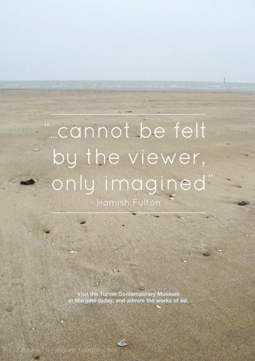
Margate Poster

Hello all!

I'm back again, and this time with a fairly old piece that I did in my first year at uni. Just thought I'd update this blog with all of my old posts from tumblr because I've decided to blog a lot more, so the next few posts would consist of my old work.


The Brief:
"Create a poster that is a (mainly) typographic response to your visit to the Turner Contemporary and Margate in general. This poster could be commissioned/used by the local tourist board to promote art in Margate in general and at the Turner contemporary in general. Please present this at A3 portrait format."


Find me at Tumblr | Facebook | DeviantART

Monday, 12 November 2012

Typographic Walk Poster - WIP

I had a massive panic attack today when I thought about how I'm lacking in material for my portfolio as I had lost all of my work from last year. So today is the first day that I'm going to go through all of my old projects and re-do them to make them look more professional.

Here's the first of my old projects: The Typographic Walk. I've changed this dramatically from the old version but... I like it, even though it's completely different. In my brief I actually had to use pieces of type from different places (like buildings, bins etc) and create a poster with all of the type, but because I had lost all of those photos I couldn't reuse them. This is the main reason I changed the whole thing; the photos of type were extremely pixelated.


Friday, 9 November 2012

Pet Peeves


This was the first time I had the choice to create my own design brief that mainly focuses on typography. I first thought that I’d use some lyrics but display them in an illustrative way, but then I decided to do something a bit more personal so that I could engage more with my viewers. 
So I listed all of the things that annoyed me and picked out ones that would specifically fit well with each others. I chose Helvetica Neue as my main typeface because of how minimalist the design was, as well as Impact and Pacifico. 
It was quite hard for me to choose the colours (as I initially was going to go for grey and white) so I went onto kuler.com and chose this colour scheme because it was bold and I was never thought that I would use this colour combination. It was quite exciting! 
I was inspired by vintage Carnival posters and the way they laid out their type. 
Please note that this brief was not a real project and was done for a uni project.