Tuesday, 20 November 2012

Fragile


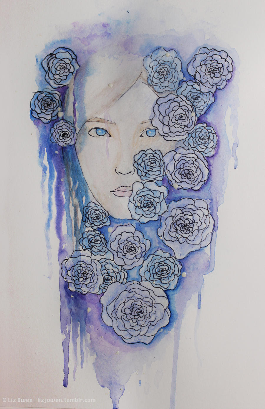
This piece is about the frail nature of life. It's linked to my last painting which you can see here.

I just find it so relaxing when I paint; listening to songs really do help, and I'm able to channel my emotions through the colours I use and the painting itself. It relieves me the stress of bottling everything up only to break down in the most awkward places. 

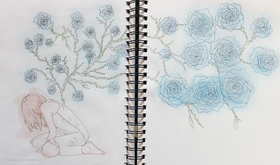
Very much an experiment as I haven't been "messy" with watercolour in such a lon time... Shall be posting a wip very soon, so keep an eye out for that!

Tools | Watercolour pencils | Watercolour Paint | Biro for the lines

Saturday, 17 November 2012

Depression - Final and details


Click to see bigger

Just a little something I did when I was going through a hard time (I was feeling crap about not being able to have the motivation to design and that I was a bad person blah blah blah). Because I have left it for so long I kind of forgotten how it felt to be so emotional... Until now, that is. 

I'm still finding it hard to get out of this mess that I'm in since he was gone, but my current uni project has revealed to me that art is a way for me to channel my emotions. For example, I'm obsessed with drawing thin lines with messy watercolour techniques (like the one shown in the picture above), roses, and stuff like decay and birds... It's frightening, actually. But I guess that at least I'm not bottling everything up.

I hope to do another picture like this soon because it truly was an experiment that turned out to have a lot more emotion in it than it should've done.


Thursday, 15 November 2012

Happy Halloween!


Okay so I was supposed to post this on Halloween, whoops. 

Tools | Watercolour pencils | Watercolour paint for the clouds and moon | Biro for the lines 

Monday, 12 November 2012

Typographic Walk Poster - WIP

I had a massive panic attack today when I thought about how I'm lacking in material for my portfolio as I had lost all of my work from last year. So today is the first day that I'm going to go through all of my old projects and re-do them to make them look more professional.

Here's the first of my old projects: The Typographic Walk. I've changed this dramatically from the old version but... I like it, even though it's completely different. In my brief I actually had to use pieces of type from different places (like buildings, bins etc) and create a poster with all of the type, but because I had lost all of those photos I couldn't reuse them. This is the main reason I changed the whole thing; the photos of type were extremely pixelated.


Stationary Set

Just did a little bit of designing for business cards, compliment slips and letterheads. Hopefully I could mass print these and start giving them out!


Friday, 9 November 2012

Pet Peeves


This was the first time I had the choice to create my own design brief that mainly focuses on typography. I first thought that I’d use some lyrics but display them in an illustrative way, but then I decided to do something a bit more personal so that I could engage more with my viewers. 
So I listed all of the things that annoyed me and picked out ones that would specifically fit well with each others. I chose Helvetica Neue as my main typeface because of how minimalist the design was, as well as Impact and Pacifico. 
It was quite hard for me to choose the colours (as I initially was going to go for grey and white) so I went onto kuler.com and chose this colour scheme because it was bold and I was never thought that I would use this colour combination. It was quite exciting! 
I was inspired by vintage Carnival posters and the way they laid out their type. 
Please note that this brief was not a real project and was done for a uni project.

Sunday, 28 October 2012

Falling Leaves


Can't believe it's actually autumn although it seems like summer skipped straight into winter OTL

Been working on this sketch because I thought it would be nice to take a break from uni work. I didn't actually "know" that I was going to come up with this, but after looking at my old work I was inspired to carry on with my Season Fae series. This one is, undeniably, Autumn!

Artist © Liz Owen
Tools Used | Watercolour Pencils | Biro lines |

Monday, 22 October 2012

What I'm Currently Working On

Seeing as I'm planning on using this blog a lot more - as well as my Tumblr page - I may as well update y'all on this piece that I'm currently working on.


Hopefully I'll finish it by the end of this week as well as starting out on my editorial illustration for my uni project.

Saturday, 20 October 2012

Brightest Star in the Sky


R.I.P Daddy, this is for you <3
So my dad passed away a couple of weeks ago. It’s still pretty hard for me to face it that he’s gone, because it was just so unexpected. The last time I saw him he was completely normal… And then this happens.
I wanted to create something which I can just pour my emotions to. My dad was the greatest man I knew, who always encouraged me in my work.
He was my star in my darkest of nights.
© Liz Owen.

Editorial Illustration: Lotta Nieminen

I'm back! For now, anyway.
I actually have a queue of posts that are waiting to be published here from my main tumblr blog. In truth, I was going to post this onto my tumblr but I just find it easier to do word-based posts on blogger. 

My post for today is about editorial illustration; at uni I get to make the choice between photography and illustration and - as you can see - I decided to go down the illustration route. I just prefer drawing to taking photos, even though it's a lot easier to take photos!

This post was actually going to consist of a list of illustrators that I was interested in, but because the illustrator below was so interesting I have now thought just to do a series of posts of inspirational illustrators - and maybe photographers - instead. This is actually going to be included in my uni work because I do need to include it in my research of different styles... I guess that this is hitting two birds with one stone!

Suez Environment