Monday 14 October 2013

New Production Schedule

After gathering some feedback from my crit and talking to my fellow classmates, I realised that there was a flaw in my schedule. I have grouped all of my projects together and not only did this make me stress a lot more, but I wasn't able to figure out which project to work on first.

I decided to thus create a new schedule and this time focus on each project individually.


Hopefully this will make it easier for me to handle all of my projects at once!

APP Words & AOI: Crit Feedback

[4] [5] [8]

During my crit meeting with my lecturers and classmates I had written some notes on the feedback I had collected on my project proposals so that I may develop them further. I only showed them my two main APPs as I am more confident in my dissertation and feel that I could go for option C (the 7000 word dissertation and 2 APPs).

One of my lecturers produced a list to ensure that I have hit all of the points in creating a strong project proposal, so I’m going to “answer” some of these points here and use them to identify the objectives of my projects.

APP 1
For my first APP – which will be the illustration competition – will be aimed at the general public to portray the vibrant city of London. I shall be doing my poster design at A3 to submit as a university project, but the submission for the Serco Prize competition would be at one of the sizes they prefer. I can illustrate multiple stories within but would have to be colourful and eye-catching to the general public.

When I first got into illustration I had done some research into the key aspects of an illustrator, and one of them was personal style. Every illustrator has their own signature style, and throughout my years of being interested in art I have noticed that I concentrate mostly on biro and different line techniques that I then combine with watercolour. I’m hoping to develop this technique further by carrying out more experimentation so that I could get a firm hold on it, as it were.

I realised that my previous production schedule was flawed because it involved me handling all three projects (my 2 APPs and my dissertation) at once, so here I have designed three separate schedules so that I wouldn’t stress as much.


As the project involves creating a poster, the only costs I would have to worry about will be the printing of it as well as gathering materials. Luckily I have all the digital softwares that I might dabble with and recently. I have also recently obtained a Wacom Inkling that I’m bursting to try out!

Other people that would be involved in this project as well as those actually viewing it would be the hosts: Association of Illustrators and Serco. I am hoping to include elements of both parties (such as the London Underground or Red Bus) to represent the competition itself.

The Learning Outcomes, as I have said in a previous post, are quite broad which makes it all the more harder to be able to cover them. I have analysed each one here.

I haven’t heard of ‘professional practice’ before doing this project, but now I understand is that these APPs are projects to show how you are becoming a professional illustrator/designer/photographer as well as our knowledge on the subject. With this in mind I’m going to explore more into biro and watercolour (as mentioned above) as well as books on illustration to read up on how illustrators got to where they are now.
I’m also going to delve deeper into semiotics as each illustration – although accompanied with text – will be portraying a story, and I need to get the right ‘signs’ across. This could be included in my research on the fundamentals of illustration and I’ll be looking to see if there are any step-by-step processes of other illustrators.
At the end of each section of research I’ll be writing an analysis, which I’ve already started doing by writing conclusions at the end of each blog post. I’ll be constantly flicking back through my research, brief and mood boards to stay on the right track and it’ll perhaps show me new things to explore. The blog posts I’ve written so far are a bit vague and I need to write them in a more professional manner and look at reliable sources, not just Behance.net.

I fear that I have been dawdling for too long on my design brief, as my dissertation keeps distracting me. However writing this post and looking at my notes has made it a lot clearer to me on how to write a successful proposal.

APP 2
My client for this second project will be a tea company – possibly Twinings – so that I could create something to promote their company as well as being ‘motivational’ for stressful students like myself. I have noticed that more and more people tend to include drinking tea every time they take a break from doing lots of work, and that it relaxes them. This idea is strengthened by the presence of tea and cafes in the university.

I haven’t yet explored extensively into my second project although I have at least decided on my client and my target audience. It was a lot harder to figure out what to do with this project as it’s my own creation and I had to make sure that it links my interests and my pathway specialism (illustration), although I worry slightly of my lack of experience in hand lettering. To overcome this, I’ll do extensive research on it and practice at least a little bit every day so that I could get the hang of it.

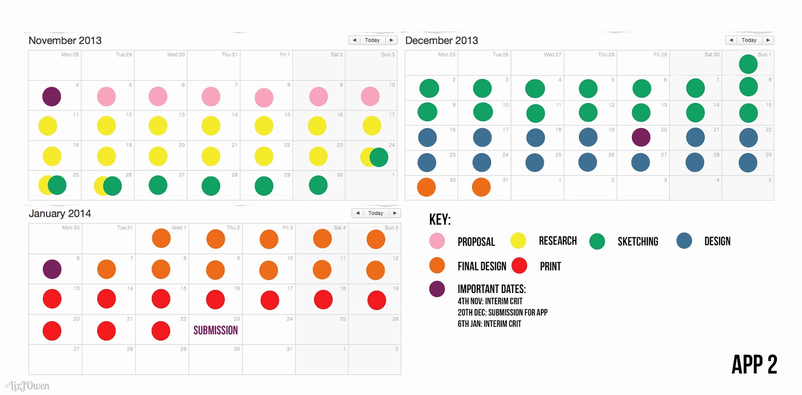
This is my updated version of my production schedule for this project:


I have seen some motivational quotes being hand lettered on posters, and so by creating it for a coffee mug I hope to make a fresh statement. I’ll probably come up with my own quote but in the meantime I’ll research into famous quotes.
As it’s going to be printed on a travel mug I must take printing costs into consideration, as it’ll be quite difficult to find a suitable company that would be able to print my design onto one. There is an option for me to print it onto a sticker sheet but then I would have to purchase this and take it to a printing company. Hopefully printing companies might be able to provide such sticker sheets!
Other costs that I would need to think about are those that cover the calligraphic materials I’ll be using for the hand lettering.

My target audience will be students, so throughout my project I could gather some feedback from my classmates – who are also interested in typography – because at the end of the day this product will be for them. I would thus need to please both them and the company that I’ll be ‘working’ for.

My pathway specialism is illustration, and with this project I hope to strengthen my illustrative techniques as well as combining it with typography, as I’m not too sure that I would want to work solely with illustration in future. Books such as ‘Hand Job’ will be really useful because they show examples of this integration of type and illustration.

I am going to handle this project – in terms of research and analysis – the same as my other APP, although in this case I’ll be looking at the work of professional typographers and those that are in that industry.


Overall Conclusion:
The crit helped me realise the importance of creating a client or target market as it stops you from straying too far off the project guidelines. It also makes my project brief a lot more realistic because I have someone that I need to impress with my product and it’s not vague like “I’m going to create a poster for someone who likes posters.”

I have also noticed that I’m not very experienced in hand lettering so my main focus on that project was to understand the basics of typography and to practice endlessly so that I could take it to a more professional status. If I am unable to do hand lettering then I’ll find ways to incorporate typography and illustration as my project brief doesn’t specifically say that I have to do the type by hand.

Tuesday 8 October 2013

APP: Possible Ideas Contin.

It has been a few days since I was given my APP brief, and during that time I have been thinking over my interests and generated some possible ideas with the help of mind maps. Yet I feel that I need to delve deeper in other to create a strong and successful design briefs.

I'm going to aim to produce three briefs as I haven't yet provided a sufficient amount of research for my dissertation, and if I do happen to fall on Option B then at least I already have an extra brief "waiting" for me.

Typography
I haven't done any hand lettering yet but I have a deep interest in them. If I happen to choose to do typography or hand lettering for a brief then I might find it challenging, and yet this will also mean that I could tick off another thing on my personal to-do list.

Here's a mood board of inspirations:


Image sources: Greg Coulton: http://www.behance.net/gregcoulton; Martin Schmetzer: http://www.behance.net/PapperOPenna; Sagmeister & Walsh and Yuko Shimizu: http://www.behance.net/gallery/Yes-Dumbo-Improvement-Project-Mural/11245521; Steve Simpson: http://www.behance.net/stevesimpson (2) ; Antonia Rodrigues Jr: http://www.behance.net/ARJr; Pako Garcia: http://www.behance.net/hideer; Alison Freund: http://www.behance.net/allisonfreund; Biljana Kroll: http://www.behance.net/biljanakroll; Linzie Hunter: http://www.behance.net/Linzie; Kelly Thorn: http://www.kellythorn.com/

From looking at this mood board I am inspired to mix illustration with typography, and perhaps do something like inspirational quotes on little cards, diaries or even a little coffee cup.

Birthday Card
One of my other ideas was to produce a birthday card but I'm not too sure what target market to aim for. I would like to do something for those in their late twenties and up as I realised that it's quite hard for them to buy cards for others (especially because most cards are all sparkly and pretty). However I just need some inspiration!

Sunday 6 October 2013

V&A Exhibitions: The Memory Palace and Illustration Awards

On Monday my design group and I went to visit the V&A Museum to see a few exhibitions: the Memory Palace, V&A Illustration Awards and the Making It Up: Photographic Fictions.

I found all of them quite interesting but the one that was the most unusual was the Memory Palace. It was set out as a “walk-through book” which was something I haven’t heard of nor experienced before so I was quite excited to see it again as I went there previously with a friend over the summer.

The Memory Palace

I have to admit that I much enjoyed the second trip compared to the first as I was a bit overwhelmed by how strange it was, but now I was able to think deeper and analyse some of the pieces there.

The “walk-through book” was actually much easier to follow than it is in a normal book, as every part is sectioned off with plenty of illustrations and typography. The text wasn’t displayed in blocks of texts but broken up into two or three sentences. This created a sense of flow because it allows the viewer to take their time when going around the room and follow the story at their own pace, allowing them to take all of the information in rather than glazing over a large amount of information.
However it was quite difficult to follow exactly where to go next because of the fact that this “book” is spread across various walls, but somehow everything is still flowed perfectly as the mind will then take the pieces of information they have gathered and connect them. This means that it might be easier to read this “book” as an actual book, because it’s clear what to read next.

Francesco Franchi

As the “walk-through book” covered a whole room, it meant that everything was larger so that all of the little details could be seen up close. An example of this is the first illustration done by Francesco Franchi, which was an infographic poster on the art of mnemonics (an aid in remembering).
The poster itself is extremely large, much larger than A1 and is set out in a portrait orientation with the timeline at the side. This means that the viewer is able to see the type clearly, even the smallest one. It is quite hard to follow the type due to the poster’s incredible detail, which is probably why the designers had used a monotone palette as a colourful one would only confuse the viewer and all of that detail would be lost.

Both of the typefaces they used were sans serif, meaning that it was easier to read as there weren’t any little serifs to get in the way when they’re at a small scale. The one used for the heading has a digital/sci-fi appearance – much like the ones used in digital clocks – which could relate to the technology that had been lost in this future world. The other typeface is quite plain and this might suggest that people have forgotten what printed words looked like and so used its simplest form.

This means that at first the poster is quite overwhelming because there is a lot of type, little illustrations and symbols to read. However the way it’s been displayed allows the viewer to take each part by circle before moving onto the next one. The eyes flow accordingly to how everything is placed: from the silhouette of a head at the bottom, then across all of the circles that are connected by thin lines.
These lines could bring up connotations of sunrays or the solar system, as a series of circles are connected to such lines. This thus is connected to science which and supports the whole subject of this infographic as it’s showing the art of mnemonics.
The combination of these “sun rays” and circles bring up the overall image of cogs, so might suggest that the human mind is similar to that of a clock, as when time goes by our minds expand to take in more knowledge.


Friday 4 October 2013

APP: The Overall Brief and Learning Outcomes Analysis

Project: Advanced Professional Practice
Level: Honours
Date Set: 30.09.2013
Date Due: Part 1: 16.12.13 and full submission 23.01.14

Preamble
This module is designed to encourage and enable students to use graphic design and the 'client' to expand and develop their professional style and to produce bodies of work for public scrutiny and evaluation. The module will enable students to synthesise theoretical, conceptual and technical skills gained during the programme to manage projects in a variety of areas of design practice and produce appropriate practical solutions.

The brief is designed in such a way as to allow open interpretation within the given theme and allow flexibility within chosen pathways. To ensure clear direction and intent from the outset of the course, you will need to determine and agree with the teach staff, your chosen pathway, i.e. typography, illustration, etc.

The Brief
The 'weight' of the dissertation that you have chosen will determine how many of the themes you will have to cover. The following indicates how many themes you are to choose:

Title
Pathway Option A -
Dissertation - 15 credits (3000-4000 words)
Advance Professional Practice - 60 credits (4 projects)
Major Project - 45 credits

Pathway Option B
Dissertation - 30 credits (5000-6000 words)
Advanced Professional Practice - 45 credits (3 themes)
Major Project - 45 credits

Pathway Option C
Dissertation - 45 credits (7000-8000 words)
Advanced Professional Practice - 30 credits (2 themes)
Major Project - 45 credits

Choose theme(s) from the following:

Arrival
Identity
Words
Conflict
Adventure
Home

Conclusion:
With all of this in mind, I will now need to decide which of the themes to choose which I shall do by creating mind maps of each one. Luckily the brief is allows for open interpretation so that I could create something that I'm interested in.


Learning Outcomes
Here are the learning outcomes for the APP, and I have analysed each one just beneath it.

[1] Gain an understanding of the needs and requirements of professional practice.

I am doing this by analysing the design brief and learning outcomes so that I aim to meet each point made. I know that it might be impossible to cover absolutely everything but I shall try my best! I would also like to look at existing products to see how other designers tackled similar briefs.

[2] Develop effective communication skills through the medium of [specialist] graphic design.

This is quite new to me as I haven't had this learning outcome before, so I'm assuming what they mean by "effective communication skills" is asking for feedback from both my classmates and the public and to write them down so that I can show how they have helped me through my designing process.


Tuesday 1 October 2013

Dissertation And APP Timetable

I have created a timetable to help me juggle all of these projects at once, as it was extremely helpful to me last year when I was working on my FMP alongside my Portraits project.


APP: Figuring Out My Interests (Possible Ideas)

Figuring Out My Interests
Alongside my dissertation I shall be working on my APP (Advanced Professional Practise). Before I want to even think about what kind of products I'd like to produce in relation to the brief, I will create a list of all that I'm interested in. I'm going to go as broad as I like, because when everything comes together there 'should' be some connection between my interests.

This is quite different to how I normally approach the brief, and it's mainly because we weren't instructed on what to produce by were given a list of themes: Arrival, Identity, Words, Conflict, Adventure and Home. So hopefully my list of interests would be able to adapt to these themes!


Image Sources: J.R.R. Tolkien: "The Hobbit"; George R.R. Martin: "A Game of Thrones; Magazine spread of Sayoko Ozaki from Happie NUTS; 11 Untranslatable Words: http://blog.maptia.com/posts/untranslatable-words-from-other-cultures; Natasha Cousens: "Life's Breath Entwined" http://natashacousens.com/; Homer, "The Illiad"; Jacopo Tintoretto: "Athene and Arachne" http://www.jacopotintoretto.org/;
 JDarnell: "The Little Mermaid" http://jdarnell.deviantart.com/; Feross Aboukhadijeh: "Travels in Japan" http://feross.org/japan/; Schin Loong (Luciole): "The Four Beauties" http://luciole.deviantart.com/

1. Reading
I love reading; I had even managed to go through most of the books in the children's department in my library's hometown, and even though I have forgotten most of those stories I can still remember some of the plots. They were mostly fantasy and how-to guides, and above are a few of my current favourites (although I have included The Hobbit which I read as a child).

2. Art & Illustration
Alongside being obsessed with reading, I really enjoy drawing and try to find as much time for it as I can during my spare time. I love Art Nouveau as well as "pretty" artwork, and am a great admirer for digital art (although I'm not that brilliant at it myself).