Friday 31 January 2014

FMP (BA): Dip Pens - Quick Exercise

I managed to get my hands on two sets of dip pens - one roundhand, the other copperplate & shadow - so today I had a little play with them. I've never really used such pens before so didn't know what I was doing but I just wanted to see what each set looked like in my own handwriting.

Calligraphy would be the first type style that I want to try out as I haven't explored with it that much in my last APP project (Words). Plus I think it'll suit some of the quotes I had gathered earlier.


Conclusion: 
As I've mentioned at the top of this post, I've never used such pens before so it was a little difficult for me to differentiate between the two sets. My next step is to take a look at some tutorials and see how other people use them as well as figuring out how to clean them properly.

Learning Outcomes:
[3] Developed written and oral skills of critical self-evaluation in relation to their design practice.
[6] Developed skills of critical thinking, analysis and evaluation.
[7] Developed their ability to learn through reflection on practice and experience.
[9] Developed their ability to work with complex material, analyse problems and identify appropriate solutions.

FMP (BA): Design Brief & Learning Outcome Analysis

The Brief
I have somewhat analysed my proposal in my "proposal" post, but I haven't broken down exactly what I needed to do to ensure that my project runs successfully. I have therefore highlighted some of the aspects in my design brief.

  • Book of Quotes - must integrate illustration & typography
  • Who for? - Oxford Literary Festival
  • Target Market - Literature Enthusiasts
  • No. of quotes - at least 4
Okay so it looks like I need to research more into the different types of hand-lettering or typography in general so that my designs don't seem repetitive. I need to make sure I choose the right quotes for my target market, so maybe the more "famous" and recognisable ones would be appropriate? I'll also need to briefly research into the Oxford Literary Festival as well. 

The Learning Outcomes
Like I have in my other projects I shall analyse each of the points separately, although will group together those that are quite similar.


[1] Developed their awareness of the needs and requirements of professional practice, manifested in the ability to produce practical graphic design work of high technical quality. 
[2] Developed a high level of intellectual and conceptual involvement with their chosen subject area, including skills of project proposal, documentation of project development and the presentation of outcomes.

Professional practice includes working to a deadline so to prove that I am doing this correctly I shall stick to the production schedule that I had drafted up in my previous post. I will also need to consider printing and paper so that I choose one that's appropriate for my final design and not leave it to the last minute. 
It seems that I've already covered the proposal section in the second learning outcome, but the others talk about how I should categorise and make note of everything that I've come across during the project. I need to take my chosen topic into a professional level so that'll include practising as much as possible with hand-lettering. I will be presenting my learning outcomes as [n] on each document at the very top or next to the section where I have covered a certain learning outcome. 

[3] Developed written and oral skills of critical self-evaluation in relation to their design practice.

I could self-evaluate by writing a conclusion at the end of each blog post to show how it was relevant to my project and what I've learnt. 

[4] Developed research skills in the area of contemporary professional practice.
[5] Developed skills of independent study, resource utilisation, problem-solving and decision-taking.
[6] Developed skills of critical thinking, analysis and evaluation.
[7] Developed their ability to learn through reflection on practice and experience.
[8] Developed their ability to scan and organise data, abstract meaning from information and communicate knowledge in a variety of formats.
[9] Developed their ability to work with complex material, analyse problems and identify appropriate solutions.

These learning outcomes mainly involve my research and documentation. To achieve these points I shall make note of: all of my experimentations, including what went right/wrong; YouTube videos and other useful tutorials; feedback gathered; conclusions and evaluations; analysis of inspirational pieces; screenshots of anything done on the computer and photos of things done by hand; and put everything on this blog.

[10] Developed their skills of visual, written and oral communication.

This learning outcome is very similar to [3] as it's all about communication. In order to show that I've communicated appropriately I shall include screenshots whenever I ask for feedback via Facebook/in class, and I'll also ask the proper target market. 

Conclusion:

I've noticed that all of these are skills that I should already have and develop, which just shows what level I'm working at. In a few months time I'll be entering the design industry so I'm expecting to know as much about my topic area as possible. 

My next step is to dive into research and experimentation, and at the same time write [n] next to each section where I have covered a certain learning outcome.

FMP (BA): Schedule

Here is my production schedule for this project. As you can see I have mainly focused on the sketching and designing process due to the amount of quotes I have to illustrate (at least 4) and the fact that I'll be trying out new styles and techniques.


Sunday 26 January 2014

FMP (BA): Book Inspiration

I wanted to take a look at existing books to figure out what is the best way to bind a mass-produced item, and my friend showed me this fairy tales book that was at a similar size to the one I'd produce.
Even though it is a poetry book I am still quite interested to see the layout of each page and how they used illustration with typography.

Front and Back

When I saw it I immediately thought of Jan Pienkowski and his silhouette illustrations, and this brought me back to the Brother's Grimm tales that I used to read when I was younger. The silhouettes are quite decorative; even the small ones on the borders are! The main focus is definitely on the illustration as the type is rather plain in comparison (although that could be because if it were any more decorative the overall appearance would be overpowering).

The price, barcode and logo are extremely clear on the back and are more dominant than the blurb because of the colour and size of the text. The blurb is centred, leaving plenty of room around it for the illustrations (which are also very decorative).


Friday 24 January 2014

FMP (BA): Proposal

Liz Owen
BA (Hons) Graphic Design - Top-Up Degree
Final Major Project

Background Information
"The Sunday Times Oxford Literary Festival is an annual literary festival where visitors can meet and listen to authors and experts from a wide range of fields discussing a variety of topics from literature, politics, history, philosophy, economics, science, culinary, travel, environment and religion, to mention only a few." - Taken from the  Sunday Times Literary Festival  website.

Despite the name change - as they are now the Oxford Literary Festival - the event still continues today, attracting a wide variety of talent every year as people gather to listen to lectures on literature as well as meet well-known authors. Both children and adults attend this festival so there's something for everyone!

The Brief
You are to design a book of quotes which integrates both illustration and typography wherever possible. It will be pocket-sized paperback so that it's easy to carry, nothing more than 200mm x 200mm. How you bind it is up to you, as long as there are around 4 quotes within.

This book will be displayed at the Oxford Literary Festival and made available to those who attend this event. If possible, at least one of the designs within will be carried across to poster designs in order to promote this festival which takes place in March (details are on their  website). This festival is quite well-known and so the target audience will be quite large but those who pick up the book will be both literature and typography enthusiasts.

Research and Methodology
I shall be looking at any existing poster designs that promote this festival as well as looking for typographic posters and books. As it's for a literary festival I shall be displaying relatively well-known quotes within my book so that it's possible for them to be recognisable by all ages.

Here are some of the websites and books I'll be looking at for inspiration:

The Oxford Literary Festival -  http://oxfordliteraryfestival.org/
Behance -  http://behance.net
Waterstones (I could look in store and online)
"Typography Sketchbooks" by Steven Heller and Lita Talarico
Youtube -  http://www.youtube.com/

By looking at existing poster designs for this event would give me an idea on how they have displayed their information before so that I can maintain consistency in my design. I shall try and make it slightly different but it'll be ideal to do a little bit of background research to base my design on.

I have covered hand-lettering in my previous APP project (Words) but I hope to go a bit further by experimenting a lot more and trying out more styles. This means that I would have to extend what I already new and maybe start from scratch so that I could figure out the basics of each type style. Looking at how other people have illustrated quotes would help me out as well by giving me a general idea on how to layout my words properly.

Speaking of quotes, I shall be looking at multiple websites as well as the Oxford Dictionary of Quotations and Proverbs. I want my quotes to be as accurate as possible because it would just look silly if I displayed an incorrect quote at a literary festival. It would bring an unprofessional appearance and might not attract as many people to go to the event.

Reflection, Testing and Learning Outcomes
Making sure that my quotations are as accurate as possible is one of the things that I will be testing continuously  throughout my project as I don't want to get to the final stage only to realise I had worded it  incorrectly. This means I'd have to ask someone who has an extensive knowledge on literature or look up at more than one website source to make sure it's legitimate.  Another way to confirm my quotations is to flick through the Oxford Dictionary of Quotations and Proverbs.

I've mentioned above that I've only dabbled in hand-lettering since my previous project, so another form of testing would be to post up what I'm working on to gain feedback so that I could correct any mistakes made in the type. Obviously the “mistakes” would make the design more organic but I want to be able to do the best I can to make it look more professional. At the same time I will jot down some notes on the feedback I received so that I can show I have considered all options to ensure a better design.
I could also gain feedback on the design as a whole to see if my target audience – literature and typography enthusiasts – like my design. If they could recognise my chosen quotations then that'll be brilliant.

Most of the learning outcomes for the FMP (Final Major Project) are quite similar to those for my APPs, although one really caught my eye: “Developed a high level of intellectual and conceptual involvement with their chosen subject area, including skills of project proposal, documentation of project development and the  presentation of outcomes.” This further emphasises the importance of me knowing what I'm working with and only makes me want to try harder in creating a near-perfect set of typographic piece. Obviously I won't be able to be completely perfect but it doesn't stop me from trying my best. I shall analyse other learning outcomes in a separate post.

Experimentation
I have partially covered what I shall be experimenting on, and this includes different type styles as well as trying out different methods on how to display my book. The brief states that I have a bit of freedom when it comes to binding and I would love to try some hand-made methods. If these methods don't work out then at least I have shown that I've tried.
I shall keep of record of each experiment with reasons of how it did/didn't work for future reference when I want to go back and improve on it.

I will experiment my final piece by showing it to my target market and assess on how they are using it as well as seeing if my quotations are recognisable.

Professional Practice
To ensure that I have covered this section I shall produce “the real thing” and actually create the book so that I could present it at an interview or a show. This means that I will have to consider different binding methods, paper, and printing companies in advance (perhaps a couple of months before my deadline) so that I don't miss the deadline because of having to wait for it to be printed. I know that our university has a connection with GFSmith so I might contact them for some paper samples.
I shall also buy a sketchbook specifically for this project so that I could show my thought process as well as a link to this blog.

Production and Contingency Planning
I shall be drafting out a time table for this project and label all of the different areas that need to be covered: research, inspiration, sketching, experimentation, and designing. I shall aim to make my schedule as spread out as possible to avoid cramming everything at once and to take it at a steady pace. It is important that I stick to this schedule to avoid panic and not producing a sufficient design. After I have completed each section I shall tick it to give me a bit of a positive-boost as I can see that I'm slowly on my way to finishing the project.


N.B Please note that this is a university project, meaning that this isn't a brief provided by the Oxford Literary Festival. I am just using them as a potential client.

Learning Outcome:
[2] Developed a high level of intellectual and conceptual involvement with their chosen subject area, including skills of project proposal, documentation of project development and the presentation of outcomes.

Thursday 23 January 2014

FMP (BA): List of Quotes

I'm leaning a bit on the idea of doing a book of quotes as it's something completely different to what I usually do, and I mentioned in my last APP project that I would love to explore more with different type styles. This would be the perfect way to do that!

I'm not quite sure on what theme I'd go with so I just collected a bunch of quotes from numerous sites and have listed them below. I had originally hand-written my ideas but... Even I couldn't read my own handwriting.
This time I will be crediting the authors as these are the more well-known quotes. I'll keep adding to this list throughout the duration of this project so that everything is in one place.

"It is difficult, when faced with a situation you cannot control, to admit you can do nothing." - Lemony Snicket
"There are times to stay put, and what you want will come to you, and there are times to go out into the world and find such a thing for yourself." - Lemony Snicket
"I put my heart and my soul in my work, and have lost my mind in the process." - Vincent Van Gogh
"Normality is a paved road; it's comfortable to walk, but no flowers grow on it." - Vincent Van Gogh
"Show me a hero and I'll write you a tragedy." - F. Scott Fitzgerald
"Never confuse a single defeat with a final defeat." - F. Scott Fitzgerald
"Soldiers are dreamers; when the guns begin they think of firelit homes, clean beds, and wives." - Siegfriend Sassoon
"I can resist everything except temptation." - Oscar Wilde
"Experience is one thing you can't get for nothing." - Oscar Wilde
"Not all those who wander are lost." - J. R.R. Tolkien
“It's a dangerous business, Frodo, going out your door. You step onto the road, and if you don't keep your feet, there's no knowing where you might be swept off to.” - J.R.R Tolkien
"Courage is resistance to fear, mastery of fear, not absence of fear" - Mark Twain
“One day it will have to be officially admitted that what we have christened reality is an even greater illusion than the world of dreams.” - Salvador Dali
"Ever tried. Ever failed. No matter. Try again. Fail again. Fail better." - Samuel Beckett; Worstward Ho
"Life is like a box of chocolates, you never know what you're gonna' get." - Forrest Gump
"Afterall, tomorrow is another day." - Gone with the Wind
"We live as we dream: alone." - Heart of Darkness
“A reader lives a thousand lives before he dies, said Jojen. The man who never reads lives only one.” ― George R.R. Martin, A Dance with Dragons
“Never forget what you are, for surely the world will not. Make it your strength. Then it can never be your weakness. Armour yourself in it, and it will never be used to hurt you.” ― George R.R. Martin, A Game of Thrones
“Some old wounds never truly heal, and bleed again at the slightest word.” ― George R.R. Martin, A Game of Thrones
"Listen; there's a hell
of a good universe next door: let's go" - E.E Cummings
“... Remember one thing only: that it's you - nobody else - who determines your destiny and decides your fate. Nobody else can be alive for you; nor can you be alive for anybody else.” ― E.E. Cummings
“As he read, I fell in love the way you fall asleep: slowly, and then all at once.” ― John Green, The Fault in Our Stars
“My thoughts are stars I cannot fathom into constellations.” ― John Green, The Fault in Our Stars
“What a slut time is. She screws everybody.” ― John Green, The Fault in Our Stars
“Some infinities are bigger than other infinities.” ― John Green, The Fault in Our Stars
"Winged Words" - Homer
"'Tis better to have loved and lost
Than never to have loved at all." - Alfred Tennyson


Sources: Dictionary of Quotations and Proverbs - The Everyman Edition compiled by D.C Browning.

Wednesday 22 January 2014

Never Give In & Never Give Up

The Brief 
The aim is to design the outer design of a travel mug using inspirational words integrating illustration where possible. We often look upon inspirational quotes to boost our motivation to get us through the week long of reports or essays we have in our workplace and yet they can even go to the lengths of providing us with the courage to pursue our life long dreams.

Background Information
I decided to go along with the idea of hand-lettering, as it was something that I haven't yet been able to experiment with in my previous projects. This grew out of my fascination with the works of Steve Simpson and Linzie Hunter, who were both key inspirations for this project.

The Design
Done in both Adobe Illustrator and Photoshop. I produced a tea-leaves pattern for the background to create a connection between the design and Twinings, a British-based tea company, and emphasised this through the use of a teapot and cup in the illustration. My colour palette choice is linked to soothing emotions with the red to give a vibrant appearance as well as that energy boost.


Important Notice:
Please note that Twinings did not in any way commission me to produce this piece, this is completely for university purposes only as I had to pick my ideal client to base this project on.


Digital Design


Thanks for viewing! Please visit my other accounts:

FMP (BA): Figuring Out My Interests (Project Ideas)

I'm at that point where I would now need to consider what project to go for for my FMP (Final Major Project). I wanted to do something stationery based due to my recent discovery that I've got a soft spot for it, but I didn't want to do wedding invitations again as I had already done that last year.

Mood board (@ Pinterest)
I am therefore going to tackle this the same way I did for my APPs; I'll be figuring out what I'm really interested in and how to take that interest in a graphic design way. In my last post for my APPs I wrote that I was interested in reading,  art, fashion, mythology, nature and fantasy. 
There is a link between most of these, and that is that they could all be done through illustration or typography. I could create a book spread for a myth/fantasy novel with a hint of nature within, and that of course would be linked to reading and art. 

To help me out a little bit more I've created a new Pinterest board just for gathering inspiration, which you can see here. I'll probably be adding everything that has inspired me for this project onto that board just to make it easier for you. However I will be copying some of the pins from that board onto my other boards for future reference.

List of Ideas
After spending a few hours collecting inspirational images I decided to conjure a list of possible project ideas, mainly focusing on stationery as that's the work I would like to do in future. Please excuse the messiness of this list, I was jotting down as I went and didn't really take into account that it had to be neat so that other people could understand what I was writing. Most of the time I didn't even look down to see what I was writing!


Mind Map
I was getting more and more persuaded to doing hand-lettering again as my previous project turned out to be quite enjoyable, so I created a mind map on the possible projects that I could do that links in with that.


I realised that doing wedding stationery might not be the best idea as I had already done it for my last FMP, so I skipped the idea of doing stationery as I could easily do it in my spare time out of uni hours. Instead I focused on areas I haven't really delved into before such as branding and typography.

This led me to explore more with my "Book of Quotes" idea.


Conclusion:
Taking a look at all of my lists and mind maps I have decided to go with the "Book of Quotes" idea. I am also quite keen to do the Art Nouveau cafe as it will link in with my dissertation topic but I'm not too sure yet. I think I'll look into it a bit more later on. 

Friday 10 January 2014

APP Words: Evaluation

General Thoughts - Research etc
I am pleased to say that this was one of my most enjoyable projects I've done throughout this year and both of the HND years. I am so glad that I went along with the idea of trying out hand-lettering, or I would've never have known how much I enjoyed it.

I think that it was enjoyable because I was able to mix together both typography through hand-lettering and illustration without feeling that it was 'too' illustrative. I had to take composition into account, but it was much easier to do than my London piece. 
Another thing was that I could embrace my 'inner-child' as I returned to doing little doodles no matter how anatomically incorrect things were, because it was acceptable. I came to terms with my imperfect drawings instead of being bogged down trying to make them before, producing a series of fun and quirky illustrations. 

This was inspired by the likes of Steve Simpson and Linzie Hunter, both of whose works I continuously looked over at. They have shown my that making mistakes or including a certain sketchiness isn't altogether bad. However I wish I did try more type styles such as Blackletter, but as I wanted to aim for that 'fun' appearance I didn't think it was appropriate. Maybe next time!

I think that this was the first time where I didn't force myself to analyse so many illustrators and illustrations, only analysing what I found inspirational. This is because everything I found interesting was placed on my Pinterest boards, and it was a great way to create mood boards. I could easily go there from my phone and just flick through my collection. I cannot explain how good Pinterest is! I'll definitely use it a lot more in future projects. 

I can't actually think of what made this project un-enjoyable because even the printing process - which is normally my downfall - went well as well as prototyping. By opening my eyes and using the resources around me I was able to produce a sufficient template almost immediately.

Speaking of resources, I have to say that in this project I asked for opinions on my designs and listened to them, trying to figure out why my target market liked one thing more than another. I was able to use that information to make my own decisions and chose what would be best for both my 'client' and for my target market. After all, they would be the ones I'll be 'selling' my designs to, so it is important that I pleased both parties.
I found it easier to base my design around an existing company, and I'm hoping to send them my designs once I've done taking photos in a studio. 

I spent a lot of time during this project having a look at videos, and I've discovered that there are the perfect way to get inspiration. By watching people actually doing some hand-lettering shows me that anyone could do it with practice, so I didn't feel too upset when I didn't get perfect results on my first try. Even though I didn't analyse videos in great detail I still found them inspirational and included them within my blog. 

My Final Design
My final design was... Unexpected. From the very start of my project I knew that I'd do hand-lettering but I thought I'd go down the calligraphy route, not the funky sans serif one, and I'm actually quite glad I did in the end. If I had used calligraphy then the design would appear all too feminine - an aspect that my audience had also pointed out - and I wouldn't be able to portray the light and funny side of tea. Tea could grant the student that energy they need, but is also good for calming down, so I aimed to create a design that reflects that.

I did this by choosing a colour palette that would link with those emotions. Green is known to represent harmony and tranquility, and I've chosen a shade relatively close to blue to emphasise the 'calm' emotion, and orange provides that burst of happiness with the cream to bring the boldness down a notch. 

I made sure that the forms were as smooth as possible to reflect the smooth flow of tea from a teapot as well as that soothing effect it could have. My main focus was on the banner so I included more shading and lighting to it to bring it out.

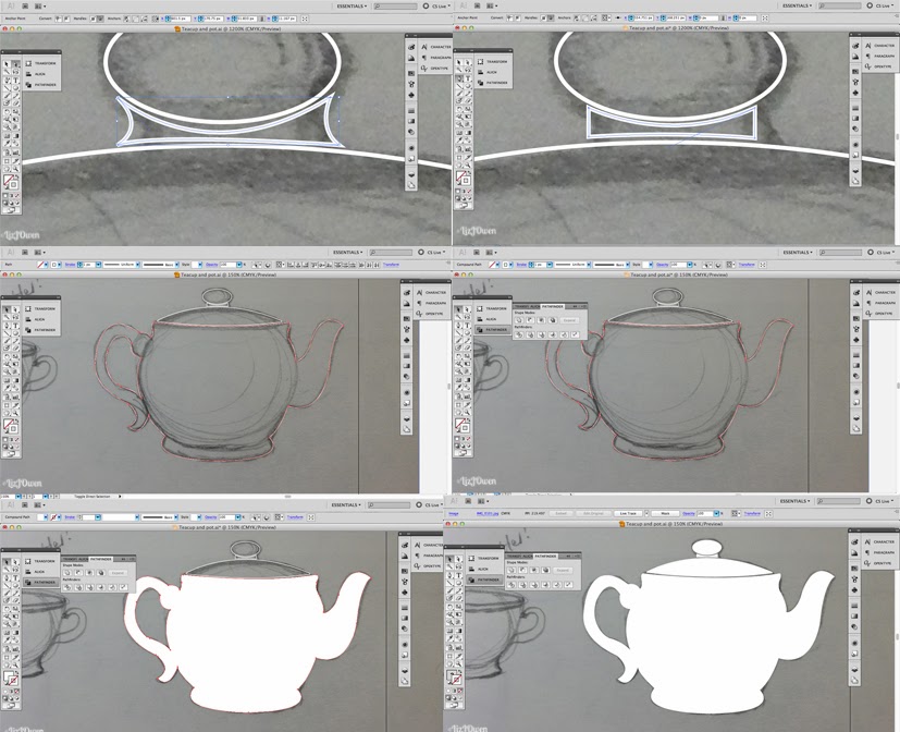
My illustration was mainly formed on Illustrator, and this in itself is surprising. I've always told myself to avoid Illustrator at all costs because of my lack of experience with it, but this project has made me come to terms with it and I can say that I'll happily work with vectors again. I have learnt so many functions and techniques, which made the process much easier later on when I had to repeat certain things over again. Repetition really is the best way to learn. 

My illustration as a whole is successful in that there is a clear relation to tea, and to Twinings. I wanted to make my Twinings label more 3D and 'realistic' than the others as if it was the real deal, and I referenced from one of their existing designs to emphasise this. Of course, I couldn't be photo-realistic, but the vector was good enough.
"Never Give In and Never Give Up" was the perfect quote choice (if I must say so myself) because it's short. This means that it was much easier to work with because I didn't have to think of the style of lots of letters, and it'll be easier to read at a glance. I didn't include any credits of the author because it wasn't a very popular one, although I'll be sure to credit them when I upload my final design onto all of my online profiles and Behance.
I chose to do a teapot and cup because it was extremely 'British' and provided a strong connection between that and Twinings, an age-old British tea company. I had originally wanted to put a watercolour paper texture to the design but as I mentioned in my last post it didn't print as well as the non-textured version, so I used matte paper to provide that slightly textured, well, texture.

Unfortunately I couldn't find a company to print this design off properly onto the travel mug, and those that I did find only provided a small square for my illustration. This is the reason why I've printed it off on paper and attached it onto the travel mug, but I do hope to find a company to do it for me one day. I think I fancy having this design myself, haha!

Conclusion
In conclusion, I really enjoyed this project for the fact that I wasn't trying to cram as much research into it, focusing more on my doodles and idea generation. I only researched on what I thought was appropriate for this project, doing it whenever I felt inspired and had to write it down. My final outcome was much better than I had original anticipated... So trying out new things isn't really a bad thing at all!


Update 17.01.14
I tweeted Steve Simpson and Linzie Hunter - the key inspirations for this project - and they both got back to me!


I am really happy to have gotten some feedback from two of my most inspirational designers, and it gives me more confidence in my design. I hope to continue down this path in future because I really enjoyed doing hand-lettering. 

Thursday 9 January 2014

APP Words: Final Design

I'll probably develop this and place it on a mug prototype, but I thought that I'd leave this here just to remind me to put some photos up later on.

I'm really, really pleased with it's outcome, and surprised at myself... My vectors actually turned out okay! I've never really been that experienced in that field so I'm happy to see that it actually worked out okay in the end.


I printed out my designs on matte paper to provide that extra boost of texture, and after comparing two versions (one with the watercolour texture and one without) I went with the one that didn't have any texture applied. This is because the colours in the ampersand and banner were a lot brighter and stood out a lot more. It provided a very 'clean' and smooth appearance, something that relates to the soothing taste of tea.


Once chosen, I cut out my design and applied to my mug and... It fits perfectly! I am so glad that I did trim off the bottom slightly otherwise it would've been too long. I'll take better pictures later but here is a preview just for now:


APP Words: Sorting out the Details

[5] [6] [9]

Camouflage Problem
I now need to sort out that 'camouflage' connotation that kept cropping up whenever I looked at the tea leaves pattern, so I went back to the tea leaves document and using the sketch as reference I started to delete some of the leaves. 


I copied this square and went back to my mug document, pasting it on the side before reducing it so that it was the same size as the other pattern. I then created a swatch and changed the background.


I put the designs side-by-side to compare them both, and I much prefer the one that had the lesser amount of tea leaves. The leaves are more prominent because there's now more of a focus on the larger ones, so it doesn't resemble the camouflage pattern so much anymore. 


Tuesday 7 January 2014

APP Words: Final Design Contin.

[4] [6] [8] [9]
One of the main focal points are the teapot, banner and cup, and it is necessary that the link between these is smooth to reflect the flow of tea from the pot so I created a new document to solely focus on that. I made the background green so that I could see everything clearly.
To try and do this link as smoothly as possible I created a smooth curve on a new layer. I used my sketch to help me out with this as well.


I used the paintbrush tool to try and make it a bit smoother, and it was a lot easier to draw the line with! I wish I discovered this function earlier. I just used the paintbrush to draw my line in the end.
That's when I realised that the paintbrush tool also had anchor points, so this should hopefully make it easier to draw the 'banner'. I ungrouped the Never Give In illustration and started to adjust it to match the line.


APP Words: Putting Everything Together

[6] [9]
I've finished all of the illustrations that I wanted to include, so now is just the case of putting them all together and then I could upload it into Photoshop to start adding texture and shading.

I am going to use the latest template - as that was the one that worked best, shown in this post - so I opened up all of the documents I needed, then put them together with the template document on separate layers. I deleted the old templates then saved it under a New Document so that I didn't lose anything.
Then I played around with all of the illustrations, scaling and arranging, before I came up with a layout I was satisfied with. I've left the colours for the Twinings label because I had the idea of including the logo on the teapot... Hmm.

As you can see, I decided to choose the most successful vote from when I gathered feedback from my peers. [4]


I tried to use the pattern but it doesn't seem to appear on this document, only in the tea leaves document, so I copied and the illustration next to the template and made a pattern by going onto Edit > Define Pattern. I then selected the template, and used the pattern as a fill colour. However it only showed the leaves and didn't have a background.


I tried out a little experiment where I filled in the pattern background with the same colour as the template background. I reduced the size of the pattern because the leaves were way too big. Adding a background colour didn't seem to work so I made it transparent. [4] [8]


The background of the template was still transparent even though the tea leaves pattern worked so I just duplicated the template, and on the duplicate I set the fill colour as the dark green. It worked! Result! I thought that the light green leaves were too light so chose a shade closer to the background. [4] [8]


Conclusion: [5]
It's nice to see everything coming together but I cannot help but think of an army camouflage when I glance at the background. I need to change something about it but I really cannot think what... Maybe I do need to make the tea leaves larger, or at least reduce the amount of them in a pattern.

So my next steps are:

  • Entwine the banner with the teapot and cup
  • Change the background pattern by reducing the amount of leaves in it
  • Add colours to Twining label
  • Convert everything to Photoshop


[n] Learning Outcome

Monday 6 January 2014

APP Words: Template Prototype 2

[4] [5] [8] [9] 
Even though I already have a template drawn out I would need to do it on the computer and then print it out just to double check that the dimensions are correct. This is really important because everything could go horribly wrong; it isn't ideal to produce a design if it doesn't fit on a standard travel mug size!

I scanned in my sketch and started to trace around it using the pen tool. It was nice and easy to do as it was quite a simple shape, so this didn't take long at all. I then hid the sketch layer and printed the template out to wrap it around the mug.


It didn't fit as well as I hoped, and I thought it was probably better to actually base it off the costa design.


APP Words: Tea Leaves Pattern

[9]
Right, now it's time to (finally) produce the tea leaves pattern! I haven't really done many - if at all - patterns on the computer so I might learn something new today. 
Luckily I found quite a detailed tutorial (here) [4] to help me out with this, because even though I have roughly sketched my pattern I know that it wouldn't be ideal as everything needs to be placed perfectly so that it would repeat effortlessly. 

I first start off by uploading a photo of my pattern sketch and draw out vectors of all of the elements that I want within the pattern design. Once I was done I selected them all, copied them, and created a new document sized 600px x 600px. I then pasted them and shifted them to the side for a bit.


I used the rectangle tool to create a box by selecting it and then clicking anywhere on the screen, then I typed in the dimensions 300px x 300px. While it's still selected I went to View > Snap to Grid so that it'll be easier for me to place all of the tea leaves in, and put the box at the centre of the document. I locked this box. Then it was just the case of placing all of the tea leaves, taking reference from my sketch.


APP Words: Teacup and Teapot Vectors

It's near to the end of the deadline so I need to come up with all of the other sections as quickly as possible. After talking to my peers and my lecturers I decided to go along with the idea of incorporating the tea cup and pot as it was pointed out that they were very "British", and would create more of a connection with Twinings. [4]

I was quite surprised at this as I thought that my target audience would like this 'fun' illustration, but it appears that I was wrong!

My first thing that I wanted to do was then create a vector of my teapot and tea cup so that I could connect them with the banner design. I created a new document in Illustrator, uploaded a photo, and began to work.

I'm starting to get used to using the pen tool and creating vector images so this wasn't a very long process at all. I kept flicking between the pen tool and the shape tool to help me out with my design, and I often had to delete some anchor points to make curves smoother.
Therefore I've decided that instead of including detailed descriptions of every little step, I shall just upload these screenshots as they are pretty self explanatory and I have covered anything new in previous blog posts. [6]


APP Words: Colour Scheme Feedback

I decided to ask my peers and lecturers on what colour scheme really catches their attention by printing out all of the different versions onto one page, and having them tick their preferences. [7] These were my results:


I also asked a few of my peers what design they prefer, and also showed them my teapot and cup version. I was surprised once more when I learnt that they actually preferred that one!


Conclusion: [5]
I was quite surprised at the outcome as I thought they'd prefer the blue version, and although it was a strong choice it was overtaken by the green/yellow/orange version. Just shows how important it is to get feedback from both my target market and fellow designers! [4]
My next step is to carry on and design all of the little illustrations (the tea leaves pattern, teapot and teacup), put them all together and then change all of the colours. [8] Can't wait!

[n] - learning outcome

Sunday 5 January 2014

APP Words: Feedback - Base Colours

I posted what I had so far on Behance and got some feedback off another graphic design student.

Image shown:


Feedback:


[4]
This confirmed my idea of installing some sort of old paper texture - maybe a similar texture to watercolour paper - and to include my more sketchier side for the shading. I don't know how I'm going to do this just yet so I'll be looking around for some tutorials. If all else fails, I'll just use my graphics tablet and do it in Photoshop. 

APP Words: Adding a Splash of Colour

[4]
With only my pattern design to do, I thought it was time to start figuring out what colours to use on my design. I'm going to thinking of the background as well as that'll be the main factor affecting the colours I choose on my "Never Give In" design.

As we've seen from a few posts back, this is what my design looks like right now:


Right, let's start adding some colour! I'm going to just show a whole series of different colours and put them all in one picture so that it'll be easier for me to compared everything.


APP Words: Twinings Label

[6] [9]

I want to get started on the other sections - the Twinings label and the pattern - as soon as possible so that I could slowly put all of the pieces together. I thought I'd tackle the label first because it will be challenging due to the serif type style.

Vector Version
The first thing I wanted to try out was drawing it straight from the sketch onto the computer, much like I did with my Never Give In design. However it didn't really turn out quite so well... The serifs went a bit crazy and clearly showed that this was my first time.


APP Words: Colour Schemes

Now is the perfect time to start figuring out colour combinations, but before I go onto kuler.adobe.com/ and randomly pick a combination I need to think of what kind of connotations and emotions that those colours would bring.

My design shall hopefully motivate the student and make them feel better about their day (especially if they're stuck on revising) so I would like to use colours associated with happiness as well as that hint of relaxation. I went onto Google to have a look at some websites and found one (http://www.colour-affects.co.uk/psychological-properties-of-colours) that had a whole list of the "main" colours and the positive and negative sides to them. Here's what I've copied and pasted from that site:

"RED. Physical

Positive: Physical courage, strength, warmth, energy, basic survival, 'fight or flight', stimulation, masculinity, excitement. 
Negative: Defiance, aggression, visual impact, strain.

BLUE. Intellectual.

Positive: Intelligence, communication, trust, efficiency, serenity, duty, logic, coolness, reflection, calm.
Negative: Coldness, aloofness, lack of emotion, unfriendliness.

YELLOW. Emotional

Positive: Optimism, confidence, self-esteem, extraversion, emotional strength, friendliness, creativity. 
Negative: Irrationality, fear, emotional fragility, depression, anxiety, suicide.

GREEN. Balance

Positive: Harmony, balance, refreshment, universal love, rest, restoration, reassurance, environmental awareness, equilibrium, peace. 
Negative: Boredom, stagnation, blandness, enervation.

VIOLET. Spiritual

Positive: Spiritual awareness, containment, vision, luxury, authenticity, truth, quality. 
Negative: Introversion, decadence, suppression, inferiority.

ORANGE.

Positive: Physical comfort, food, warmth, security, sensuality, passion, abundance, fun. 
Negative: Deprivation, frustration, frivolity, immaturity.

PINK.

Positive: Physical tranquillity, nurture, warmth, femininity, love, sexuality, survival of the species. 
Negative: Inhibition, emotional claustrophobia, emasculation, physical weakness.

GREY.

Positive: Psychological neutrality. 
Negative: Lack of confidence, dampness, depression, hibernation, lack of energy.

BLACK.

Positive: Sophistication, glamour, security, emotional safety, efficiency, substance. 
Negative: Oppression, coldness, menace, heaviness."

The best choices out of these colours - if I did want to go with the happy-but-relaxing idea - would be green, red, blue, yellow and orange. I would choose pink as well but that is stereotypically associated with feminine aspects and I want to produce a unisex design.

APP Words: Laying Down the Foundations

[6]

Three-Colour Palette
I still haven't figured out a colour scheme just yet, however I want to see what my design would look like with some colour on it so I chose three shades of grey. These three shades would then be the different shades of whatever colour I choose in the end, although I might make the darkest shade in a completely different colour. 

I drew three boxes and filled them in colours so that it'll be easier to fill the banner design in, as I just need to use the dropper tool to do so. I first filled in the colours for the banner -  I haven't yet incorporated what I've learnt from my experiments [6] - and then started to work on the ampersand.
For some sections they appear to be right at the back of the banner, so I just selected it to bring it to front. I then adjusted the parts that overlaps so that it looked like the ampersand is still going beneath the banner.


Saturday 4 January 2014

APP Words: Experimentation

[4] [9]

After looking back at the design I had so far I figured out what was bugging me; I was creating a 3D type on a banner. I want it to look as if it was actually 'printed' on the banner, and the 3D effect just made it look weird.

I had a browse at some tutorials online so I can try a bit of experimentation with my design. Plus I'll definitely be learning something new! It's a win-win situation.

Scribble Typeface
I took reference from this tutorial here. I first copied and pasted my design so far and brought it over so that it was on the side of the document, then deleted all of the shadows.


I then thought that it'll be easier to do this experiment on a new document so I created one and started to work on there.
I selected one of the letters - N - and took off it's fill. I then went onto the Appearance panel and clicked "Add New Fill", and it automatically chose black.


APP Words: Author's Signature

[8]

One of the things I mentioned on my previous post was that I needed to add a little signature of the author's name, so I spent a while just sketching out different signature styles before finally deciding that I'll place this on the bottom of the ampersand. I had this idea in mind for a while but actually seeing it confirmed this placement choice.


Friday 3 January 2014

APP Words: Working on the Final Design - Never Give In Illustration

[6] [9]

I wanted to work my "Never Give In and Never Give Up" design on Illustrator as I wait for my Inkling to charge, in hopes of improving my vector skills. I looked back at Leslie Carbarga's book "Logo, Font and Lettering Bible" to refresh my knowledge a bit about some of their tools.

As I'm going to be drawing up a vector I didn't have to scan a perfect image of my design, so I just took a photo on my phone and uploaded it on Illustrator. I'm not too sure how to draw up the template just yet so I just created an A4 document (as it isn't larger than A4) and started working on it. 
I reduce the opacity of the sketch to around 35%, created a new layer for the line work, and then locked my sketch layer.