Wednesday, 18 December 2013

APP Words: Existing Mug Designs

[3] [5] 

I took a picture of my sister’s travel mug because that’s what inspired me to carry out this project. She uses travel mugs so often that she actually bought two of them so that I could always have one ready whenever she needed it. I’m going to take her opinion into consideration despite being a year younger than my target market, although I’ll make sure that’s she’s the only exception.


I’ve compiled a mood board of mug designs, and I decided to do it on Photoshop rather than on Pinterest, as they are my friend’s photos (or those that they weren’t able to take photos of, so just searched on Google instead). I looked at mug designs because most of my friends didn’t own travel mugs as they just used the paper ones provided by coffee shops that they threw away after they’ve finished their drink.


Looking at these photos I can tell that illustration is a consistent factor in all of these designs. This might mean that I would have to put more of an emphasis on illustration if that’s what makes my target market buy these products. My friend Jess had the most interesting mug… It was just full of type, and reminded me of an infographic piece.

APP Words: YouTube Tutorials & Videos 2

I actually find watching YouTube videos most inspiring, especially if it's a time lapse where the artist or typographer show their progress from start to finish. I shall leave inspirational videos here so that I could always refer back to them in case I needed that inspirational boost.

Even though the title says that it's YouTube videos, I've included some videos I found on vimeo as well.


Saturday, 14 December 2013

APP Home (AOI): Converting Double Royal to A3

After much thought I decided to try taking the poster composition used for the Double Royal poster onto A3. Even though I have tried doing this before and highlighted that the type was extremely small, I still would like to print it out to see if it actually looks better on paper than on screen. 

I opened up the two documents - the A3 and Double Royal version - and first copied and pasted the illustration onto A3. I then copied and pasted the text from the Double Royal version onto the document. Once it was on the document I shifted everything into place and then adjusted all of the text.


The text pt. size wasn't actually as small as I had thought before, so I decided to carry on with this design and saved it. I opened up Photoshop so that I could add the logos for the final touch. I took reference from my Double Royal poster design as it was just another version of it. 


Friday, 13 December 2013

APP Words: Chalk Lettering

[3] [4] [5] [7]

On the way to an exhibition in London I stumbled upon a series of chalk lettering outside a pub, and when I looked closer I realised that they weren't actually done with chalk but some sort of paint. Nevertheless it had that chalk appearance and I really liked the type styles so I took photos of them anyway.
I've been interested in this type of lettering since I had a look at Matthew Tapia's work on Pinterest, as I really like the way they lay each element out and it has that 'traditional' appearance. 

Unfortunately I do not know the letterer behind these 'posters' so if anyone knows who did them, please let me know so I can credit them!


Thursday, 12 December 2013

APP Words: Developing Sketches

To make things easier and keep to the flow of this blog I shall be doing separate posts every time I do my sketches so that I can see my progress and how that relates to my research. It'll also help me to pin point the areas I need to brush up on so I could get it done as quickly as possible to ensure I have more time to develop my final sketch. [8]

I spent the whole day yesterday at uni drawing lots of doodles and sketches and flicking through my typography album on Pinterest for inspiration, and I annotated my sketches where I was inspired by someone's work. This was quite a relaxing way of sketching for me because I didn't have to go off and analyse an inspirational piece and then sketch, but just sketch, write down the source of inspiration so I can go back to it after I was done. This meant that I could just focus solely on my ideas and get me 'in the mood' for doodling.

I've taken some of my previous doodles to develop here, especially those that I think I might carry across to my final sketch although I'm not too certain just yet what I'll include.


Conclusion:
I really like this method of sketching ideas because I was able to continuously generate them without getting bogged down by the thought of not analysing inspirational works just yet, because I could always do that at a later stage as I had written their names in the annotations. 
I think I might continue to do this in later sketches and then create a big post at the end of all of the images I drew references from, making note of them in my sketchpad or create a mood board on Pinterest. As you can tell in my sketches above I've made some progress in hand-lettering, especially when it comes to how each letter sits and is arranged. I've definitely leaned more on sans-serif styles and 'chunky' writing. 

My next step is to look back at my motivational quotes to help me come up with some quotes of my own (if I do choose to go with my own quote). If not I shall just pick a handful of the most inspirational ones that fit within my design.  

[n] Learning Outcome

APP Words: Doodles 2

I was inspired to do some more doodles after I flicked through my Pinterest board and stumble upon the work by. I wanted to develop some of my previous doodles, especially where I had done the words "good morning beautiful," "anything can happen" and "you can do it" because I think that those are really motivational and full of positive thoughts. 


Works in Progress

After some thought I realised that maybe "good morning beautiful" might not be adequate for a unisex design, because it might appear to be too feminine. I then moved onto writing out the words "good morning sweet" as I want it to tie in with sugar cubes, but even then... Well, not everyone drinks tea in the mornings, and I want my design to be used throughout the day.

Anything Can Happen
This led me on to the development of "anything can happen", and I've taken pictures to show my process. I was inspired by a video on YouTube and Sean Wes' work where they had written out a phrase then worked from the middle outwards. I first drew out my banner, wrote my quote, figured out where the middle of each word was, and then moved on from there. 


Wednesday, 11 December 2013

APP Words: Logo, Font and Lettering Bible by Leslie Cabarga

[4] [5] [7]

I had recently purchased this book after having a friend refer it to me while I was still deciding whether or not to do this project. I have to say that it is jam-packed with lots of useful information, although I was just a bit overwhelmed by this because there's just so much writing in it.


The first section covers the history and basics of typography before moving on to drafting type, so I quickly skimmed this so that I could reach the section I was really interested in; the things that I needed to take into account when drafting type.

I took photos of these pages, and there's quite a lot of them! Please excuse the glare on some of the pages, it's my table lamp.


APP Words: Analysing Typefaces - Hand Lettering Exercise

[4] [5] [7] [9]

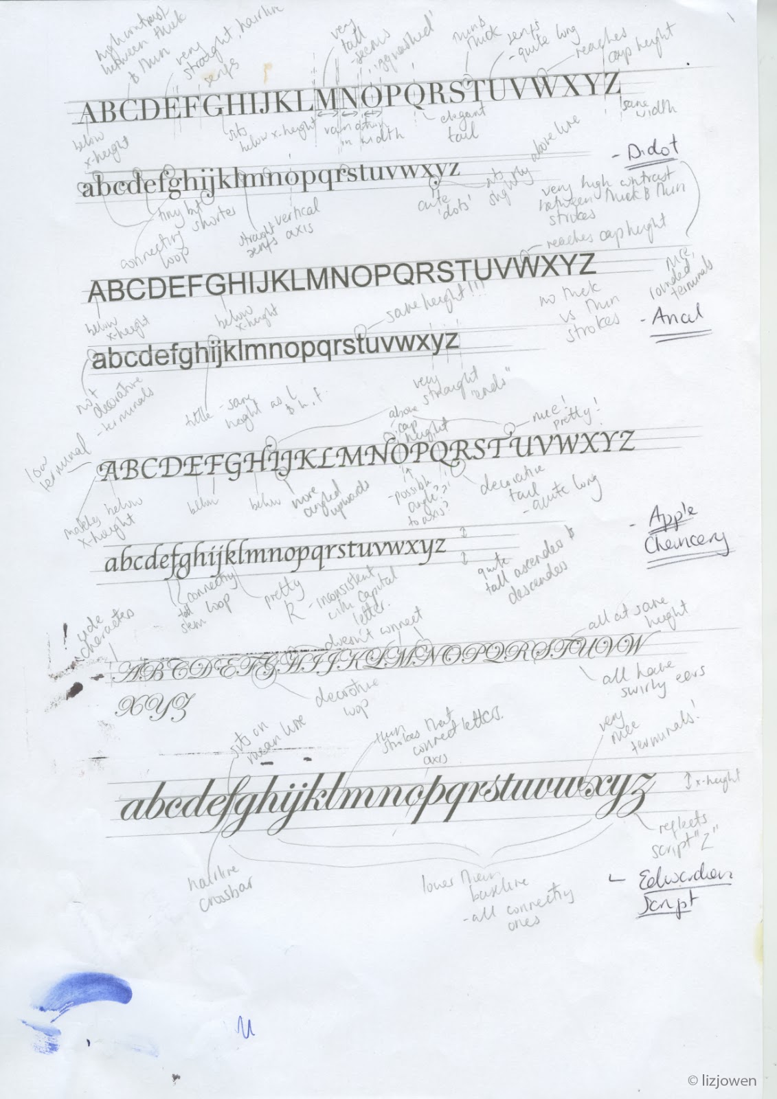
After watching some YouTube videos and looking at Sean Wes’ work I realized that I need to go back to basics with typography and start analysing different type styles, mainly focusing on how each letter sits on the baseline as well as the other lines (mean line and cap height). This will make it easier for me to draw letterforms accurately even though I want that ‘personal’ appearance to show that it has been hand drawn.  This means that I wouldn’t stress over tiny details and shall allow for mistakes to show.

I printed out three styles: serif, sans serif and brush script. I want to be able to work with all of these types because I’m not too sure what kind of styles I’m headed for right now. I then drew the lines across them and made a lot of annotations to make it easier for me to remember their characteristics. 

I started to run out of ink! Whoops!

APP Words: Hand Lettering Experimentation 2

[9] 

During one of my lectures I sketched out some quick letterforms and tried out Blackletter with a variety of pens; I used the biro pen, the pilot pen and brush pen that my lecturer provided. It was nice to play around with different nib sizes to achieve different outcomes and even though it was relatively tricky to get to grips with it was a really fun exercise.

Two of my classmates decided to join me and we produced an A3 sheet of random letters and words with these pens and brushes. We tried Blackletter, Script and Sans Serif to see which styles worked best with these pens. I wasn’t very experienced with Blackletter so my tries weren’t perfect but there’s a first time for everything!


I moved onto doing the two-pencil trick where I cello taped two pencils together and wrote normally, then shaded in the letters with biro pen. This created a really interesting effect and I would like to use this in my initial designs. This is because it has that really ‘fun’ as well as a slightly calligraphic appearance because of the contrasting thick and thin strokes. 


APP Words: Motivational Quotes

[4]

The motivational or inspirational quote will be one of the key aspects in the design, and even though I've decided that I'll do several snippets of this I want to figure out what makes a quote motivational. This involved me looking through websites and highlighting the quotes I find really inspirational whether they had to do with sport or just everyday life.

This will help me to figure out what quotes to include in my piece and stop them from being 'boring' and sound the same. I shall be collecting typographic posters that feature motivational quotes at the same time and will analyse some of the most inspirational ones. 

Collection of Quotes

"You are never too old to set another goal or dream a new dream." C.S. Lewis
"Our greatest weakness lies in giving up. The most certain way to succeed is always to try just one more time." Thomas A. Edison
"Even if you fall on your face, you're still moving forward." Victor Kiam
"If you can dream it, you can do it." Walt Disney
"Never, never, never give up." Winston Churchill
"Work hard in silence, let success be your noise." Frank Ocean
"If your dreams don't scare you, they are not big enough." Ellen Johnson Sirleaf
"You can't wait for inspiration. You have to go after it with a club." Jack London
"Never give in and never give up." Hubert H. Humphrey 
"All our dreams can come true - if we have the courage to pursue them." Walt Disney
"The journey of a thousand miles begins with one step." Lao Tzu
"It always seems impossible until it's done." Nelson Mandela
"Believe you can and you're halfway there." Theodore Roosevelt
"If opportunity doesn't knock, build a door." Milton Berle
"All that is gold does not glitter, not all those who wander are lost. The old that is strong does not wither, deep roots are not reached by the frost. From the ashes a fire shall be woken, a light from the shadows shall spring. Renewed shall be the blade that was broken, the crownless again shall be the King." John Ronald Reuel Tolkien

(Sources: Brainy QuoteMain Quotes; Brainy Quote [Inspirational])

What makes these quotes inspirational/motivational? From what I can see from this collection, they all have a similar goal; to tell the person they're talking to never to give up and make opportunities. If I was to write my own quote I would try and aim for a similar thing like I did in my previous sketches e.g. "you can do it" and "everything will be okay".

Typographic Posters

I placed all those pieces featuring quotes in the same typography folder so that everything is kept in one place. To see more of the posters I've collected, please click here.

I'm actually going to just use one post for my analysis of typographic posters, so to see my analysis please click here.


Conclusion:
I shall be picking out several of these chosen quotes to use on my design, as I'm hoping to use at least one of them and then create several little snippets of my own. This is because I wouldn't want to overwhelm my design by lots of famous quotes.

[n] Learning Outcome