Showing posts with label graphic design. Show all posts

Wednesday, 22 January 2014

Never Give In & Never Give Up

The Brief 
The aim is to design the outer design of a travel mug using inspirational words integrating illustration where possible. We often look upon inspirational quotes to boost our motivation to get us through the week long of reports or essays we have in our workplace and yet they can even go to the lengths of providing us with the courage to pursue our life long dreams.

Background Information
I decided to go along with the idea of hand-lettering, as it was something that I haven't yet been able to experiment with in my previous projects. This grew out of my fascination with the works of Steve Simpson and Linzie Hunter, who were both key inspirations for this project.

The Design
Done in both Adobe Illustrator and Photoshop. I produced a tea-leaves pattern for the background to create a connection between the design and Twinings, a British-based tea company, and emphasised this through the use of a teapot and cup in the illustration. My colour palette choice is linked to soothing emotions with the red to give a vibrant appearance as well as that energy boost.


Important Notice:
Please note that Twinings did not in any way commission me to produce this piece, this is completely for university purposes only as I had to pick my ideal client to base this project on.


Digital Design


Thanks for viewing! Please visit my other accounts:

Thursday, 19 December 2013

Unveiling Wonderland

For our APPs (Advanced Professional Practice) we had the choice of whether to create our own design brief or follow one of the competition briefs listed by our lecturers. The Serco Prize hosted by both the Association of Illustrators and Serco really caught my eye; it involved portraying a London story or stories in a single narrative.
 
I delved into London folklore as I had a keen interest in fantasy and fairy tales. I wanted to create an amalgamation of both well-known and lesser known narratives, and the ones that really stood out to me were Sherlock Holmes, Dick Whittingham, William I and Sons, Spring-heeled Jack and Witch Well. 
 
Even though I was unable to fully complete my illustration in time for the Serco Prize deadline, I continued with it and produced a poster design to submit as my university project. I initially had produced a different A3 version which you can see here, but after following the feedback from my lecturers and classmates who had all agreed that they preferred the Double Royal poster version. I thus adapted my A3 poster design to reflect this one so that it would mirror the Serco Prize's existing poster designs. 

Illustration


Poster Design

Friday, 6 December 2013

APP Home (AOI): Unveiling Wonderland

Update: To see my updated version, please click here

As I've mentioned in my previous post, I am going to produce two designs for submission; one as an A3 poster, and another as a mockup of what the Double Royal would look like. I'll also submit my illustration as a standalone.

This illustration was... Challenging. I haven't really ventured into digital painting that much so there were some parts where I struggled but I'm very pleased with the results nevertheless. It's really nice to see that it is possible to mix traditional and digital media without looking too 'artificial'.

A3 Poster Version


Friday, 19 July 2013

Personal Project: Pirate Birthday Invitation Design

I can't believe it; I've finished, I've actually finished it!

Brief: To design an invitation to celebrate a five year old boy's birthday, who wants to host a pirate-themed party.


You can see my process on my previous post here. Be warned, it is very detailed as I wrote it as I was researching and designing this.

Friday, 14 June 2013

Live Brief: Basement Jaxx Single Cover

This is my submission for a live competition hosted by both Basement Jaxx and JDO which was to create a single cover for one of their songs. We had to first choose and theme and then a song, and I chose “Everything Is Connected” and “We R Not Alone”.

 This project really made me think outside of the box and cross boundaries because I allowed myself to think weird ideas. Like here I thought: what if the Earth wasn’t orbiting the sun on its own, but had a UFO to carry it around? And this was the result!


Wednesday, 15 May 2013

Fairy Tale Wedding Stationary

My FMP (Final Major Project) was to design an invitation for a fairy tale wedding and, if I had the time, some other parts of wedding stationary. I wanted to create something that links in with traditional media, taking inspiration from Illuminated Manuscripts and the work of Jan Pienkowski.


Wednesday, 3 April 2013

Woop woop! Business Cards Arrived

Yay my business cards arrived in the post! I ordered them from moo.com and I tell you, they have got a really good thing going on there.


What's amazing is that they'll allow you to upload your own design - which is what I did here - and it's printed on really good quality paper as well! The price is brilliant and they arrived around 3 days after I ordered it which was incredibly quick. 

Monday, 25 March 2013

The Other Faces

Final Illustration
Mock up (how it would look when printed)

"We have many faces beneath the surface; anger, happiness, surprise, mourning… and each of these make us who we are. "

This is my editorial illustration for my uni project based around the subject the "Psychology of Faces" to be displayed in a magazine similar to New Scientist. I used the line technique where I didn't lift my hand/pen from the page so that all of the faces are connected by a single line to show that our emotions are, in the end, all connected.

The Original Illustration

Sunday, 10 March 2013

Featured Design: Simply Himelyn

Hello readers!
Remember a couple of posts back where I showed you the business card and logo design I had done for Chaudie? Well, I am pleased to announce that her blog has now finished it's construction and she has used my logo in her blog header.


To visit her blog please click here. I expect great things from her!

Tuesday, 5 March 2013

Red String of Fate

This is for my uni project that is linked to the Design Factory competition. Here I have designed a Valentines Day card as I thought that the ones we sell are too cliché and that we don't look into the deeper meaning of love. I have based my design around the East Asian belief of the Red String of Fate, where we are tied to our soulmate by an unbreakable bond.


Thursday, 21 February 2013

Simply Himelyn


I was contacted by one of my friends to design a logo and a business card for her, reflecting the rococo style as well as her personal style. As it was my first time working with a client outside of uni - like my music clients - I immediately took up the notion. Over a couple of days I had managed to compile a logo design as well as a business card.

Saturday, 16 February 2013

Tsunami Tides In My Eyes

Lyrics from Ed Sheeran - U.N.I

Ed Sheeran has the most beautiful voice I've ever heard; his lyrics are just so amazing and I always get a bit emotional when I listen to his songs.
I came up with the idea of creating a typographic poster featuring my favourite line from his song "U.N.I" because they explain what I'm currently going through. I wanted to do something that mixes type and illustration so voila! I painted a wave with watercolour and combined that with type.


Tuesday, 22 January 2013

Stationary Set

Okay so this isn't really related to my live music project, but today I've been creating loads of "mock-ups" as I can hardly find any free for use on the internet. I did find one for my business card though from deviantART.


Check out my stuff on Behance! :D 


Thursday, 20 December 2012

Metallic Grunge Type


Did some experimenting in Photoshop today with different layers styles by following this tutorial. I don't want to look at just how many screenshots I took of each step...

To see my screenshots of my step-by-step process please click here.

Typeface | Rothenburg Decorative
Brushes | Subtle Grunge Brushes 

Monday, 17 December 2012

iPhone Apps

So in my first year of uni one of my projects was to create an App of seven measuring devices: thermometer, pedometer, barometer, anemometer, speedometer, altimeter and decibel. In all honesty this project gave me much grief because I had lost all of my work as I was halfway through the project, so not only did I have to start my designs all over again I also had lost all of my previous projects. Taught me never to solely rely on memory sticks ever again...

Et voila! Here are les designs (or dessines en francais, but I can't really remember whether it is that or not...) for my app of which I dubbed "MD Apps" for Measurement Devices Apps. It was one of the rare occasions where I had only used illustrator to produce my designs but I still feel that I need to practise on it a bit more.

I quite liked my apps because of the consistency in the designs which meant that you could tell they all belonged to the same group. Woop woop!

Thursday, 13 December 2012

Unusual Words - Final Designs

I managed to finish my project two days before the deadline, woop woop!
I actually did a lot better in this project than I had done before. I guess that's because I had only researched on what was relevant instead of rambling off on one topic or another that wouldn't help me at all through my sketching and designing stage. Hmm.

Anyway here are my final designs, and I've also included a photo of when they were all printed out and pretty. I'm just so happy with them! Especially Avicide... Really tapped into my creepy side with that (not that I have a creepy side though!)


Printed out:

Tuesday, 11 December 2012

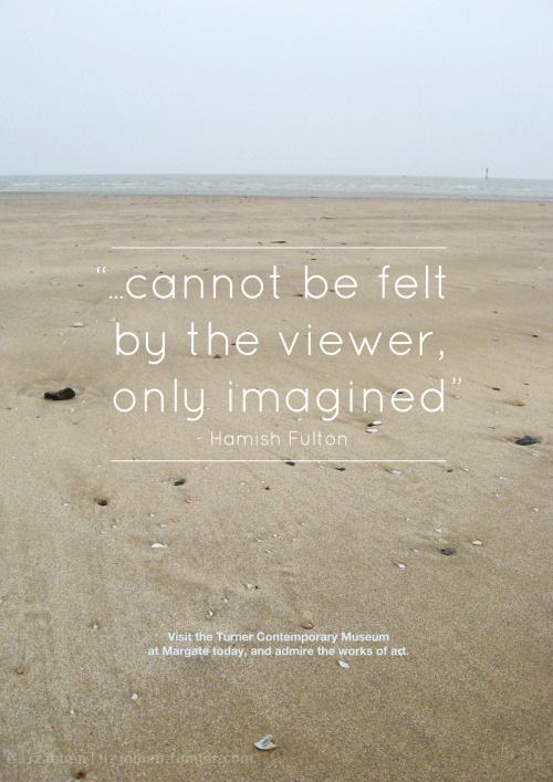
Margate Poster

Hello all!

I'm back again, and this time with a fairly old piece that I did in my first year at uni. Just thought I'd update this blog with all of my old posts from tumblr because I've decided to blog a lot more, so the next few posts would consist of my old work.


The Brief:
"Create a poster that is a (mainly) typographic response to your visit to the Turner Contemporary and Margate in general. This poster could be commissioned/used by the local tourist board to promote art in Margate in general and at the Turner contemporary in general. Please present this at A3 portrait format."


Find me at Tumblr | Facebook | DeviantART

Monday, 12 November 2012

Stationary Set

Just did a little bit of designing for business cards, compliment slips and letterheads. Hopefully I could mass print these and start giving them out!


Friday, 9 November 2012

Pet Peeves


This was the first time I had the choice to create my own design brief that mainly focuses on typography. I first thought that I’d use some lyrics but display them in an illustrative way, but then I decided to do something a bit more personal so that I could engage more with my viewers. 
So I listed all of the things that annoyed me and picked out ones that would specifically fit well with each others. I chose Helvetica Neue as my main typeface because of how minimalist the design was, as well as Impact and Pacifico. 
It was quite hard for me to choose the colours (as I initially was going to go for grey and white) so I went onto kuler.com and chose this colour scheme because it was bold and I was never thought that I would use this colour combination. It was quite exciting! 
I was inspired by vintage Carnival posters and the way they laid out their type. 
Please note that this brief was not a real project and was done for a uni project.