Showing posts with label illustration. Show all posts

Friday, 6 December 2013

APP Home (AOI): Unveiling Wonderland

Update: To see my updated version, please click here

As I've mentioned in my previous post, I am going to produce two designs for submission; one as an A3 poster, and another as a mockup of what the Double Royal would look like. I'll also submit my illustration as a standalone.

This illustration was... Challenging. I haven't really ventured into digital painting that much so there were some parts where I struggled but I'm very pleased with the results nevertheless. It's really nice to see that it is possible to mix traditional and digital media without looking too 'artificial'.

A3 Poster Version


Tuesday, 17 September 2013

Little Dove


I don't understand why people don't like Sansa Stark.
If you think about it, she's in a terrible situation; most of her family is dead - and at the hands of the people she's surrounded by - and she's being tortured mentally and physically on a daily basis. Yes she might be a little naive and she was a bit stupid during the first season but she was only a little girl. She still is a little girl, really.

Tools Used
Watercolour pencil and paint to produce this. I wanted to initially use the no-line technique but couldn't help myself but reach for the ballpoint pen.

Artist © LizJOwen
Character © George R.R. Martin

Step by Step


1. The sketch on "normal" paper. 


2. Transferring of the sketch onto watercolour paper using the window as a backlight. Should really get my hands on a light box...


3. "Painting" the face using watercolour pencils. 


4. Painting the doves with watercolour paint, making a lot of mess in the process. 


That's all for now!
Lizzie.


Thursday, 4 July 2013

Under the Blossom Tree II

Been up since 5.30am thinking about this piece when I thought, "What the heck, I might as well finish it!"

Et voila, here is the final piece.


This was more of an exercise to see how much I've improved in terms of drawing and painting, as I decided to redo an old favourite of mine which you can see on my deviantART page here.

Here's both versions placed side by side so that we could see the improvement:


It's crazy how much my style has changed! I've moved away even more from the anime/manga style (in 2010 I was beginning to move away from it) and I have improved in my anatomy. I think my choice of colours for the skin is more realistic as well.

Here's a WIP:


Guess that's all for today! Thanks for reading.

Friday, 14 June 2013

Live Brief: Basement Jaxx Single Cover

This is my submission for a live competition hosted by both Basement Jaxx and JDO which was to create a single cover for one of their songs. We had to first choose and theme and then a song, and I chose “Everything Is Connected” and “We R Not Alone”.

 This project really made me think outside of the box and cross boundaries because I allowed myself to think weird ideas. Like here I thought: what if the Earth wasn’t orbiting the sun on its own, but had a UFO to carry it around? And this was the result!


Monday, 25 March 2013

The Other Faces

Final Illustration
Mock up (how it would look when printed)

"We have many faces beneath the surface; anger, happiness, surprise, mourning… and each of these make us who we are. "

This is my editorial illustration for my uni project based around the subject the "Psychology of Faces" to be displayed in a magazine similar to New Scientist. I used the line technique where I didn't lift my hand/pen from the page so that all of the faces are connected by a single line to show that our emotions are, in the end, all connected.

The Original Illustration

Tuesday, 19 March 2013

Portraits: Idea 1


This illustration was inspired by Joe Ciardiello's line work, although I used the technique where I didn't take the pen off the page (I had previously experimented with this in my initial sketches). I did this because I wanted to connect all of the faces together and show that they are the many expressions of one person; sadness, anger, surprise and happiness.

Saturday, 16 February 2013

Tsunami Tides In My Eyes

Lyrics from Ed Sheeran - U.N.I

Ed Sheeran has the most beautiful voice I've ever heard; his lyrics are just so amazing and I always get a bit emotional when I listen to his songs.
I came up with the idea of creating a typographic poster featuring my favourite line from his song "U.N.I" because they explain what I'm currently going through. I wanted to do something that mixes type and illustration so voila! I painted a wave with watercolour and combined that with type.


Friday, 15 February 2013

Love Letter

(This would've been a lot more suitable if I had done this yesterday, on Valentines Day. Just shows how annoying my brain is).

Yay I finally got something new to show you all! :D


Just done this about half an hour ago and I feel so good because it felt like I hadn't done any art in ages. I just wish I had this idea yesterday because it would be perfect for Valentines Day... Oh well, I guess this is a late "Happy Valentines Day" to my wonderful followers!

Tools | Biro, yet again. Eurgh I love using it so much <3 Oh and felt tip for the heart. 

Wednesday, 16 January 2013

Deep Roots (2)


To see the original version alongside my annotations, please click here.

So I have made some adjustments to the design... The reason being was that I had shown Angela Rizza, who was my inspiration to for this piece, and she actually replied to my message! This is what she said:

"Hey, looking really good! The texture you created is great and there’s a beautiful uniqueness about each branch, so they don’t look repetitive. If you want to help make things stand out a bit, I’d add some thicker lines, made with a brush. Just a few, such as one going down the side of the tree, two or three on the lower side of branches, and a few outlining the roots. This will help create a simple illusion of light and add a bit of contrast to the piece. If you want I can show you an example in photoshop of what I’m talking about. Looking good!"

She then pointed out the areas where I could add thickness, and with a thin brush I thickened the lines in watercolour! I usually do this with biro so it was a bit of an experiment to me. 
I'm glad I did thicken these lines because it really does bring depth to the piece, and it doesn't look so flat anymore. I think that I might continue to use this method in future :D

Sunday, 13 January 2013

Deep Roots


This took me three days to do, I tell ya'. THREE DAYS.

Okay that was mainly because I was ill so I didn't have much time, but when I did boy did I feel like I was pouring my soul into it. Detail was the key here, and I wanted to create texture by doing lots of intricate lines and circles to give it a bit of oomph.

Not too sure if I'm actually going to use this but it was nice to experiment anyway! Trying out different methods and compositions for the album cover. 

I was inspired by this illustrator called Angela Rizza who has some amazing, jaw-dropping work. You can find her on tumblr here.

The reason why I'm going back to sketching ideas is because I realised that I needed to come up with a design that would somehow relate to the album title. I chose a tree because Jonny Pain had mentioned wanting to have a forest illustration.
I also chose it because a tree is known to be strong, tall, and they could last many lifetimes. Their roots sink deep into the ground so it's hard to cut them down, and they are the symbol of nature. I'm going to continue with going with their forest idea until they have given me their lyrics... I would also need to re-evaluate what typeface I use as I would like that to link in with the title name as well. 

Tools Used | Biro

Friday, 11 January 2013

"Where Oceans Bleed Into The Sky"


"...Far from the world of you and I,

Where oceans bleed into the sky..." - Linkin Park, Catalyst


While I was doing some uni work I played my Linkin Park CD as it had been ages since I had listened to them. In the middle of doing some research I heard the song "Catalyst" and immediately thought up of waves reaching up and leaking into the sun. So I moved everything out of the way and got painting!

The painting was a bit messy as I used a lot of water to get the paint to drip down the page. Didn't really expect some of it to actually go around the sun but it looks pretty cool.


Although this painting doesn't necessarily link in with the album cover's name, I wanted to experiment with watercolour on how to achieve abstract imagery. I could possibly use this technique in my final design if I choose to, because now I know how it "works". The watercolour bleed reminds me of the cracks in shattered glass or veins for some reason.
If I go down the "tree" route, then I could possibly use this technique to paint thin tendrils for the branches. 

Friday, 21 December 2012

The Dance


Drew this when I was just about to go to sleep. It’s a wonder what happens to you when that happens. One minute I was curled up in bed and the next I was sketching away. Even though I do like the sudden spark of inspiration it’s a bit of a pain having to drew whilst half asleep.
This is dedicated to my mum and dad who were both born in the year of the rabbit. Planning on giving this to my mum - my dad passed away 3 months ago - to show her that even though he’s gone he’s still watching over her. 

Sunday, 16 December 2012

Avicide Illustration

In my last couple of posts I showed you the final design for both of my unsual words, but I thought I'd create a post displaying the illustrations themselves.

First up is my illustration for Avicide, my favourite out of the two.


Avicide means "the killing of a bird or birds" or "the slaughter of birds, bird-shooting". Pretty gruesome huh?

Tools | Biro | Photoshop to paint blood and do the blur

Friday, 14 December 2012

Let It Snow


When I saw the contest on DeviantART called “Let It Snow” I immediately wanted to submit something to it. It had been ages since I signed up for any competition, and because England right now is downright miserable it’ll be easy to come up with some snowy.

But I didn’t want that; I didn’t want to do a drawing of a snowman or any of those other stereotypical Christmas things, I wanted to do something personal.  Christmas to me means being with my family and just spending time together without worrying about those things you have to do for work or uni.

Spending time with every member of the family, even those we have lost.


Even though it’s been three months I still miss my dad. It’s getting easier to cope but it’s still difficult. I still get those moments where I just want to curl up in bed and cry without anyone asking what was wrong – because it was so obvious, wasn’t it?

So this is probably what I would do as soon as I go home for Xmas; give my dad some flowers, tell him that I miss him, and to have a very Merry Xmas.

I wanted to do a really simple illustration as I have lately been very inspired by Simon's Cat. I think I might want to go to doing illustrations for Children's books as a career but shall have to do more experimentation and research before I dedicate myself to that.  

Tools | Watercolour pencils (without water, so sticking to their pencil form) | Watercolour paint

Thursday, 13 December 2012

Unusual Words - Final Designs

I managed to finish my project two days before the deadline, woop woop!
I actually did a lot better in this project than I had done before. I guess that's because I had only researched on what was relevant instead of rambling off on one topic or another that wouldn't help me at all through my sketching and designing stage. Hmm.

Anyway here are my final designs, and I've also included a photo of when they were all printed out and pretty. I'm just so happy with them! Especially Avicide... Really tapped into my creepy side with that (not that I have a creepy side though!)


Printed out:

Wednesday, 12 December 2012

Made myself a new signature, woop woop!

I'm still not quite sure whether or not to use this or my tumblr as my main blog, so I decided to create a brand spanking new brush so that I wouldn't have to worry about continuously updating my URL to match the website/blog I frequently use!

I swear it took ages for me to do it... I don't know why but when placed under pressure I can't seem to write properly. Managed to create one in the end with my own handwriting.

Isn't it so beautiful?

Updated this illustration after a very long time! I wasn’t really satisfied when I finished it all of those months ago and my mum kept commenting on how she “had too much hair on that tiny head” so today I finally caved in and erased a whole chunk of it. I have to say that she does look a lot better now and not as if thousands of wigs had been placed on a skull!

Can't you see my new sig there? ;D
Guess that's all for today! I was going to create a post on how I made an epic blog design but I kind of gave up the idea of hassling around with codes to "improve" the look of this blog. I kind of like it how it is right now anyway.

And now I’m off for a nice bubble bath because it’s absolutely freezing today o_o Until next time!

Wednesday, 5 December 2012

Falling Feathers

Just some illustrations I have done this past week for my uni project.


I went and bought some feathers the other day from Hobbycraft because I think I might settle with the idea of having some falling feathers stained in "blood" for my Avicide piece. I have just decided which one to post but I thought that I might as well post them all here.

1 & 2. Used watercolour for the background, white feathers, and also some watercolour for the blood. 
3. Used biro and then scanned it into Photoshop to do some blood splatters and make some of the feathers blurry. 

Tuesday, 20 November 2012

Fragile


This piece is about the frail nature of life. It's linked to my last painting which you can see here.

I just find it so relaxing when I paint; listening to songs really do help, and I'm able to channel my emotions through the colours I use and the painting itself. It relieves me the stress of bottling everything up only to break down in the most awkward places. 

Very much an experiment as I haven't been "messy" with watercolour in such a lon time... Shall be posting a wip very soon, so keep an eye out for that!

Tools | Watercolour pencils | Watercolour Paint | Biro for the lines

Saturday, 17 November 2012

Depression - Final and details


Click to see bigger

Just a little something I did when I was going through a hard time (I was feeling crap about not being able to have the motivation to design and that I was a bad person blah blah blah). Because I have left it for so long I kind of forgotten how it felt to be so emotional... Until now, that is. 

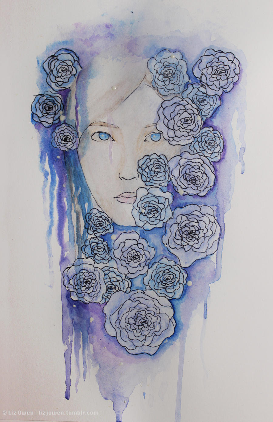
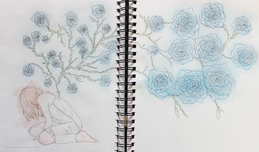
I'm still finding it hard to get out of this mess that I'm in since he was gone, but my current uni project has revealed to me that art is a way for me to channel my emotions. For example, I'm obsessed with drawing thin lines with messy watercolour techniques (like the one shown in the picture above), roses, and stuff like decay and birds... It's frightening, actually. But I guess that at least I'm not bottling everything up.

I hope to do another picture like this soon because it truly was an experiment that turned out to have a lot more emotion in it than it should've done.


Thursday, 15 November 2012

Happy Halloween!


Okay so I was supposed to post this on Halloween, whoops. 

Tools | Watercolour pencils | Watercolour paint for the clouds and moon | Biro for the lines