Editing the Illustration
I scanned it in and brought the illustration up on Photoshop so that I could edit the areas where the biro had thickened and smudged.
By creating a new layer - "Fixes" - I took the brush tool in a round, hard brush, and selected a white colour. I then covered up the troubled areas.
Front Album Cover - InDesign
Now that the illustration has been edited, I open up InDesign and chose the dimensions of my album cover - 120mm x 120mm. By creating two pages stuck together this will act as the front of my cover, and also the back of the insert. I Placed my illustration onto Indesign and moved it to where I wanted it to be. Once done I Placed the shattered glass type for the title (of which I had done in Illustrator).
My initial thought was to have the back of the insert darker than the front by placing a slightly transparent black box over it, so that's what I did with the Rectangle tool.
I had to change the type to a much smaller size when I realised just how large it appeared when printing, so I reduced it to 10pt. I kept "Jonny Pain" relatively large though.
Back Cover and Spines
After I experimented with the front cover I decided to concentrate on the back, as I haven't been able to come up with a decision on what to do with it yet, although I had a few sketches to work on which was good. I kept sketching at the same time as the designing when my ideas developed.
I create a new document on InDesign with the dimensions of 150mm x 117mm. Using the rectangle tool I created the spines and placed them either side.
After that I Placed the illustration onto it, sending it right to the back and positioning it so that it would be aligned with the front cover. I lowered the opacity of the spines. After looking back at my notes about the layout of the type I set out my type in the way it would be shown when published.
Once I finished tinkering with the type - adjusting the pt size, changing the colour - I resumed the spine's opacity.
Now that the type was done I looked up at some CD covers, most particularly the spines. I realised that all had a publishing logo - Roadrunners being the most popular - so I searched up and used their logo, placing it where it should normally rest. I even added a couple of random numbers so it looks like "the real thing".
Got the logo from here: http://thankgodforworkerbees.blogspot.co.uk/2012/05/is-obama-too-cool-for-office-new-yorker.html
Now I am just tinkering with type layout; switching back and forth with whether or not I should use the illustration in the background. I wanted to have as many ideas as possible so that I don't change my mind at the last minute.
I first started off with a very simple layout, but then I experimented with different type arrangement. I then deleted the background and to see what it looks like with just the type, and then decided to try out using my glass shatter effect on the type.
The last shows two ideas combined; the illustration and the minimalist idea, with the illustration faded slightly.
Feedback
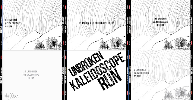
I've gathered some feedback and from this I made my decision to either use the back cover with the faded illustration or the minimalist. Here is a collection of all of the likely designs that I am going to use:
Conclusion:
I have decided to go along with the middle design where the illustration has spread all over the design. My reasons for this are that although the black makes the image have a clean finish, it is a bit too "dark" for it. The black border would have to be spread onto the other design, and therefore taking away some attention from the illustration.
I would also revert the back illustration back to it's usual opacity to suit the illustration on the front. The shattered type is effective but the gaps would need to be a little larger so it's more visible.


I have been browsing online more than 2 hours today, yet I never found any
ReplyDeleteinteresting article like yours. It is pretty worth enough for me.
Personally, if all website owners and bloggers made good content as you did,
the internet will be much more useful than ever before.
Also visit my site: Wildpartygirls.Org
Hi,Different industries, topics, content, purpose, users and competition. Every Web Design Cochin site is different and often requires very different SEO strategies.Thanks....
ReplyDelete