Monday, 13 May 2013

FMP: Gathering Feedback

Today I sat down with my lecturers and classmates to have a crit meeting on where we were so far in our projects, so I was able to present the designs that I had to see if I could get any feedback from them. I am pleased to say that the crit went extremely well and that most liked my designs – especially my typeface choices – and there wasn’t really anything that I needed to desperately change about it.

I showed them two versions: one set of designs I had printed off at Staples, and the other from uni. All had agreed that the Staples designs were a lot more pristine and the black really stood out from the page, and this only confirmed my thoughts so I decided to stick with those.

They mentioned I should try out is to cut down the white border around the invitations or get rid of it altogether, so I printed out several versions and cut them down to different sizes.

I first cut the border so that it was 5mm away from the illustration, and then another where it was 8mm away, and then another without the border at all. I then cut down some black card that I was hoping would be inserted between the back and front design to see how it would look as a final piece.
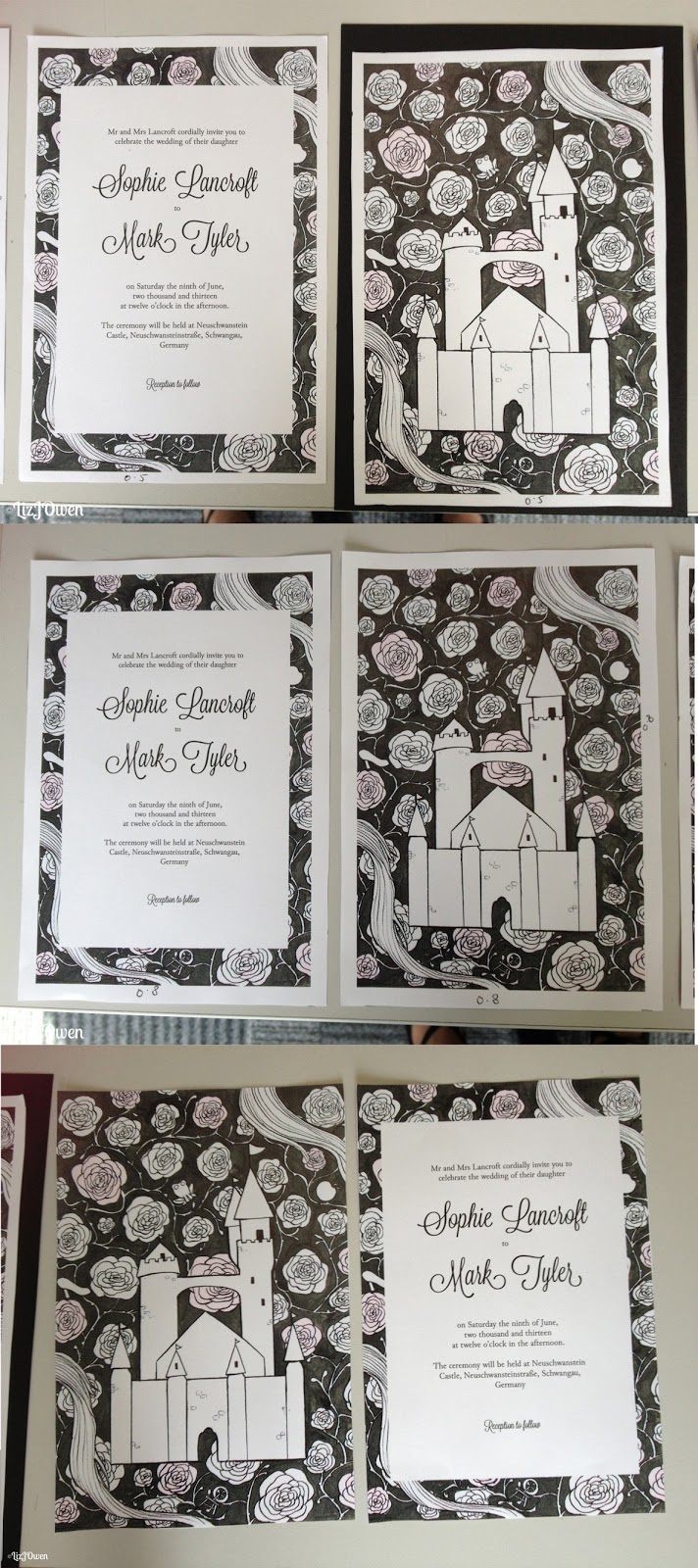
(please zoom to see more detail!)

The thin border (5mm) looked quite good without the card but as soon as I placed it in front of it, it looked as if I was mounting my design onto a portfolio rather than creating an invitation. This was the same for all of my other designs that had borders, and the one without any borders at all just looked a bit out of place.


I then put my original design in front of the black card and it looked perfectly fine; although the black card didn’t create a border, it was a subtle feature as when I turned it to the side you could see the black card sandwiched between the front and back.


Conclusion:
After taking notes on the feedback I gathered I was able to do some experimentation, and this allowed me to try something that I never thought of before. Even though I am going back to my original design it was nice to try out the idea of thinning out the borders. 

Sunday, 12 May 2013

FMP: Thank You Card Sketches & Design

The Final Design


The Process
The first step I took was to get some sketches down on paper, and this didn't take long because I already had my ideas in mind that was inspired by all of the other parts of the stationary. I wasn't going to design something completely new so I could get away with having the same format as the other designs.


FMP: Budgeting & Materials

Even though I have mentioned that I am going to design a few more cards, I have decided to print off those that are completed just in case I run out of time. After all my brief was just to create the wedding invitation, so whatever else is just a bonus.
I first printed off using the printers at uni, having to pay just for the paper which was 0.60p per sheet of matte paper. The print outs came out perfectly, but I wanted to print out at Staples to see what their quality was like and if it was better.

Printing for uni
I rang Staples first to see what price range their paper was before I went into the shop, as I wasn't sure whether or not they printed out on matte paper.
Unfortunately they don't print out on envelopes so I would have to figure out a way to get a design onto an envelope elsewhere.

Matte paper (90 gsm & 100 gsm) - A4

Colour - 56p
B&W - 15p

There is an additional charge of £3 to open up the files so I'll be paying at least £3.71 for just two pieces of paper. Now I find this to be ridiculously expensive, so I wondered whether or not it'll be easier if I printed off more than two pieces and do, say, 10.

If I do ten colour prints on A4 then it'll be £5.60 + £3 = 8.60. This is still expensive but doesn't sound as expensive as it would do for just printing out two sheets of A4 paper.

100gsm would be too thin for my designs, so instead I looked at 160gsm which came to 60p per sheet. So 7x0.60 = £4.20 to print out two invitations (one double sided and another with separate sides), the Save the Date, the RSVP, and the Place Card. Then it was an additional £3 so £4.20 + £3 = £7.20

Tuesday, 7 May 2013

FMP: Screenshots - Changes to the Designs

After gathering some feedback I made some changes to all of my designs - the invitation, Save the Date, RSVP and Place Card - because there were still some aspects of them that needed tinkering. Luckily I still had more than enough time to do this!

Place Card
I only made a small change to the place card which was to change the name to my own. The reason for this is because when people walk past to look at my work, my name would be printed on that place card and it would be this design that people talk about e.g. "the wedding invitation with Elizabeth Owen on it..."
I normally wouldn't display my full name but because it's quite long it would show that names would be able to fit on one line.


FMP: Thank You Card Research

The Thank You card is one of those that I would like to try and design - if I have enough time - as it is one of those that would fit more with the stationary set that I have already designed, that and the Table Plan (because the Place Card looks slightly out of place). I begin my research by doing what I usually do; gathering inspirational designs and creating a mood board.

The Mood Board


Image Sources: http://www.behance.net/gallery/Missoula-Wedding-Announcements/5928711 http://www.behance.net/gallery/Cameron-Wedding/3182282 http://www.behance.net/gallery/CMYK-Themed-Wedding-Invites-and-more/4665299 http://www.coralpheasant.com/blog/wedding-invitations/great-gatsby-inspired-editorial/ http://www.coralpheasant.com/blog/wedding-invitations/april-matts-french-garden-party-wedding-invitations/ http://www.coralpheasant.com/blog/wedding-invitations/megan-and-ben/ http://www.beastpieces.com/2012/02/brooklyn-wedding-invitations/ http://www.luulla.com/product/8638/ http://www.paperchainweddingstationery.co.uk/Collections_florence.htm http://www.dearevie.co.uk/invitations/blackboard.html http://www.dearevie.co.uk/invitations/fern.html http://www.hellolucky.com/wedding/thank-you-cards.html (2) http://www.weddingpaperdivas.com/product/12445/foil_stamping_thank_you_cards_lasting_impression.html http://www.minted.com/product/thank-you-cards/MIN-43Z-TYC/beaucoup-de-fleurs http://www.minted.com/product/thank-you-cards/MIN-0A6-TYC/we-said-i-do http://www.minted.com/product/thank-you-cards/MIN-69Z-TYC/bold-botanicals http://www.minted.com/product/thank-you-cards/MIN-29Z-TYC/flower-sketch http://www.minted.com/product/thank-you-cards/MIN-52Z-TYC/strawberry-thanks http://www.shineweddinginvitations.com/wedding-thank-you-cards/fairytale-thank-you-card http://www.shineweddinginvitations.com/wedding-thank-you-cards/classic-damask-thank-you-cards http://www.notonthehighstreet.com/beautifulday/product/love-birds-design-thank-you-cards http://www.notonthehighstreet.com/eb1weddinginvitations/product/cameron_thank_you_card http://www.weddingchicks.com/2012/10/26/easy-bridal-shower-ideas/


Image Sources: http://ohsobeautifulpaper.com/2013/05/jamie-aarons-modern-romantic-destination-wedding-invitations/ http://ohsobeautifulpaper.com/2013/03/quick-pick-la-happy/ http://ohsobeautifulpaper.com/2013/03/courtney-pauls-brooklyn-wedding-invitations/ http://ohsobeautifulpaper.com/2012/12/helen-steves-country-inspired-kraft-paper-wedding-invitations/ http://ohsobeautifulpaper.com/2012/11/greeting-cards-a-z-thank-you-cards/ http://www.behance.net/gallery/Wedding-Invitations/655646 http://www.behance.net/gallery/Le-Wedding-Invitation/1242107 http://www.behance.net/gallery/Wedding-Set/1582883 


Inspirational Designs
Unlike my RSVP cards I shall pick a few of these designs to analyse, although these might be very brief as (from what I can see already) the Thank You card designs are very minimalist so there won't be much to talk about.


Monday, 6 May 2013

FMP: List of Wedding Stationary

I mentioned in my previous post how I was going to see if I have enough time to do other cards for this stationary set, so I'll first start off by looking to see what is actually included in a wedding stationary set and found this website (Black Mouse Wedding Stationary) that has a list of them along with a little description on each one. I shall copy & paste what they have written below and cross out the stationary I have already done:


"Day Invitation
The most basic requirement is the invitation itself. These can be many formats, but a quality card single folded to A6 is ideal. We have these available in white, ivory, gold, silver and pearl.
Traditionally, the lettering is in black, but a color or a metallic gold is not unusual. The text is usually printed on a paper insert and we have these available cut to fit our cards so that you can write, photocopy or print them from a computer yourself.

The wording of the invitation copy is dependent on your situation. Consider who is doing the inviting (usually the bride's parents), who are the recipients (their full names and titles), the kind of ceremony (church or civil ceremony, formal or informal), when, and where. An RSVP is usually requested and a reply card may be enclosed to facilitate this (see below)
Click here for basic wording examples.

Envelopes for hand made stationery are available in a range of colours, including gold and silver.

Evening Invitation
These are reception only invitations and can either be the same size as the day invitation or sometimes a smaller version. We have a smaller 88 x 114mm card available if required. To an extent the size may be determined by the amount of text you need inside.

Announcements
An announcement card is sent to inform those family and friends who for whatever reason were not invited to the wedding. They are sent after the ceremony. They look very similar to an invitation with different wording inside.

Save The Date
These are sent in advance of the invitations to ensure that the special day is earmarked by guests. Often used when the wedding is taking place abroad or for other reasons where the guests will need to know a long time in advance. They look very similar to an invitation with different wording inside. They can also be a flat printed A6 card. For more details click here

Friday, 3 May 2013

FMP: Place Card Design

The Final Design

The Process
I wanted to create the other parts of the stationary set and decided to design a place card, having gotten an idea whilst doing the RSVP, so it was just a matter of converting it into a Place card.

I started by looking at different dimensions of Place cards before settling with 11x5cm when folded. I opened up InDesign and put in the dimensions of when it'll be flat (so 11x10cm) and put in three margins.
Once that was done I needed to place a rectangle in it as a guide to see where it would fold, so I clicked on the Shape tool, then clicked randomly and a boxed appeared. I typed in 11x5cm. I then put the rectangle at the top and Placed in the illustration and wrote the longest name I could think of so I know what pt size the type has to be.


Thursday, 2 May 2013

FMP: Place Cards - Brief Research

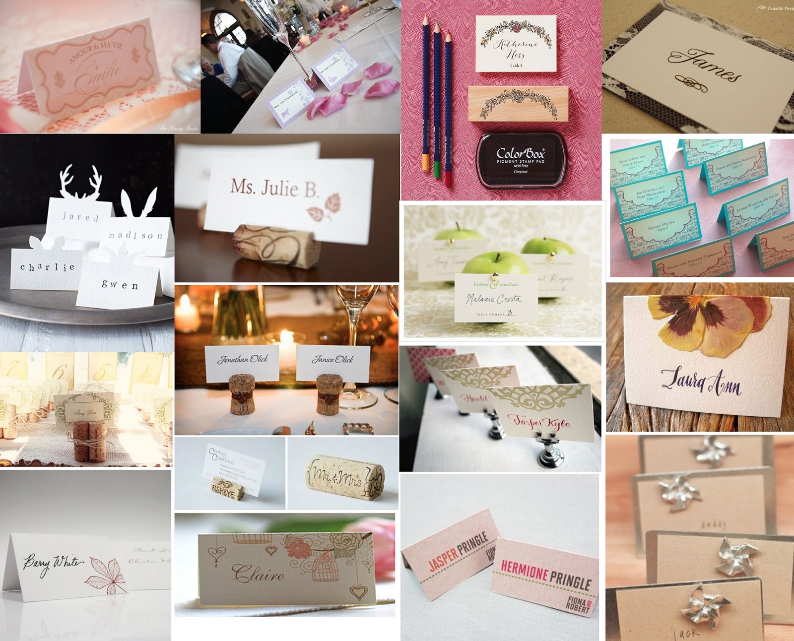
I am going to briefly research into Place Cards (even though I already have ideas inspired by my RSVP ideas) just so that I know what the basic format and dimensions of the Place Card is. The reason why I'm not going to go into great detail is that I am not doing the whole design afresh as it would have obvious links to my invitation suite and so I'm not producing anything new. Besides, the Place Card will probably only display an illustration and then the name on it.

Mood Board


Image sources: http://theknottybride.com/18528 http://blog.paper-source.com/wedding/studio-city-inspiration-wedding-place-cards-menus/ http://blog.paper-source.com/wedding/for-you-diy-wedding-suites-2013/ http://www.zenadiadesign.com/archives/4938 http://thenaturalweddingcompany.co.uk/blog/2013/04/animal-ears-silhouette-place-cards-for-a-woodland-wedding/ http://www.sugarfootmomma.com/2010/11/thanksgiving-table-inspiration.html http://blog.weddingpaperdivas.com/diy-apple-place-card-display/ http://imbueyouido.com/real-palettes/purple-teal-navy-wedding-reception-stationery.php http://nestlovedesigns.blogspot.co.uk/2012/01/our-wedding-day.html http://baerhomedesign.com/more-wine-cork-inspiration/ http://smockpaper.com/blog/2009/06/08/custom-letterpress-place-cards-calligraphy/ http://www.designsgirl.typepad.com http://www.beau-coup.com/wedding/personalized-autumn-leaves-place-cards.htm http://www.notonthehighstreet.com/beautifulday/product/personalised-wedding-place-name-cards http://ohsobeautifulpaper.com/2012/06/day-of-wedding-stationery-mid-century-modern/ http://ohsobeautifulpaper.com/2012/06/wedding-stationery-inspiration-pinwheels/  


Wednesday, 1 May 2013

FMP: RSVP Card Design

The Final Design 


The Process

Laying out the Type
With my Save the Date card out of the way I could now focus on my RSVP design. As I already have an idea in mind I was ready to go straight onto InDesign.
So I create a new document with the dimensions of an A6 card but this time with a landscape orientation. Then I was able to start filling in the type.


Once I did some of the type I drew a thin line using the line tool, holding down shift at the same time so that it would be perfectly straight. I changed the thickness to 0.25pt so that it wouldn't be too thick.
As I had included a line between the two words, I had to adjust them so that they allowed enough space for the line. In the end I shortened the line and made sure that I shortened the others to keep the design consistent.

Inspirational Quote: "You just gotta fight your way through"

Image taken from Tumblr