Sunday, 30 December 2012

Grunge Photo Effect Walkthrough

Because I'm doing a grungey-type cover I scrolled through google in search for suitable tutorials, but this time focusing more on photo manipulation. I found one here, and decided to try it out but making my own adjustments to it.

Photo Stock | mjranum-stock on DeviantART

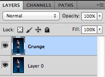
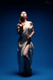
So I first downloaded the stock provided that I thought was suitable for a grunge effect in Photoshop, and duplicated the background layer. This is because I was going to do lots of editing on it so I didn't want to ruin the original image in case I went wrong. I called this duplicate "Grunge".


The Client & Their Needs

General Information


Name: Jonny Pain
Members: Connor Moor - Vocals/Guitar
Tom Fricker - Guitar/Vocals
Rob Qureshi - Bass/Vocals
Larry Turner - Drums

Genre: Post-Hardcore, Rock & Metal
About: "Taking a love of Post-Hardcore, Rock, Metal and all alternative styles, with brutal pig squeals, catchy riffs and epic chorus lines.Born out of an old project taking the songs and adding to them with a fresh perspective, new musicians and new songs." - Taken from their Facebook page, Jonny Pain

Image Source: http://www.facebook.com/pages/Jonny-Pain/175601632525413


Inspirations: Iron Maiden, Deaf Havana, Foo Fighters, Bon Jovi and Metallica.


Friday, 21 December 2012

The Dance


Drew this when I was just about to go to sleep. It’s a wonder what happens to you when that happens. One minute I was curled up in bed and the next I was sketching away. Even though I do like the sudden spark of inspiration it’s a bit of a pain having to drew whilst half asleep.
This is dedicated to my mum and dad who were both born in the year of the rabbit. Planning on giving this to my mum - my dad passed away 3 months ago - to show her that even though he’s gone he’s still watching over her. 

Thursday, 20 December 2012

Metallic Grunge Type


Did some experimenting in Photoshop today with different layers styles by following this tutorial. I don't want to look at just how many screenshots I took of each step...

To see my screenshots of my step-by-step process please click here.

Typeface | Rothenburg Decorative
Brushes | Subtle Grunge Brushes 

LizJOwen - Metallic Grunge Type


I did some experimenting with layer styles in Photoshop today because I wanted to start playing around with different typefaces (as the main focus is on typography after all). I used this tutorial that I found by typing "grunge type tutorials" and I thought it would be really good to use in future.
I took some screenshots because it's a bit of a habit now, and I also want to show you how I did it step-by-step. It wasn't really necessary as you could easily just look at the tutorial... But oh well!

Typeface | Rothenburg Decorative
Brushes | Subtle Grunge Brushes 


I first start by creating a new document at 72dpi and 1800x1300px. I filled in the background layer with black and then created a new layer - Grunge Brushes - and just took a couple of the brushes and dotted them around, varying with different styles to create more texture.


To-Do List

My projects always start with a to-do list of some sort. I don't know why but I just find it so much easier when I have one of these lists because during those projects I didn't... Well, imagine me just rushing around the room waving my arms like a lunatic. Yes, I have panic attacks when I don't know what I'm doing.

I've been doing these lists for as long as I can remember - I do them on a daily basis when I know that there's a pile of things I needed to get done but I had put off because I am procrastinating too busy. I like to be organised and know what kind of "deadline" I was working under.

So this is my to-do list for my Live Music project:

  • Mood boards - business cards, logos, CD covers
  • Design Brief & L. Outcomes - analysis
  • Background info. on band
  • Sketches
  • Screenshots
  • Evaluation
  • Tutorials 
  • Research - type, business cards, music genres, logos, CD covers
I'll just tick these off when I have done them.

(Okay now that I've done this I'm kind of worried that I won't have time... I guess that is a downside to creating a to-do list!)

Live Music Brief & Learning Outcomes Analysis


As usual, I have taken parts of the design brief and the learning outcomes that I find are the most important key points. I would have to abide to every one of these key points in order to come out with a successful project.

Live Music Design Brief


University of Kent at West Kent College
HND  Graphic Design
Year 2, Term 1/2
Project:   Live Music Brief
Module: Graphic Design and Typography 2

Wednesday, 19 December 2012

Une Annonce Importante

(Feeling a bit of the ooh la la vibe of la France.)

In case you don't know French, I have an important announcement to make! From this day I shall be using this blog for my uni work. ("Uni work?" "Ah, oui.") This is because I learnt a very important lesson that working on Word and having to print out everything the day before the deadline is a killer; it takes far too long and I have several panic attacks when I thought I hadn't saved a document etc etc.

This means that I'll be blogging a lot more (yay!) and it won't be of endless sketches and final pieces, but also of my research stage. I normally hate to put out my research to the public because of people just strolling along and copying & pasting my words and using them as my own, so I have included a little notice on the side of my blog saying please do not steal my ideas. It would be great if you could follow this as well! I might make it bold and shiny so that it'll attract your attention or have like a cat gif or something, tehe.

Aherm anyway enough rambling for now - I really shouldn't have drunk that tea - and onto whatever post I'm going to post next! I suppose I might as well start with a to-do list... Hmm.

Until next time,
Lizzie.


Monday, 17 December 2012

iPhone Apps

So in my first year of uni one of my projects was to create an App of seven measuring devices: thermometer, pedometer, barometer, anemometer, speedometer, altimeter and decibel. In all honesty this project gave me much grief because I had lost all of my work as I was halfway through the project, so not only did I have to start my designs all over again I also had lost all of my previous projects. Taught me never to solely rely on memory sticks ever again...

Et voila! Here are les designs (or dessines en francais, but I can't really remember whether it is that or not...) for my app of which I dubbed "MD Apps" for Measurement Devices Apps. It was one of the rare occasions where I had only used illustrator to produce my designs but I still feel that I need to practise on it a bit more.

I quite liked my apps because of the consistency in the designs which meant that you could tell they all belonged to the same group. Woop woop!

Sunday, 16 December 2012

Avicide Illustration

In my last couple of posts I showed you the final design for both of my unsual words, but I thought I'd create a post displaying the illustrations themselves.

First up is my illustration for Avicide, my favourite out of the two.


Avicide means "the killing of a bird or birds" or "the slaughter of birds, bird-shooting". Pretty gruesome huh?

Tools | Biro | Photoshop to paint blood and do the blur

Friday, 14 December 2012

Art Improvement Meme

Yesterday I realised that I shouldn't be ashamed of my old work; why should I be ashamed when it is a record to show my journey in the art world? So I "un-hid" all of my old work on DeviantART and just sat back and started flicking through them.

It's just such an amazing feeling to just look back and think: wow I've definitely improved on anatomy, on facial expressions, on hands (OH GOD THE HANDS... I just love picking out the things that I now am pretty good at whereas before I spent hours pouring over reference images just to draw one little finger. 

Anyway, so I decided to fill out this improvement meme on DeviantART by kamaniki to see how I'm going so far!


Now I'm dying to do more illustrations and things, and try out different techniques :D

Let It Snow


When I saw the contest on DeviantART called “Let It Snow” I immediately wanted to submit something to it. It had been ages since I signed up for any competition, and because England right now is downright miserable it’ll be easy to come up with some snowy.

But I didn’t want that; I didn’t want to do a drawing of a snowman or any of those other stereotypical Christmas things, I wanted to do something personal.  Christmas to me means being with my family and just spending time together without worrying about those things you have to do for work or uni.

Spending time with every member of the family, even those we have lost.


Even though it’s been three months I still miss my dad. It’s getting easier to cope but it’s still difficult. I still get those moments where I just want to curl up in bed and cry without anyone asking what was wrong – because it was so obvious, wasn’t it?

So this is probably what I would do as soon as I go home for Xmas; give my dad some flowers, tell him that I miss him, and to have a very Merry Xmas.

I wanted to do a really simple illustration as I have lately been very inspired by Simon's Cat. I think I might want to go to doing illustrations for Children's books as a career but shall have to do more experimentation and research before I dedicate myself to that.  

Tools | Watercolour pencils (without water, so sticking to their pencil form) | Watercolour paint

Thursday, 13 December 2012

Unusual Words - Final Designs

I managed to finish my project two days before the deadline, woop woop!
I actually did a lot better in this project than I had done before. I guess that's because I had only researched on what was relevant instead of rambling off on one topic or another that wouldn't help me at all through my sketching and designing stage. Hmm.

Anyway here are my final designs, and I've also included a photo of when they were all printed out and pretty. I'm just so happy with them! Especially Avicide... Really tapped into my creepy side with that (not that I have a creepy side though!)


Printed out:

Wednesday, 12 December 2012

Made myself a new signature, woop woop!

I'm still not quite sure whether or not to use this or my tumblr as my main blog, so I decided to create a brand spanking new brush so that I wouldn't have to worry about continuously updating my URL to match the website/blog I frequently use!

I swear it took ages for me to do it... I don't know why but when placed under pressure I can't seem to write properly. Managed to create one in the end with my own handwriting.

Isn't it so beautiful?

Updated this illustration after a very long time! I wasn’t really satisfied when I finished it all of those months ago and my mum kept commenting on how she “had too much hair on that tiny head” so today I finally caved in and erased a whole chunk of it. I have to say that she does look a lot better now and not as if thousands of wigs had been placed on a skull!

Can't you see my new sig there? ;D
Guess that's all for today! I was going to create a post on how I made an epic blog design but I kind of gave up the idea of hassling around with codes to "improve" the look of this blog. I kind of like it how it is right now anyway.

And now I’m off for a nice bubble bath because it’s absolutely freezing today o_o Until next time!

Tuesday, 11 December 2012

Blogger vs Tumblr

I'm a bit caught up in a dilemma  I can't figure out whether or not to make this my main blog, or just leave it with my tumblr.

I post all of my sketchbook work, WIPs and finals on Tumblr and post final things over here, but wouldn't it be easier to do everything on here? It's so confusing!

I guess I'm only thinking of this because my current signature is "lizjowen.tumblr.com" and I don't know whether to change that to "lizjowen.blogspot.com" as I want it to look more professional. WHAT DO. 

Margate Poster

Hello all!

I'm back again, and this time with a fairly old piece that I did in my first year at uni. Just thought I'd update this blog with all of my old posts from tumblr because I've decided to blog a lot more, so the next few posts would consist of my old work.


The Brief:
"Create a poster that is a (mainly) typographic response to your visit to the Turner Contemporary and Margate in general. This poster could be commissioned/used by the local tourist board to promote art in Margate in general and at the Turner contemporary in general. Please present this at A3 portrait format."


Find me at Tumblr | Facebook | DeviantART

Wednesday, 5 December 2012

Falling Feathers

Just some illustrations I have done this past week for my uni project.


I went and bought some feathers the other day from Hobbycraft because I think I might settle with the idea of having some falling feathers stained in "blood" for my Avicide piece. I have just decided which one to post but I thought that I might as well post them all here.

1 & 2. Used watercolour for the background, white feathers, and also some watercolour for the blood. 
3. Used biro and then scanned it into Photoshop to do some blood splatters and make some of the feathers blurry. 

Tuesday, 20 November 2012

Fragile


This piece is about the frail nature of life. It's linked to my last painting which you can see here.

I just find it so relaxing when I paint; listening to songs really do help, and I'm able to channel my emotions through the colours I use and the painting itself. It relieves me the stress of bottling everything up only to break down in the most awkward places. 

Very much an experiment as I haven't been "messy" with watercolour in such a lon time... Shall be posting a wip very soon, so keep an eye out for that!

Tools | Watercolour pencils | Watercolour Paint | Biro for the lines

Saturday, 17 November 2012

Depression - Final and details


Click to see bigger

Just a little something I did when I was going through a hard time (I was feeling crap about not being able to have the motivation to design and that I was a bad person blah blah blah). Because I have left it for so long I kind of forgotten how it felt to be so emotional... Until now, that is. 

I'm still finding it hard to get out of this mess that I'm in since he was gone, but my current uni project has revealed to me that art is a way for me to channel my emotions. For example, I'm obsessed with drawing thin lines with messy watercolour techniques (like the one shown in the picture above), roses, and stuff like decay and birds... It's frightening, actually. But I guess that at least I'm not bottling everything up.

I hope to do another picture like this soon because it truly was an experiment that turned out to have a lot more emotion in it than it should've done.


Thursday, 15 November 2012

Happy Halloween!


Okay so I was supposed to post this on Halloween, whoops. 

Tools | Watercolour pencils | Watercolour paint for the clouds and moon | Biro for the lines 

Monday, 12 November 2012

Typographic Walk Poster - WIP

I had a massive panic attack today when I thought about how I'm lacking in material for my portfolio as I had lost all of my work from last year. So today is the first day that I'm going to go through all of my old projects and re-do them to make them look more professional.

Here's the first of my old projects: The Typographic Walk. I've changed this dramatically from the old version but... I like it, even though it's completely different. In my brief I actually had to use pieces of type from different places (like buildings, bins etc) and create a poster with all of the type, but because I had lost all of those photos I couldn't reuse them. This is the main reason I changed the whole thing; the photos of type were extremely pixelated.


Stationary Set

Just did a little bit of designing for business cards, compliment slips and letterheads. Hopefully I could mass print these and start giving them out!


Friday, 9 November 2012

Pet Peeves


This was the first time I had the choice to create my own design brief that mainly focuses on typography. I first thought that I’d use some lyrics but display them in an illustrative way, but then I decided to do something a bit more personal so that I could engage more with my viewers. 
So I listed all of the things that annoyed me and picked out ones that would specifically fit well with each others. I chose Helvetica Neue as my main typeface because of how minimalist the design was, as well as Impact and Pacifico. 
It was quite hard for me to choose the colours (as I initially was going to go for grey and white) so I went onto kuler.com and chose this colour scheme because it was bold and I was never thought that I would use this colour combination. It was quite exciting! 
I was inspired by vintage Carnival posters and the way they laid out their type. 
Please note that this brief was not a real project and was done for a uni project.

Sunday, 28 October 2012

Falling Leaves


Can't believe it's actually autumn although it seems like summer skipped straight into winter OTL

Been working on this sketch because I thought it would be nice to take a break from uni work. I didn't actually "know" that I was going to come up with this, but after looking at my old work I was inspired to carry on with my Season Fae series. This one is, undeniably, Autumn!

Artist © Liz Owen
Tools Used | Watercolour Pencils | Biro lines |

Monday, 22 October 2012

What I'm Currently Working On

Seeing as I'm planning on using this blog a lot more - as well as my Tumblr page - I may as well update y'all on this piece that I'm currently working on.


Hopefully I'll finish it by the end of this week as well as starting out on my editorial illustration for my uni project.

Saturday, 20 October 2012

Brightest Star in the Sky


R.I.P Daddy, this is for you <3
So my dad passed away a couple of weeks ago. It’s still pretty hard for me to face it that he’s gone, because it was just so unexpected. The last time I saw him he was completely normal… And then this happens.
I wanted to create something which I can just pour my emotions to. My dad was the greatest man I knew, who always encouraged me in my work.
He was my star in my darkest of nights.
© Liz Owen.

Editorial Illustration: Lotta Nieminen

I'm back! For now, anyway.
I actually have a queue of posts that are waiting to be published here from my main tumblr blog. In truth, I was going to post this onto my tumblr but I just find it easier to do word-based posts on blogger. 

My post for today is about editorial illustration; at uni I get to make the choice between photography and illustration and - as you can see - I decided to go down the illustration route. I just prefer drawing to taking photos, even though it's a lot easier to take photos!

This post was actually going to consist of a list of illustrators that I was interested in, but because the illustrator below was so interesting I have now thought just to do a series of posts of inspirational illustrators - and maybe photographers - instead. This is actually going to be included in my uni work because I do need to include it in my research of different styles... I guess that this is hitting two birds with one stone!

Suez Environment

Sunday, 22 July 2012

Dance of the Flames

This has to be one of my most experimentive pieces ever.
I realised that I never really stepped out of my comfort zone when it came to the body, so I decided to choose a dynamic kind of position so that I could learn more about anatomy. I referenced such pose from the lovely Jlior on dA, as her elegance inspired me.
I also experimented with different shading and colouring techniques, as I used various once for different elements; for example, for the skin I used a very minimalist amount of blur, relying on a low opacity hard brush to blend all of the colours instead. I really liked this technique and hope to use it again! 
Originally I was going to go for a different theme as I was listening to OBSESSION - SHINee, and their music really gave me the feeling of sadness, passion, and I kept having images of fire and explosions, and sometimes a bit of rain. Maybe next time I’ll add a bit of rain to this piece once I know how to paint rain. 
So tada! I hope to do more of these dance poses… Perhaps I could create a series?
References | Jlior on dA | My own photos |
© Liz Owen 
For the step-by-step process please click here to be redirected to my main blog 

Saturday, 14 April 2012

Moving to Tumblr.

I've decided to move to tumblr because I really don't like using Blogger for my art... Even though I can view it from uni, it's just not the same D: It's harder to post inspirational pictures and what not on here which is really annoying. I love blogging, I really do, but tumblr is just so much better art wise~
I'm still going to keep this up here in case I want to come back to it, but for now I'm creating a new tumblr blog. My initial thought was to keep posting on here and keep a tumblr blog for inspiration but what's the point of seperating my art into two blogs when I can keep it on one?

So that's why I'm going to move to tumblr! It's just so much easier on there, and the layouts are much nicer to use.

Knowing me I will return to this site in a matter of hours, but oh well. 


[[EDIT]]
Looks like I did return after all.
I've decided to revamp this blog to make it look like my tumblr one (which you can view here), and this shall be my secondary art blog. I'll only post final pieces on here, and my work alone... And tumblr shall be my main art blog.
This is because I just love using tumblr, but unfortunately tumblr is blocked at uni so I can't really access it there~

To summarise:

Tumblr - main art blog where I'll post EVERYTHING; inspirational pieces, WIPs, written posts...
Blogger - final pieces (basically like a portfolio or something).
Wednesday, 28 March 2012

Inspirational Post - Week One

Hello!
Looks like I'm back in business... Kinda.
I've been so busy with uni and work lately that I haven't had the time to do any *proper* art work. All of my attention has been focused on the numerous projects I get that I haven't been able to just sit in front of a desk and draw whatever I wanted to. I've also been having a major art block as well, which doesn't really help things.

I'm hoping to post more on this blog just to keep me going because a) I love art and b) I kinda' miss it. A lot.
So I thought that I may as well start off by posting a weekly inspirational post! This includes tutorials and what not as well that I'm willing to try out ^^

This week I'm featuring this lovely lady: Janna. Her website is kuoma @ dA . She does amazing art pieces featuring fairies and I used to look at her site every day back in the day when I was caught up on fantasy art. When I looked at dA today and noticed that this was one of the popular pieces it brought back memories ^^ Her work reminds me that of Amy Brown, another artist who's amazing at fairy art.


Some of her art pieces:


Friday, 3 February 2012

And everytime I'm just staring at the same blank wall, again and again

I hate this feeling of helplessness that I always come across. Now matter how many days, weeks, months or years go by I always find myself hitting the same wall over and over again. I mean, how many times have I wrote about this problem here? Millions, perhaps. So many times that I'm surprised that people haven't given up on me.

I need to do art, I want to, and then when I get that feeling that makes me go, "Yeah I can do it!" I just fall back into the same lazy pattern that I've gotten accustomed to. Where I just can't be bothered to pick up a pencil, let alone look at a blank page. Why can't I just keep that enthusiastic part of myself running for more than just a day? What happened to the time where I just loved to draw and kept doing it day after day? I've always dreamed of doing art, of becoming a good artist one day, but something is holding me back...

Truth is, I really don't know what that "something" is.

Is it because of the lack of tutor? Guidance? Someone to help me each step of the way? Sure I did a hell of a lot more art when I was doing it for my GCSE's, and did many pictures when I was applying for uni. Or is it my lack of self-confidence? Skill? What the hell is holding me back? D: Whenever I listen to music or watch a film I find myself daydreaming, yet I never seem to put my ideas to paper even though they're still stuck in my head. Why? Why can't I just draw?

I wish that someone was there to help me with this, to point me in the right direction, and actually help me overcome this once and for all. I'm sick and tired of this feeling... But I don't want to force myself into it either like I did before. 

Wow I sound like such an idiot.