
I showed them two versions: one set of designs I had printed off at Staples, and the other from uni. All had agreed that the Staples designs were a lot more pristine and the black really stood out from the page, and this only confirmed my thoughts so I decided to stick with those.
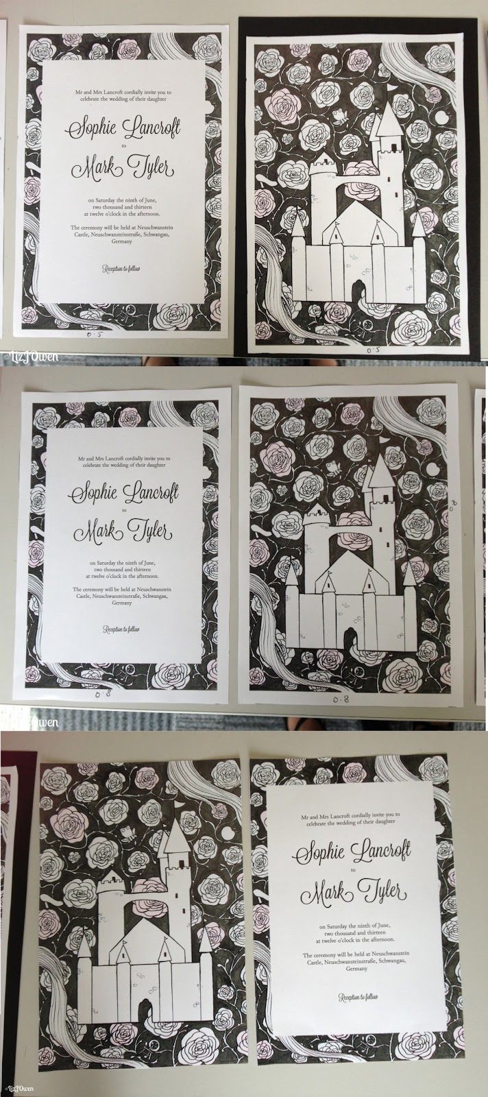
They mentioned I should try out is to cut down the white border around the invitations or get rid of it altogether, so I printed out several versions and cut them down to different sizes.
I first cut the border so that it was 5mm away from the illustration, and then another where it was 8mm away, and then another without the border at all. I then cut down some black card that I was hoping would be inserted between the back and front design to see how it would look as a final piece.
 |
| (please zoom to see more detail!) |
The thin border (5mm) looked quite good without the card but as soon as I placed it in front of it, it looked as if I was mounting my design onto a portfolio rather than creating an invitation. This was the same for all of my other designs that had borders, and the one without any borders at all just looked a bit out of place.

I then put my original design in front of the black card and it looked perfectly fine; although the black card didn’t create a border, it was a subtle feature as when I turned it to the side you could see the black card sandwiched between the front and back.
Conclusion:
After taking notes on the feedback I gathered I was able to do some experimentation, and this allowed me to try something that I never thought of before. Even though I am going back to my original design it was nice to try out the idea of thinning out the borders.
No comments:
Post a Comment