Friday, 19 July 2013

Personal Project: Pirate Birthday Invitation Design

I can't believe it; I've finished, I've actually finished it!

Brief: To design an invitation to celebrate a five year old boy's birthday, who wants to host a pirate-themed party.


You can see my process on my previous post here. Be warned, it is very detailed as I wrote it as I was researching and designing this.

Personal Project: Birthday Invitation Process

WARNING: Very detailed!

I have decided to come up with my own little project to keep me occupied over the summer, and this time I aim to design a children's birthday invitation. After much thought I have created the following brief:

To design an invitation to celebrate a five year old boy's birthday, who wants to host a pirate-themed party.

With the brief done I can now start my researching process.

Moodboard
Even though I know the theme of the party I want to take a look at other children's invitations so that I could pick out some of the aspects they have e.g. what kind of wording they use, how the illustrations are set out etc.


Image sources: http://theplaygroundph.tumblr.com/post/54599950750/ethans-mom-asked-me-to-design-a-safari-themed (2) http://www.behance.net/gallery/Childrens-Party-Invitations/7243961 (2) http://www.behance.net/gallery/Party-Invitations-and-Thank-Yous/5029201 (2) http://www.behance.net/gallery/AHOI/9145117 http://www.zazzle.co.uk/pirate_and_mermaid_invitations-161898138254790990 http://www.zazzle.co.uk/boy_and_girl_pirate_invitations-161852976881709458 http://www.zazzle.co.uk/jungle_safari_photo_birthday_invitations-161268921838798133 http://www.zazzle.co.uk/old_macdonald_eieio_farm_barnyard_birthday_invite-161670174034418123 http://www.zazzle.co.uk/pirate_boy_birthday_invitations-161301535145411190 http://www.behance.net/gallery/Camilles-Birthday-Invitations/1255209 http://www.behance.net/gallery/Kids-Birthday-Invitation-Party-Kit-Vintage-Retro/9829079 http://www.behance.net/gallery/Football-Shirt-Invites/2601131 http://www.behance.net/gallery/Wesleys-First-Birthday-Invitation/8513167 http://www.behance.net/gallery/High-Tea-Party-Stationery/8769561 http://www.behance.net/gallery/Birthday-Invite-for-Tvisha/4573945 http://www.behance.net/gallery/Minnie-Mouse-Birthday-Invitation/5835769 http://www.behance.net/gallery/Birthday-Invitations/8490621 http://www.behance.net/gallery/Baby-Bobber-Birthday-Invite/5292731 http://www.behance.net/gallery/Vans-1st-Birthday-Invitation-Design/9416387 http://www.behance.net/gallery/Invitation-for-1st-Birthday-Party/5237913 http://www.ballisticblue.com/number_five_invitations/9708fa8d01584757bd1a2a23f0b9fc5e/ http://www.ballisticblue.com/wizzy_wizard_invitations/67f46d0e9e1f4e73862c06684858ce52/3/ http://www.partyrama.co.uk/pp/Invitations/Boys_Invites/Dear_Zoo_Theme_Party_Invitations_-_Pack_of_10.html 


Wednesday, 17 July 2013

Inspirational Artists/Illustrators

I'm going to take a break from my mini project - which I'm hoping to complete today! - and write about my current inspirational artists. This is mostly because I'm really into illustration and drawing lately and looking at my inspirations really makes me, well, inspired!


First off is Angela Rizza, who I have talked about waaaaay back during one of my university projects. She is still an inspiration to me because I've fallen in love with the intricate detail in her lines, and I feel that there is a similarity between our styles as we both love lineart/inking and prefer to colour it on Photoshop rather than doing the lines on there as well. It's so amazing to finally find someone who does the same thing you did a few years ago, having given up on the idea because I was so depressed that I was the only one.

Saturday, 13 July 2013

Update

Hello!
Just going to give you all an update on what I'm doing: absolutely nothing. Well, that's not entirely true because I have been browsing around for inspiration all work but in terms of projects I haven't really completed any.

I've been in a bit of a design rut because I have been mainly focusing on art rather than design, having just completed my Cherry Blossom Painting. I think it's really relaxing to go back into drawing again especially because I have time to do it, so design has taken a back seat.

However today I had the idea of creating some birthday invitation designs, and right now I'm trying to decide on a theme. Hopefully I'll be able to complete this mini project by the end of the week! Although it'll all depend on whether or not I overcomplicate things...

Here's my to-do list then for this week (and perhaps next week as well):

  • Art Trade with Annie
  • Birthday invitation design
  • Portrait painting - digital or traditional

Trying not to make the list too long or it'll be near impossible to complete!

See you around!

Thursday, 4 July 2013

Under the Blossom Tree II

Been up since 5.30am thinking about this piece when I thought, "What the heck, I might as well finish it!"

Et voila, here is the final piece.


This was more of an exercise to see how much I've improved in terms of drawing and painting, as I decided to redo an old favourite of mine which you can see on my deviantART page here.

Here's both versions placed side by side so that we could see the improvement:


It's crazy how much my style has changed! I've moved away even more from the anime/manga style (in 2010 I was beginning to move away from it) and I have improved in my anatomy. I think my choice of colours for the skin is more realistic as well.

Here's a WIP:


Guess that's all for today! Thanks for reading.

Friday, 14 June 2013

Live Brief: Basement Jaxx Single Cover

This is my submission for a live competition hosted by both Basement Jaxx and JDO which was to create a single cover for one of their songs. We had to first choose and theme and then a song, and I chose “Everything Is Connected” and “We R Not Alone”.

 This project really made me think outside of the box and cross boundaries because I allowed myself to think weird ideas. Like here I thought: what if the Earth wasn’t orbiting the sun on its own, but had a UFO to carry it around? And this was the result!


Wednesday, 15 May 2013

Fairy Tale Wedding Stationary

My FMP (Final Major Project) was to design an invitation for a fairy tale wedding and, if I had the time, some other parts of wedding stationary. I wanted to create something that links in with traditional media, taking inspiration from Illuminated Manuscripts and the work of Jan Pienkowski.


FMP: Evaluation

The Final Designs
I am extremely pleased with my designs, even more so that I have managed to create a stationary set rather than just a wedding invitation. It had been my first time in dabbling in stationary design and I have to say that I really enjoyed it and would love to do it again.

The fact that I’ve hidden little aspects of fairy tale stories within my illustration that is repeated across all of my designs means that I have met the requirements of my brief, which was to create an invitation for a fairy tale wedding. I had used traditional techniques because I felt that it was one of my strong points in design, and I am so glad that I had done this (especially because I wasn’t happy with my previous designs!)
It may seem strange that I had used black in my designs, but that’s because I wanted to create a design that would fit into one of the current trends in wedding stationary - Monotone. By using pink only brings the illustration to life and enhances the romantic appearance of the design, therefore linking to the love that the couple share.
I am very pleased with my typeface choices as well, as I fell in love with Lavanderia as soon as I clapped my eyes on it. It is actually the first typeface I’ve used in a university project where I could only use it for personal use, so whenever I posted my design online I will say how it’s for a personal project in order to avoid any problems in future with the type designer. 
Junicode works really well with Lavanderia because it is quite simple in comparison, and it wasn’t too overpowered by its serifs, as they were relatively thin. 

However I feel that by using black for the back of my other designs does probably make it look too dark. The reason I used black in the first place was so that all of my designs linked in, and as I used black card to insert in between my invitation then I thought it would be best to carry on this feature throughout my other designs. The audience could misread the use of black as one of the dominant colours, and so I hope that by using hints of pink and a lot of white space then this’ll dampen the “dark” connotations that crop up.
The reasons listed above is the reason why I have changed my mind and quickly printed out another series of designs, and this time I didn't mount them up onto black card (although left the invitation with the black card inserted in between the two sheets, as it were). The black card backing just didn't seem right to me, and even though it might look quite plain these designs are now more suited for a wedding. 

I had some problems deciding whether or not I should draw a line for the couple to write out the guest’s name, but after much deliberation I decided to leave it as it seems more personal and less mass-produced if I left this feature out. Besides, most of the invitations I had looked at didn’t include this line possibly for the same reasons as mine.
I also couldn’t figure out whether it would be more appropriate to write “names” on the RSVP card instead of the “M”, as when I showed it to several of my classmates they didn’t know what the M was for. I went with the “M” in the end as it was very rare to write “names” and I hardly ever saw it being used on the RSVP cards I had looked at. To help my lecturers know what the M is for I shall write on the names of a made up guest and then provide a blank version. 

Printing & Assembling Designs
This happens to be the first project where the printing process went extremely smoothly as I was more experienced in using the printers at university, and I had also tried out by printing off at Staples. The result was perfect; the black was pristine and the type didn’t sink into the matte paper. Even the illustration came out very clean and there were no pixilation issues. 

I did have problems with assembling my designs, especially where I wanted to put the black card inside of the invitation. My spray mount wouldn’t work so I had to resort to using double-sided tape that worked surprisingly well. Too well, in fact, because when I stuck my black card inside my invitations wrong I wasn’t able to correct it so I had to cover it by inserting another black card atop of that. 

The Overall Process
After having some experiences in the past where I was rushing at the last minute I made sure that I did as much as I could right at the beginning of the project, and so all of my energy was focused during the first stages of my project. This enabled me to be able to do relevant research and even though I did go around in circles and had to redo my designs, I had plenty of time to experiment because of the fact I was doing so much work at the beginning rather than spreading it out.

My research went along quite well and I was more open to getting ideas rather than just sticking with Behance, and soon found stationary designers through wedding magazines. Even though these magazines mainly focus on clothing and the bride I was able to figure out the current trends and this helped me with my design. And, like I mentioned before, these magazines often featured some stationary designs so I was able to research into the actual designers a bit more. My favourite has to be Coral Pheasant, and she was my inspiration throughout the project. 

I did waste a lot of time debating on what kind of direction I wanted to go in; for ages I went for the more digitalised look (so minimalist vectors) and kept on experimenting with different ideas even though I didn’t like any of them. Luckily I was able to talk to my lecturers about this to get me onto the right track, because if I hadn’t then I would’ve ended up hating the project and all of my designs. 
I just wish I thought of using traditional media sooner! The thought was there at the beginning, but I just wanted to try something completely different that I didn’t realise I would end up not liking it. I think next time I won’t be so stubborn and perhaps try both digital and traditional media to see which one looks best. 

I didn’t experiment with media as such – and would’ve loved to try out gold foil and creating wax seals – but there were several difficulties in learning these methods, and so I thought of abandoning the wax seal and replace the gold foil with experimenting on outlining with gold pen. 
I focused most on my experimentation on idea generation, and this was something completely new because I had never been able to develop my ideas as much as I did for this project. This means that I spent more time on getting the ideas and sketching so that the designing process was much shorter (as I knew exactly what I was doing). 


Overall Conclusion:
All in all, I really enjoyed this project despite the difficulties I had at the beginning and would love to delve further into stationary design, so maybe over the summer I shall look into it a bit more.  

Monday, 13 May 2013

FMP: Gathering Feedback

Today I sat down with my lecturers and classmates to have a crit meeting on where we were so far in our projects, so I was able to present the designs that I had to see if I could get any feedback from them. I am pleased to say that the crit went extremely well and that most liked my designs – especially my typeface choices – and there wasn’t really anything that I needed to desperately change about it.

I showed them two versions: one set of designs I had printed off at Staples, and the other from uni. All had agreed that the Staples designs were a lot more pristine and the black really stood out from the page, and this only confirmed my thoughts so I decided to stick with those.

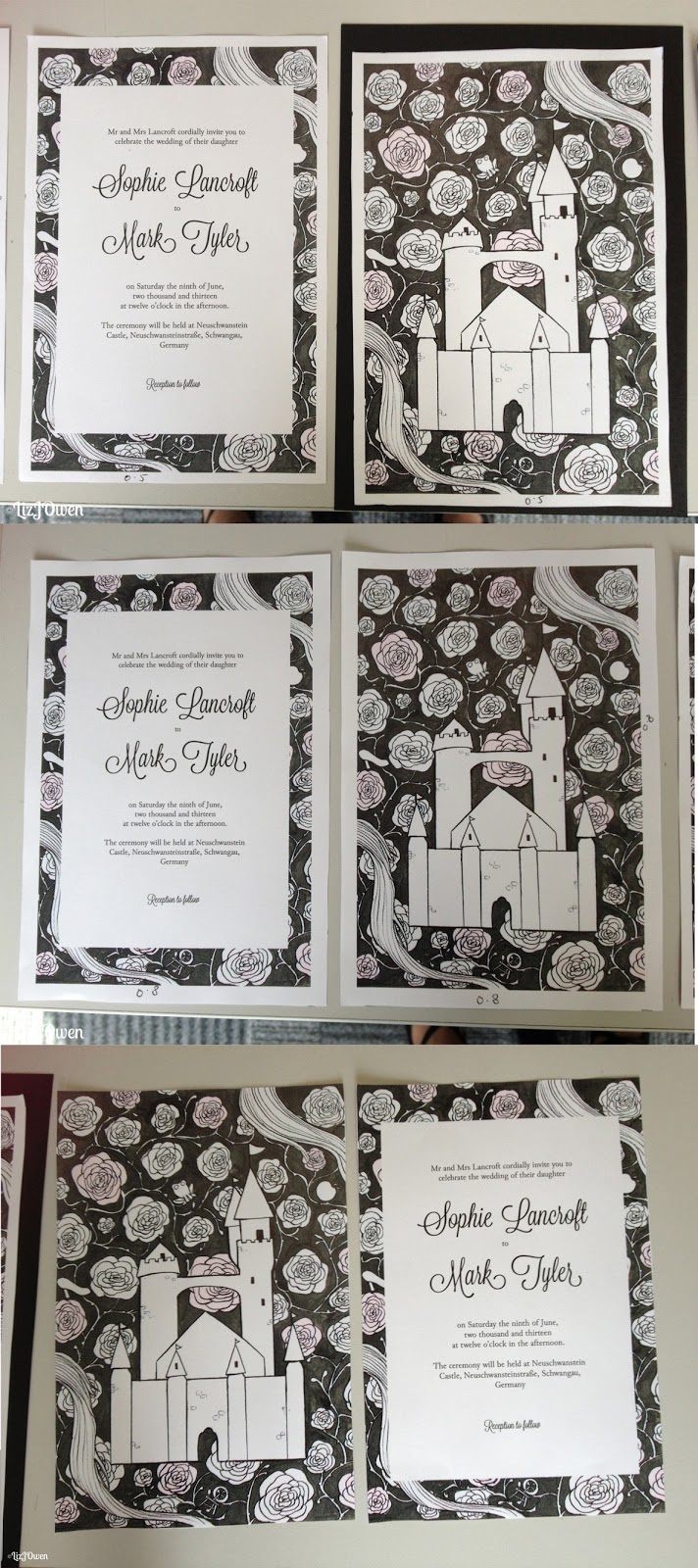
They mentioned I should try out is to cut down the white border around the invitations or get rid of it altogether, so I printed out several versions and cut them down to different sizes.

I first cut the border so that it was 5mm away from the illustration, and then another where it was 8mm away, and then another without the border at all. I then cut down some black card that I was hoping would be inserted between the back and front design to see how it would look as a final piece.

(please zoom to see more detail!)

The thin border (5mm) looked quite good without the card but as soon as I placed it in front of it, it looked as if I was mounting my design onto a portfolio rather than creating an invitation. This was the same for all of my other designs that had borders, and the one without any borders at all just looked a bit out of place.


I then put my original design in front of the black card and it looked perfectly fine; although the black card didn’t create a border, it was a subtle feature as when I turned it to the side you could see the black card sandwiched between the front and back.


Conclusion:
After taking notes on the feedback I gathered I was able to do some experimentation, and this allowed me to try something that I never thought of before. Even though I am going back to my original design it was nice to try out the idea of thinning out the borders. 

Sunday, 12 May 2013

FMP: Thank You Card Sketches & Design

The Final Design


The Process
The first step I took was to get some sketches down on paper, and this didn't take long because I already had my ideas in mind that was inspired by all of the other parts of the stationary. I wasn't going to design something completely new so I could get away with having the same format as the other designs.