
After gaining some feedback I was really motivated to do my book cover design, and as I was flicking back through my previous sketches I realised that they have become really structured and 'stiff'. Therefore I went back even further to look at the designs just before I reached this stiff appearance, and found one of my sketches where the words were flowing around the page.
That together with one of my inspirations, the Ely poster, I began to start sketching again and this time just improve on this 'flow'. I really liked how the designer connected the words and let some of the swirls overlap them. These swirls have a very strong Art-Nouveau appearance as they are heavily detailed and there is more focus on the illustration than on the type.
One of my old sketches:

One of my old sketches:
Sketches & Development
I had the idea that quills will be floating around the type and towards the book like words floating off of the page. There was going to be a mixture of flow and structure, so I kept in mind that I wanted my type to remain in a set boundary. I too want the illustration to be dominant but not so much that the type disappears behind it.
At first I was going to display all of the information on the same page but, once again, after looking at how I did the DPS design for Moby Dick I decided to feature my name and "FTWeekend" on the back cover.

After I had developed my sketch a little bit I jotted down a little to-do list of my next points of action. The first one was that I would work on the "the little book of" as my lecturer had previously mentioned that it needed beefing up a little bit.
I tried out several different styles and at first I didn't think about the kerning, as I just wanted to get the style down first. Once I had the style in mind I began to develop it.
I went for the serif in the end after noticing how professional this turned out in my Moby Dick design, and I wanted to produce that elegant appearance seeing as the design would be quite fun and busy. I made sure that the serifs weren't too dominant and kept them at a small size. To reduce the elegance of it I made sure that there wasn't a stark contrast between the strokes... Another reason being that it would be hard to read at a small scale.


While the ink was drying I moved onto concentrating on the main word, Quotes. I really liked how my type turned out the last time I designed the cover so I decided to use that but change the thickness as the hairline strokes might get lost behind the detailed 'flow'.
To do this I simply traced over what I had before and thickened the strokes. I made sure that all of these new strokes had the same thickness. I traced over this again and inked it in.

I missed out drawing the little floral detail because of the fact that they now didn't go with my new idea. I'm hoping to allow some of the 'flow' to entwine with the lettering but it all depends on the layout. Speaking of, I decided to go back to my sketches and develop it even further, building up on my idea that the little swirls will rise from the book and around the type.

I was starting to feel excited now that my sketch was reaching it's final stages, so I put my type aside so that I could fully concentrate on that.
I began buy drawing out my boundaries and made it so that each side was 50mm larger than my actual dimensions (so 175mm x 204mm). This is so that when it comes to scanning in I could easily reduce it's size. Besides, my book cover might actually be a little bit larger than the inside pages so I was just going to be on the safe side and do it larger.
After laying down my boundaries I moved onto drawing some lines as a rough idea of where the type might be. I'm not going to be actually drawing the type so I'll need to leave a space for them so that I could put everything together in Photoshop later on. Then I moved onto drawing the book and quill, and then the swirls.
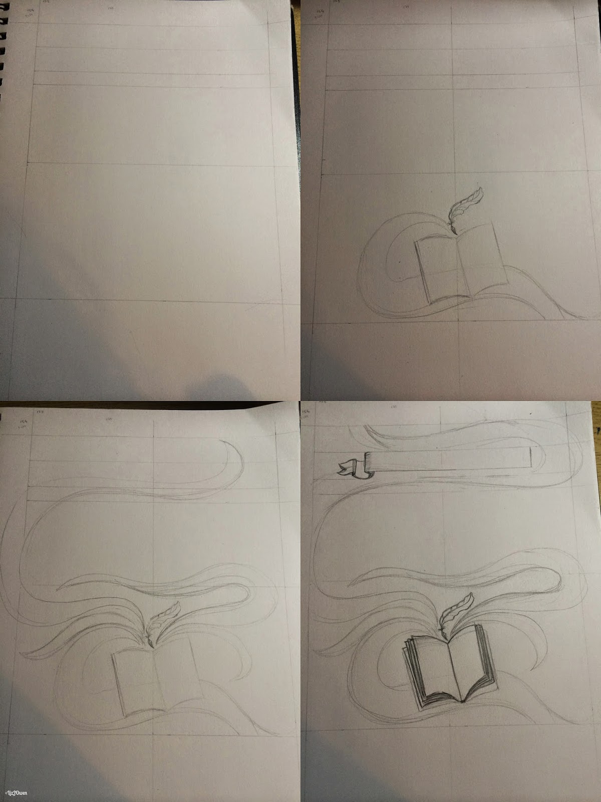
I have now produced the foundations of the illustration, so I took a new sheet of paper and traced over the sketch (using my window as a light box). I neatened up the swirls a little bit and made the one that swirled around the top a bit thicker so that I could fill in some of that white space.
Once done it was just the case of inking! This took a very long time as I wanted to do the swirls as neatly as possible. I lined the book, quill and banner in various micron thicknesses but did the swirls in biro to set them all apart slightly. I learnt this technique from my The Raven piece.
Instead of doing quills floating around in the swirls I decided that I would produce a more wavy-feather feel. This is because I wanted to highlight the quill floating about the book so that the swirls would appear like ideas floating from the quill and book, and if I did more quills on the page than this quill would just disappear from being one of the main focus' of the piece.


I now have all of my pieces ready to be scanned into Photoshop and put together!
To do this I simply traced over what I had before and thickened the strokes. I made sure that all of these new strokes had the same thickness. I traced over this again and inked it in.
I missed out drawing the little floral detail because of the fact that they now didn't go with my new idea. I'm hoping to allow some of the 'flow' to entwine with the lettering but it all depends on the layout. Speaking of, I decided to go back to my sketches and develop it even further, building up on my idea that the little swirls will rise from the book and around the type.
I was starting to feel excited now that my sketch was reaching it's final stages, so I put my type aside so that I could fully concentrate on that.
I began buy drawing out my boundaries and made it so that each side was 50mm larger than my actual dimensions (so 175mm x 204mm). This is so that when it comes to scanning in I could easily reduce it's size. Besides, my book cover might actually be a little bit larger than the inside pages so I was just going to be on the safe side and do it larger.
After laying down my boundaries I moved onto drawing some lines as a rough idea of where the type might be. I'm not going to be actually drawing the type so I'll need to leave a space for them so that I could put everything together in Photoshop later on. Then I moved onto drawing the book and quill, and then the swirls.
I have now produced the foundations of the illustration, so I took a new sheet of paper and traced over the sketch (using my window as a light box). I neatened up the swirls a little bit and made the one that swirled around the top a bit thicker so that I could fill in some of that white space.
Once done it was just the case of inking! This took a very long time as I wanted to do the swirls as neatly as possible. I lined the book, quill and banner in various micron thicknesses but did the swirls in biro to set them all apart slightly. I learnt this technique from my The Raven piece.
Instead of doing quills floating around in the swirls I decided that I would produce a more wavy-feather feel. This is because I wanted to highlight the quill floating about the book so that the swirls would appear like ideas floating from the quill and book, and if I did more quills on the page than this quill would just disappear from being one of the main focus' of the piece.
I now have all of my pieces ready to be scanned into Photoshop and put together!
No comments:
Post a Comment