
I chose to try out Illustrator first because it seems that he had placed the CD Labels exactly where they have been placed on the label paper.
Illustrator
I opened up the template and by creating a new layer, Placed the illustration atop of it. By lowering the opacity I shuffled the illustration around, making it so that the circle would go around the centre.

I sent the illustration layer to back, resumed it's opacity, and by selecting both that and the CD layer I went onto Object > Clipping Mask > Make.

I wanted to try another version where only the logo is placed onto the CD to reflect the design of the insert, so I Placed the logo onto the CD.
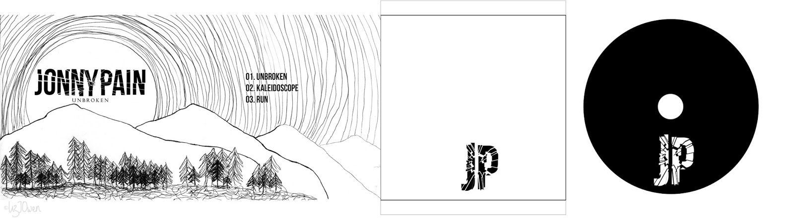
That's when I decided; why not make it black? It'll match the colour scheme of the business card plus it'll have the opposite colours to the insert, so I changed it the other way around.

So now I've got two CD designs: the illustration and the black one. I put them side by side the album cover so that I could choose which one is more appropriate.

Black: Pros - Contrasts against the insert, the logo is nearly placed in the same position, it contrasts with the design overall
Cons - Maybe looks a bit too dark? Memorial-like?
Illustration: Pros - Matches the design of the album cover, decorative, not too simple
Cons - Too repetitive? Boring? Same old same old?
Conclusion:
I decided to go along with the black CD label because of it's contrast to the insert image, and also because of how bold and striking it it. It also matches the theme of the business card so brings all of the designs together.
Additional - Photoshop
(I wanted to experiment with Photoshop anyway).
I opened up the template in Photoshop, and it came out like this. By taking the Magic Wand tool I selected the smaller circle and deleted the area so that it was clear (I don't want the image to be covering that part)
I then Placed my illustration on top on a new layer, lowering the opacity as I figure out where to place it. Once done I pressed Enter so that it didn't budge.
By selecting the Magic Wand tool I went onto the CD layer, selected inside the circle, then clicked onto the Illustration layer and pressed cmd+j (I basically duplicated it. Now now on the new layer it has copied the Illustration but only what was within that circle.
All done!

Conclusion:
Although Photoshop required less to create the label, the template has been cut off so my worry is that it wouldn't fit on the paper. This was why I chose my Illustrator file instead.
No comments:
Post a Comment