
 |
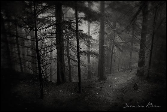
| Dark by Sebbri http://sebbri.deviantart.com/art/Dark-40174819 |
As soon as I saw this
I felt as it I was walking down the forest past and through the trees. This is
probably because of the way the photographer held their camera as they were
taking this – they could’ve done it at a slight angle – so that it “focuses”
more on the path. To help the photograph lead the eye across the path, there is
some sort of grey mist that lightens it. This creates an eerie kind of scene
because it has softened the edges of the trees to make them appear friendlier,
although the dark shadows that masks the trees on the left hides whatever lurks
there.
Conclusion: I like
how instead of the trees being the main focal point, the path is, and the
photographer has emphasised this by angling their camera down at it.
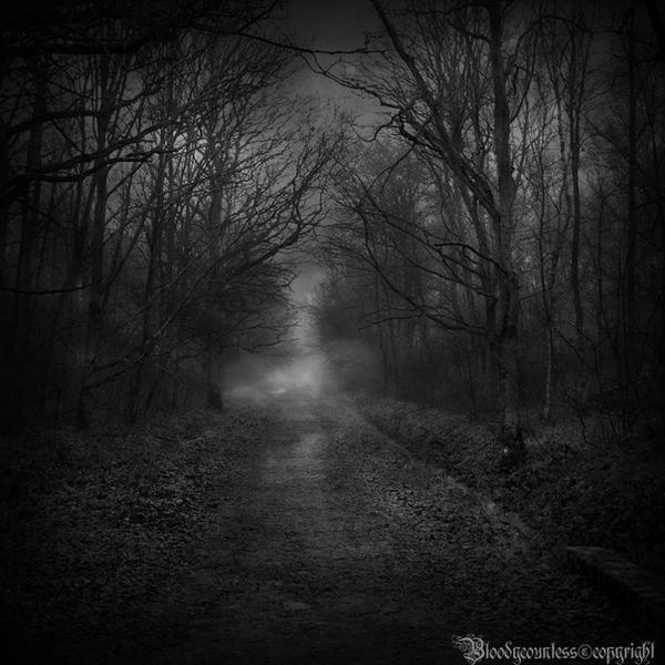 |
| In the Dark Forest by CountessBloody - http://countessbloody.deviantart.com/art/In-the-dark-forest-151691539 |
The main focal point would have to be the mist hovering
in the centre of the pathway; I can’t see anything of the path behind it, and
can just imagine a headless horseman just waltzing right through it waving his
sword around like a mad man (I have just watched Sleepy Hollow by Tim Burton…).
There isn’t really much to see in this photograph because of the lack of colour
and the very dark shadows. The grey sky reveals the treetops and some spiny
branches, and the mist does illuminate part of the path, but apart from that I
can’t really see anything. There is a slight “vignette” around the piece so the
image could be placed onto the background, but I think that this means that the
image overall looks slightly restricted and small.
Conclusion: Never use too much shadow! It takes away a
lot of detail in the piece.
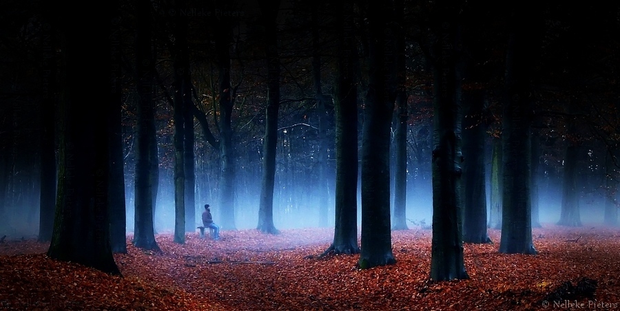 |
| To Be In The Dark by Nelleke- http://nelleke.deviantart.com/art/To-Be-In-The-Dark-338760950 |
This
was the first photo that belonged in the category of "dark forests"
that had a bit of colour to it. The contrast between the dark trees and the red
leaves on the ground creates a bold appearance, although the red fades slightly
as the blue mist caresses the ground. There is some hint of green – or
is it yellow? – in the leaves that are still on the trees, and it is this
subtle colour that brings the trees to life. If it had not been for the yellow
the trees would’ve looked bare like the ones you see in winter.
The
deep shadows hides most of the detailing in the branches in the foreground, but
in the background where the shadows aren’t so deep there are some hints of
other shapes such as the leaves and also the gaps between each branch. The deep
shadows create a spooky connotation because we cannot see if there is anything
lurking amongst the trees safe for the man sitting down at the bench. Was he a
distraction? We do not really know. It’s quite hard to tell whether this is a “friendly”
forest or one that you could get easily lost in.
It’s
surprising how much detail the camera has picked up because I could also “feel”
the texture of the floor-ridden leaves. They look as if I could sink my feet
into them and never be able to see my shoes!
Composition-wise,
this sort of photo would be brilliant for a CD cover because the tips of the
trees have faded into black, so the type could be easily placed above it
without covering the image. I would definitely like to do something like this!
Conclusion:
The balance between the shadows and detail is brilliant; there isn’t too much
to look at, nor too little. I like the idea of the black gradient on the tips
of the treetops, because it could easily be placed onto a black background
where I could possibly place the type. The mixture of different colours is
wonderful, and the blue mist rather than a white one creates an eerie edge.
 |
| Dark Forest by Bojkovski - http://bojkovski.deviantart.com/art/Dark-forest-332669264 |
This
composition is different to the others, because the perspective makes it appear
as if we, the viewer, are looking upwards towards the sky. To help this the
photographer has enhanced the gradient at the bottom so that our eyes naturally
go upwards where it’s lighter.
 |
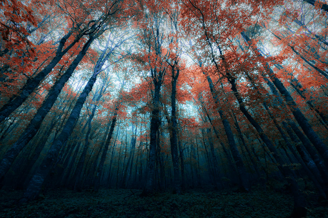
| Dark Forest by Beyzayildirim77 - http://beyzayildirim77.deviantart.com/art/dark-forest-277451289 |
In
my first sketch I experimented by drawing a treeline, so I went and looked for
an image that also has a treeline so that I could see whether the trees are at
a similar height or not. From this image I can see that the trees are
relatively the same height and the only hint of detail are in the very top
branches. I assume that this is because of the cluster of trees have blocked
any light coming through.
Conclusion:
I really like the treeline idea because I could make the viewer focus on the
moon or the type a lot more.
Overall Conclusion: After looking at all of these different perspectives and compositions, I have decided to continue with my tree-line idea. This is because I would find it easier to place my type onto the page without it obscuring the imagery or making the design too busy. Jonny Pain mentioned having a design like Iron Maiden, and I find a tree-line would be best because (as I have shown in my sketches) I could place the skull faintly where the moon is on the design I had analysed just above.
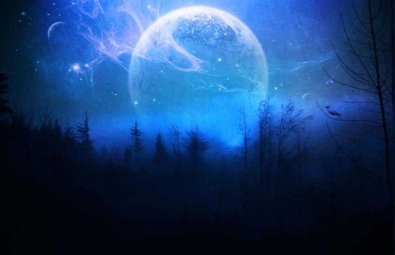
Different Tree-line Compositions
To make it easier for me to sketch out the whole tree-line idea I have created a small moodboard of all of the images I have found that I'll use as references.

From all of these photographs I have noticed that the trees are normally around the same height, although many overlap each other. What I mean by this is that there's a layer at the back, and a shorter layer in front of that etc. Generally speaking, most of these trees are the same height and we don't see their "full body" unless there's only a thin lines of them.
Conclusion:
So when I draw up my tree-line I need to think of how many "layers" of trees I'll be drawing as I will need to think whether or not I need to show the whole shape of the tree, or just the outline of the treetops.
Overall Conclusion: After looking at all of these different perspectives and compositions, I have decided to continue with my tree-line idea. This is because I would find it easier to place my type onto the page without it obscuring the imagery or making the design too busy. Jonny Pain mentioned having a design like Iron Maiden, and I find a tree-line would be best because (as I have shown in my sketches) I could place the skull faintly where the moon is on the design I had analysed just above.
Different Tree-line Compositions
To make it easier for me to sketch out the whole tree-line idea I have created a small moodboard of all of the images I have found that I'll use as references.

Resources: http://greenleaf-stock.deviantart.com/art/OLD-lake-88961924 http://rinymph-stock.deviantart.com/art/Premade-Bg-Jungle-Hills-120836655 http://forestgirlstock.deviantart.com/art/Forest-Pond-140549188 http://choirgal463.deviantart.com/art/Forest-Line-178620119 http://littleredplanet.deviantart.com/art/Tree-Nebula-115468291 http://hibakushainblood.deviantart.com/art/Tree-Tops-253496684 http://celestialraven16.deviantart.com/art/tree-tops-166210812
From all of these photographs I have noticed that the trees are normally around the same height, although many overlap each other. What I mean by this is that there's a layer at the back, and a shorter layer in front of that etc. Generally speaking, most of these trees are the same height and we don't see their "full body" unless there's only a thin lines of them.
Conclusion:
So when I draw up my tree-line I need to think of how many "layers" of trees I'll be drawing as I will need to think whether or not I need to show the whole shape of the tree, or just the outline of the treetops.
No comments:
Post a Comment