
Here I shall cover the "Illustration & Typography" section. I know that I may/may not have experimented with calligraphy that much, but I thought I'd treat this week as a 'tester' week before diving into the type of hand-lettering that I enjoy the most.
To see my 'mood board', click here.
Inspirational Pieces
Unicorn Empire Prints - http://www.etsy.com/uk/shop/UnicornEmpirePrints

Inspirational Pieces
Unicorn Empire Prints - http://www.etsy.com/uk/shop/UnicornEmpirePrints
I received this top as a Christmas present and fell in love with the layout of type as well as the mix with illustration. I do have a soft spot for illustration, and to see it working so well with type makes this 'piece' all the more inspirational.
The type styles used reflect that of chalk lettering, and I'm hoping to do another post solely on it so that I can provide a comparison between it and this piece.
This link with chalk lettering is shown in the way that some of the words are shaded. In my previous project I noticed that the shading was done quite differently in chalk lettering to make the words stand out a little more even though it was very subtle. Such an effect can be seen in the words "Welcome" and "Demon Blood Special". I have briefly experimented with different shading types in my previous project “Words” but I hope to explore it a little bit more in this project.
What also brings up connotations of it being influenced by chalk lettering is that there's only really one colour used throughout the piece, with the only other colour being the background (the top), yet somehow they've managed to make it clear where the boundaries are between the illustration and type. This is due to the way they've drawn their thick lines to separate each element. This is quite an interesting technique and if I ever create a piece with only two colours I would like to use it.
In terms of typography, they seem to do a mixture of sans serif and a sort of script typeface. The script typeface is a lot more decorative and most aren't really placed inside an illustration, creating more on an emphasis on such words. This is strengthened by the way they've made some of the words much larger than those that are sans serif, as well as the fact that they are more decorative through the use of shading.
I can't seem to place what kind of connotations the script typeface brings up but I strangely think of thick melted chocolate that had just been hardened. It's really strange! I also think of American diners and their big fancy lettering that they have on their signs that are normally lit up to attract customers. The smoothness of the characters emphasise their size and this hides whatever serifs that are there (as shown in “Ruby”). This creates an effect that the serifs are barriers in the word to stop it from curving and flowing any further, and provide a structure.
This flow could resemble a wave or even the flowing of blood from a wound, which reflects the series Supernatural where a lot of demons and monster hunting are involved. Using the name "Ruby" only strengthens the connotation of blood, as she was one of the main demons in this program.
The sans serif is very plain in comparison and it clearly reveals that the letters were done by hand by the way the some of the letters are shorter than others, and don't seem to sit on a uniform line as shown in “Yesterday was Tuesday but today is Tuesday too!” However this could be due to the fact that the writing sits inside a banner and the letters are only bending with the curved edges.
The lack of decoration on the sans serif surprisingly puts more of a focus on the words as they contrast strongly with the heavily decorative illustration that surrounds them. This means that the overall piece isn't so overwhelming and the eye flows gently down. This makes the words easier to read because they are at a much smaller scale than the decorative script. This has shown me that in order to create a perfect balance with elaborative illustration I must make the type style plain, and vice versa.
There are quite a lot of aspects that link in with Supernatural (the program) as well as things that the fandom, people who are fans of Supernatural, would remember.
At the top of the list are the moose antlers [Example 1], as Sam (one of the main characters of the show) is nicknamed "Moose" by one of the villains. This is a nickname that is adopted by fans and they often produce fan comics of Sam with moose antlers. [Example 2; Example 3] The shoe dangling on one of the antlers is also connected to Sam; in one of the comical episodes he had lost his shoe down the drain.
The rest are: "Pig-N-Poke", a dish that Dean (who is another main character) always eats; the knife which is one of the two weapons that could kill demons; and the pentagon that creates a "Devils Trap" which wards off demons as well as trapping them if they step over it.
However even though these aspects with demons, blood and pentagons relates strongly to Supernatural, it is only recognisable by the fans so it's catered to a very specific target audience. Other people who don't watch Supernatural (especially religious people) might not understand and this it's something Satanist, especially the pentagon.
The only thing that could 'save' such connotations is that everything is drawn quite comically so the viewer could tell that they're not being serious and it's just playful.
Conclusion:
I really like this piece and it is by far one of the most inspirational ones that I've seen throughout my research into hand-lettering. I would love to create something similar, especially because they've integrated illustration really well.
I'm hoping to find some tutorials on different shading techniques to do on either Photoshop or Illustrator as well as doing them by hand.
WEAREYAWN - https://www.behance.net/weareyawn
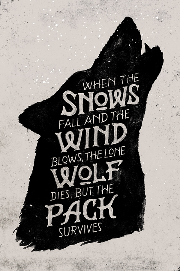
This piece is a lot plainer than the previous one as the illustration isn't as elaborate. Instead, there is more of a focus on the typography as it is relatively large and bold.
The typeface used is very unusual, showing that it was hand-drawn, and this is indicated by the way the typographer had drawn the crossbars and the 'o'. For some reason this reminds me of the sea and anchors, especially by the way they've drawn their 'W's', and could reflect the strength of the wolf pack that the artist describes. This idea could be emphasised by the tall form of the letters and the use of uppercase as well as the fact that the x-height is quite high up, showing the stance of the wolves in that they hold their heads up high despite losing a member of their pack. This then describes the event in Game of Thrones when the father, Eddard Stark, dies, and how his family had to cope with his death (the direwolf was their family emblem). I have created this connection because this piece is actually made as a form of fan art for the A Song of Ice and Fire/Game of Thrones series.
I've learnt that there's always a reason why some of the words are larger and the others small when I was researching for my previous project, and this made me have a look closer at the words that are highlighted here: snow, wind, wolf, and pack. These all link in with Winterfell – the location of the Stark household – but also the underlying theme of the book/tv series. There is the never-ending fear that “Winter is Coming” (the Stark words) and by highlighting such words places an intensity on this fear.
Aside from this it was quite unusual for me to see a widow – a lone word at the end of the paragraph – in this piece because it's something to be avoided, which makes me think that it was possibly done on purpose. Despite the snow and the wind and the fact that a wolf had died, the thought of survival is still strong. It shows a strong sense of hope in that the pack – the family – can continue onwards.
The texture displayed is quite interesting and it reminds me of ink splatters and woodcut printing, and judging by the simple illustration this might be the technique that the artist had used. This would explain why nothing is very elaborate because it would be very difficult to carve small details onto wood.
This texture also reminds me of snowflakes because it's quite soft yet grungy at the same time, revealing the hidden darkness in the message and the coming of winter. There are stronger smudges at the bottom edge of the page, perhaps mirroring the effect of fallen snow on ground, or as a way to lead the eye down the words to the bottom.
Conclusion:
Even though I really admire the previous illustrator's work because of the elaborate decorations, I quite like this simple design because it's very effective and brings up numerous connotations to link it with the series it's based on. The technique is quite different, and as I've never used ink nor woodcut in typography before I might take a look at some tutorials!
Mateusz Witczak - https://www.behance.net/mateuszwitczak
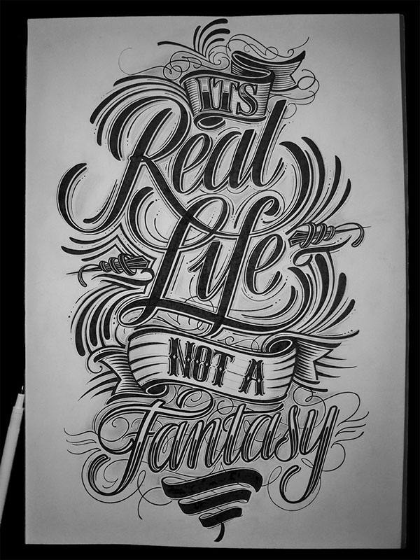
I can only imagine how long this would've taken them to do. Unlike the other pieces I've analysed, this one is most definitely focused on the typography. In fact there is so much of a focus that they are no longer letters but illustrations.
This emphasises the fact that it's entirely hand drawn, as there's no way that these words were put together by existing computer fonts. It makes the piece all the more organic and original, a one-of-a-kind, and so this makes it more valuable as it can't be easily replicated by others.
There isn't a straight baseline for all of the characters which covers any 'mistakes' made such as a difference in cap-heights and x-heights. This is a pretty clever technique and one adopted by other hand-letterers, but even so the mistakes would make it seem more personal and 'human'.
There are two main styles here - one that is calligraphic, and the other 'Western'. The calligraphic one has the thick and thin strokes effect achieved by a dip pen and yet the outline is extremely smooth. There is normally a slight tremor depending on how experienced the calligrapher is, but this looks almost perfect. It actually reminds me of a brush pen or just a brush in general because of the sweeping swashes and legs of the letters. The sweeping motion of R connects with F, drawing the two words together almost as if 'reality' and 'life' complete each other.
There is another thin outline to bring out the words so that they are brought to the same layer as the banner, meaning that they won't vanish beneath it.
The differences in calligraphy are mainly found in the colours. "Real Life" has a solid, black colour, which could reflect the plain truth of reality and it's dominance is slowly squashing fantasy as it's done at a larger and bolder scale. "Fantasy" is more decorative, unusual, which shows how unreal it is and that it's quite mysterious. Even though it has a thick outline it is being squashed down by the other words on the pages, much like how fantasy is overtaken by reality. The black banner is trying to support it.
The Western typeface seems muted in comparison as it's done at a smaller scale and fitted within the boundaries of the banner. This banner restricts the space that the words sit but it also provides a structure to the overall piece. It creates a balance between the sweeping characters in "Real Life" and stops them from going over the edge, and the bottom banner stops it from reaching the word "Fantasy".
Conclusion:
I am amazed how much these words 'speak out' and create so many connotations, almost giving them character. They are extremely decorative which could explain why there aren't any main illustrations, only outlines, and this means that the words wouldn't get lost on the page.
I think I'd quite like to experiment with calligraphy a bit more after seeing this and with pt sizes because here they definitely mean something!
Tobias Saul - https://www.behance.net/tobiassaul

Despite it appearing very detailed, this piece has only one main illustration (the anchor) and a couple of typestyles. These typefaces are all in serifs so that it appears that there are only two different styles at first but each one had been either shaded differently or have a line down the middle.
All of the typefaces have similar aspects: a very tall x-height; small width; tall characters which gives them a very stretched appearance; are quite decorative; and there is a contrast between thick and thin strokes. The E in 'we' is very unusual and is quite confusing to read at a glance as I initially thought it was all one word.
The 'decorations' are what sets each typeface apart the most, and the one most elaborate is the "what" and "sailor". They remind me of the old Western fonts and 3D Fonts, and it seems that only two words are in this style as they are so decorative. If the typographer had used more than two words in this style the piece would appear very cluttered.
This also explains why they used a short quote with each word on a different line - it allows them more room to breathe. The kerning is relatively large as well as the leading, but this isn't very noticeable as the illustration fills in the spaces.
The little parts surrounding the main illustration appear to only act as a way to fill out the page and, as I've mentioned above, to fit into the gaps and make the piece appear less spacious and 'empty'. I like how the designer used a texture as another way to do this as it really brings out the small dots that remind me of air bubbles in the ocean. Perhaps these bubbles are also from the drunken sailor? Like in the cartoons where they draw bubbles floating out of a drunks mouth as they're sleeping?
At first it doesn't seem like the swirls are related to the subject matter, but upon closer inspection I realised that there were tiny details at the ends which reminds me of wheat or something similar. This could thus be the type of ingredient used in beer/alcohol, which relates to the drunken sailor. The sailor is a bit all over the place, stumbling around the deck, and the swirls could be outlining his sense of direction.
This technique is really clever because even if the illustrator hadn't intended for such connotations to arise, they are the 'right' ones as they relate to the quote. I hope to do something similar for my designs!
Other connotations produced originate from the trio colour combination. The red used for the anchor reminds me of a lobster for some strange reason, and this ties in with the general theme of the sea. When I think of a lobster I think of very posh French restaurants, and then to sailors and fishermen.
Conclusion:
This piece shows that even the tiniest detail could boost the theme and create the right connotations as well as the colour choice.
Reflective Learning - Summary
Here I've analysed quite a wide range of pieces in this certain style and even though they are all quite decorative, they are done extremely differently. There's quite a variety of type and illustrative styles which just shows that anyone could add their own 'voice' to this area of design.
I find the mixture of typography and illustration a lot more inspirational than just having calligraphy on it's own, and would like to spend quite a bit of time on this section. This group of analysis has taught me that the way that letters are drawn could produce connotations, which are often supported by the illustrations paired with them.
Perhaps the only downside to this kind of style is that I might not be able to use it for other subjects such as politics or travel, so I should still look at other types of hand-lettering. It might appear time-consuming to do this but in the end it gives me inspiration so I can't really ask for more than that.
My next step is to either create a quote inspired by such style or to have a look at different inspirations and analyse them.
Learning Outcomes:
[4] Developed research skills in the area of contemporary professional practice.
[6] Developed skills of critical thinking, analysis and evaluation.
[8] Developed their ability to scan and organise data, abstract meaning from information and communicate knowledge in a variety of formats.
This piece is a lot plainer than the previous one as the illustration isn't as elaborate. Instead, there is more of a focus on the typography as it is relatively large and bold.
The typeface used is very unusual, showing that it was hand-drawn, and this is indicated by the way the typographer had drawn the crossbars and the 'o'. For some reason this reminds me of the sea and anchors, especially by the way they've drawn their 'W's', and could reflect the strength of the wolf pack that the artist describes. This idea could be emphasised by the tall form of the letters and the use of uppercase as well as the fact that the x-height is quite high up, showing the stance of the wolves in that they hold their heads up high despite losing a member of their pack. This then describes the event in Game of Thrones when the father, Eddard Stark, dies, and how his family had to cope with his death (the direwolf was their family emblem). I have created this connection because this piece is actually made as a form of fan art for the A Song of Ice and Fire/Game of Thrones series.
I've learnt that there's always a reason why some of the words are larger and the others small when I was researching for my previous project, and this made me have a look closer at the words that are highlighted here: snow, wind, wolf, and pack. These all link in with Winterfell – the location of the Stark household – but also the underlying theme of the book/tv series. There is the never-ending fear that “Winter is Coming” (the Stark words) and by highlighting such words places an intensity on this fear.
Aside from this it was quite unusual for me to see a widow – a lone word at the end of the paragraph – in this piece because it's something to be avoided, which makes me think that it was possibly done on purpose. Despite the snow and the wind and the fact that a wolf had died, the thought of survival is still strong. It shows a strong sense of hope in that the pack – the family – can continue onwards.
The texture displayed is quite interesting and it reminds me of ink splatters and woodcut printing, and judging by the simple illustration this might be the technique that the artist had used. This would explain why nothing is very elaborate because it would be very difficult to carve small details onto wood.
This texture also reminds me of snowflakes because it's quite soft yet grungy at the same time, revealing the hidden darkness in the message and the coming of winter. There are stronger smudges at the bottom edge of the page, perhaps mirroring the effect of fallen snow on ground, or as a way to lead the eye down the words to the bottom.
Conclusion:
Even though I really admire the previous illustrator's work because of the elaborate decorations, I quite like this simple design because it's very effective and brings up numerous connotations to link it with the series it's based on. The technique is quite different, and as I've never used ink nor woodcut in typography before I might take a look at some tutorials!
Mateusz Witczak - https://www.behance.net/mateuszwitczak
This emphasises the fact that it's entirely hand drawn, as there's no way that these words were put together by existing computer fonts. It makes the piece all the more organic and original, a one-of-a-kind, and so this makes it more valuable as it can't be easily replicated by others.
There isn't a straight baseline for all of the characters which covers any 'mistakes' made such as a difference in cap-heights and x-heights. This is a pretty clever technique and one adopted by other hand-letterers, but even so the mistakes would make it seem more personal and 'human'.
There are two main styles here - one that is calligraphic, and the other 'Western'. The calligraphic one has the thick and thin strokes effect achieved by a dip pen and yet the outline is extremely smooth. There is normally a slight tremor depending on how experienced the calligrapher is, but this looks almost perfect. It actually reminds me of a brush pen or just a brush in general because of the sweeping swashes and legs of the letters. The sweeping motion of R connects with F, drawing the two words together almost as if 'reality' and 'life' complete each other.
There is another thin outline to bring out the words so that they are brought to the same layer as the banner, meaning that they won't vanish beneath it.
The differences in calligraphy are mainly found in the colours. "Real Life" has a solid, black colour, which could reflect the plain truth of reality and it's dominance is slowly squashing fantasy as it's done at a larger and bolder scale. "Fantasy" is more decorative, unusual, which shows how unreal it is and that it's quite mysterious. Even though it has a thick outline it is being squashed down by the other words on the pages, much like how fantasy is overtaken by reality. The black banner is trying to support it.
The Western typeface seems muted in comparison as it's done at a smaller scale and fitted within the boundaries of the banner. This banner restricts the space that the words sit but it also provides a structure to the overall piece. It creates a balance between the sweeping characters in "Real Life" and stops them from going over the edge, and the bottom banner stops it from reaching the word "Fantasy".
Conclusion:
I am amazed how much these words 'speak out' and create so many connotations, almost giving them character. They are extremely decorative which could explain why there aren't any main illustrations, only outlines, and this means that the words wouldn't get lost on the page.
I think I'd quite like to experiment with calligraphy a bit more after seeing this and with pt sizes because here they definitely mean something!
Tobias Saul - https://www.behance.net/tobiassaul
Despite it appearing very detailed, this piece has only one main illustration (the anchor) and a couple of typestyles. These typefaces are all in serifs so that it appears that there are only two different styles at first but each one had been either shaded differently or have a line down the middle.
All of the typefaces have similar aspects: a very tall x-height; small width; tall characters which gives them a very stretched appearance; are quite decorative; and there is a contrast between thick and thin strokes. The E in 'we' is very unusual and is quite confusing to read at a glance as I initially thought it was all one word.
The 'decorations' are what sets each typeface apart the most, and the one most elaborate is the "what" and "sailor". They remind me of the old Western fonts and 3D Fonts, and it seems that only two words are in this style as they are so decorative. If the typographer had used more than two words in this style the piece would appear very cluttered.
This also explains why they used a short quote with each word on a different line - it allows them more room to breathe. The kerning is relatively large as well as the leading, but this isn't very noticeable as the illustration fills in the spaces.
The little parts surrounding the main illustration appear to only act as a way to fill out the page and, as I've mentioned above, to fit into the gaps and make the piece appear less spacious and 'empty'. I like how the designer used a texture as another way to do this as it really brings out the small dots that remind me of air bubbles in the ocean. Perhaps these bubbles are also from the drunken sailor? Like in the cartoons where they draw bubbles floating out of a drunks mouth as they're sleeping?
At first it doesn't seem like the swirls are related to the subject matter, but upon closer inspection I realised that there were tiny details at the ends which reminds me of wheat or something similar. This could thus be the type of ingredient used in beer/alcohol, which relates to the drunken sailor. The sailor is a bit all over the place, stumbling around the deck, and the swirls could be outlining his sense of direction.
This technique is really clever because even if the illustrator hadn't intended for such connotations to arise, they are the 'right' ones as they relate to the quote. I hope to do something similar for my designs!
Other connotations produced originate from the trio colour combination. The red used for the anchor reminds me of a lobster for some strange reason, and this ties in with the general theme of the sea. When I think of a lobster I think of very posh French restaurants, and then to sailors and fishermen.
Conclusion:
This piece shows that even the tiniest detail could boost the theme and create the right connotations as well as the colour choice.
Reflective Learning - Summary
Here I've analysed quite a wide range of pieces in this certain style and even though they are all quite decorative, they are done extremely differently. There's quite a variety of type and illustrative styles which just shows that anyone could add their own 'voice' to this area of design.
I find the mixture of typography and illustration a lot more inspirational than just having calligraphy on it's own, and would like to spend quite a bit of time on this section. This group of analysis has taught me that the way that letters are drawn could produce connotations, which are often supported by the illustrations paired with them.
Perhaps the only downside to this kind of style is that I might not be able to use it for other subjects such as politics or travel, so I should still look at other types of hand-lettering. It might appear time-consuming to do this but in the end it gives me inspiration so I can't really ask for more than that.
My next step is to either create a quote inspired by such style or to have a look at different inspirations and analyse them.
References: http://hyuman.deviantart.com/art/SPN-SAM-THE-MOOSE-162703036; http://uktaxidermy.co.uk/products/European-Elk-(Alces-alces-alces)-Moose-Antlers-9072.html; http://m0nzteer.deviantart.com/art/Fanfiction-Supernatural-291795647;
Learning Outcomes:
[4] Developed research skills in the area of contemporary professional practice.
[6] Developed skills of critical thinking, analysis and evaluation.
[8] Developed their ability to scan and organise data, abstract meaning from information and communicate knowledge in a variety of formats.
No comments:
Post a Comment