
Okay so to pick up from where we left off, I scanned my sketch into the computer and started to work on Illustrator. I hadn't typed in the exact dimensions of the book as I wanted to mainly focus on the illustration itself, as I had the idea to crop it down at a later stage.
N.B I had taken a lot of screen shots for this exercise because there was quite a lot of adjustments made, so I had to bunch a lot of screenshots together in one picture. To see the images in more detail just click on them.
Drafting the Type
I started to work on the type first as the type was one of the main focal points. I had quite a fair amount of practice with hand-lettering now on Illustrator so I was able to do it in just a few hours (compared to a day, which was how long it used to take me when I first started). I haven't really thought about colour schemes just yet so I did everything in shades of grey.
I worked on the easiest type styles first, and to make it as accurate as possible I drew each letter as if it was sitting on a straight line before tilting it slightly. I might change this later but for now I wanted to see what it looked like. I did this for quite a lot of the type - mostly all of it - so it was rather time consuming. I drew the hat outline around the same time.


For the 'western' type faces I drew them in blocks before using the mesh/merge tool to make it into one shape. I wanted to make sure that each letter was at the same width or height before putting it in it's rightful place. Once a couple of letters were done I just copied and pasted them into the other areas that I used them in.


I then moved onto the script typeface because I wasn't too sure how I would warp the "that is". I did the two words in different styles; the first word I did it so that it was one shape, and the second it I did it in little shapes before joining it all together.


This is what I had so far; I have roughly done most of the type although I haven't really arranged anything properly, so this was my next step. I worked slowly, section by section, to ensure it was as accurate to the sketch as possible.

I knew that the words "that is" was going to be a pain so this was the first set I worked on. I've never really warped any shapes before so I drew some guidelines on a new layer to help me out. I then adjusted the heights to match these guidelines.


I used a similar technique when it came to placing all of the other words roughly on a baseline. When I looked at it afar, however, I actually preferred my sketch where there were some imperfections in the type so I changed some of the words. This made it more cartoony and hand-drawn.


Adding In Some Colour
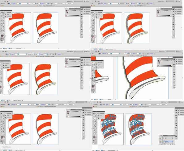
The Cat's Hat
I'm now quite satisfied with the type so my next step was to fill in the hat with some stripes so that it resembles the cat's hat. This was relatively easy and quick to do. I did this on a new layer 'colour band'.

The Type - Red & White
Once that was done I moved onto the type. I wrote down a note in my sketchpad that I might try out changing the type into two colours; the type within the red sections would be white, and the white sections red. This meant that I had to draw where the type went over the edges again so that it would become two separate shapes, making it easier for me to have one letter with two colours.


I wasn't too keen on this as it made the hand-writing easier to read. That's when I looked back at the reference image and realised that blue might be a suitable colour for it!
The Type - Blue
I made everything the same blue as they used in Dr. Seuss' name in the image, but noticed that the type was still quite difficult to read against the red. I thus experimented with having a faint white outline around all of the letters to see if that brought the words out.

Hmmm... Not quite... Maybe it needs a darker outline? I changed the outline to a charcoal grey as well as changing the type to a lighter blue to compare it with the 'original' blue.

It's still quite hard to see the type so I asked for some feedback from my classmate and she mentioned making the outline thicker. I did it, and it worked!

Adding Some Tweaks
Serifs
Now I just need to make some slight adjustments to the type, especially the "that is". Now that it has a thicker line the serifs are far too close together so I might have to increase the gap between each letter. Before I do that, however, I need to create a file with the correct dimensions as I may have to size down the whole thing anyway. Then it was time to do some tweaking!

Background & Author's Name
Once all of my adjustments were made I started to think of where to place Dr. Seuss, but I just couldn't think of a typeface that was appropriate so instead I focused on composition as I'm planning on doing the name by hand.

I had three compositions in total:

1) Full view - can see more of the hat, but type might look too small when printed?
2) Mid view - can still see that it's a hat but there is more of a focus on the type
3) Zoomed view - can't really tell that it's a hat anymore but type is definitely dominant which is good. Might be harder for the viewers to see that it's Dr. Seuss' hat?
Looking at the notes I've made above I think I shall go with either the first or second compositions because I want the hat to be instantly recognisable. Now I shall figure out what to do with the background as it looks rather plain.


I pretty much used the same method for most of my backgrounds, and came up with these versions:

I really like the one where it's slightly zoomed in onto the hat so I chose to work with that. Then it was time to go back to Dr. Seuss as I had the idea of just using what I had hand-rendered before. I adjusted it continously with uppercase and lowercase.

Reflective Learning - Summary
Doing this made me realise that my type doesn't have to be absolutely on-point to be acceptable, especially because it's all hand-rendered so of course there would be 'mistakes'. In fact, as you can see in this process, I much preferred those 'mistakes' made than an accurate typeface. Leave accuracy to the type designers!
I actually had a lot of fun with this even though it was exhausting because most of the steps were so repetitive. I found myself enjoying this a lot more than I did with other quotes.. Maybe I should carry on going down the 'fun' route?
Recording my whole process was also exhausting because I had to try and remember exactly what I have done, and I unfortunately did this right after I had finished my design. Next time I shall record as I go to avoid feeling frustrated again! I almost didn't want to do this, haha.
I shall take a break for a bit to look at it with fresh eyes. I hope to print out my design and annotate them as it might look different on paper (I should know from my experience with printers). Doing the whole design in one day is really exhausting!
Learning Outcomes:
5] Developed skills of independent study, resource utilisation, problem-solving and decision-taking.
[6] Developed skills of critical thinking, analysis and evaluation.
[7] Developed their ability to learn through reflection on practice and experience.
[9] Developed their ability to work with complex material, analyse problems and identify appropriate solutions.
[9] Developed their ability to work with complex material, analyse problems and identify appropriate solutions.
No comments:
Post a Comment