
Initial Sketches
I was so inspired by the typeface styles I showed in my last post that I had done some sketches based off this. I first tried to imitate it but then I wanted to add my own kind of style to it so that I had my "voice". I wasn't too sure how decorative I wanted to go so for now I just drew whatever I wanted as it could always be adapted later. I started small because I just wanted to get the general idea of the typeface I was going to do and didn't want to concentrate on layout just yet.

Developing Sketches - Lettering
I then picked a few to adapt over the next couple of pages, even if I was only changing a few things. I noticed that during my last 'project' where I was hand-lettering the Lord of the Rings quote that my lettering was better if I focused on just one word to figure out how wide each letter should be. After each type was drawn I used tracing paper to copy it and then add a new feature to it.
I wanted to emphasise the "sailor" theme that I was going for so I added a few swirls and flourishes to the type design inspired by Victorian typography, but I felt that it was much too obvious (as I tried to imitate waves) and much preferred the ones where there was a diamond-shape in the middle. I didn't want to overpower the type and although I do want to try out flourishes I didn't want to add them just yet.

I quite liked the second one on the left page and the first one on the right-hand page, and kept these two in mind. I don't think they'll necessarily work well together but I think either one or the other would be really good as the main typeface in my design.
Composition
Now that I had two ideas in mind I moved on from drawing out the typefaces and instead focused on the composition. I had already jotted down some ideas on my mind map so I went and tried a few of them out. I really liked the idea of looking at the whale through a telescope/spy glass but I wanted to have as many options as possible.
My compositions were mainly inspired by Jon Contino and Tobias Saul [both pieces are here], although I did flick through and looked at some sailor tattoos that are gathered on Pinterest as well just to see if there was a trend in typefaces. I've learnt that the composition is extremely important from watching Jon Contino's class as it highlights the key aspects in a piece. As my quote is really short I want an emphasis on all of it.
I didn't linger too long on this because I managed to draw up two ideal compositions in a short period of time, which were the end result of the composition development. I circled around the two that I wanted to develop even further into a near-enough final sketch.

The reason why I chose no.3 was because it was a pretty straightforward, easy-reading composition. While I was watching Sean Wes' video where he talks about laying out type he mentions that if we're using this kind of layout, the viewer would naturally focus on whatever was in the circle before reading from top-to-bottom. Therefore the viewer would first look at the whale, then at "call me" then "Ishmael". There is definitely a smooth transition between each element.
I didn't want the design to be completely obvious of where the quote was from so I only drew a small section of the whale and completely disregarded the ship and the other characters. This is because I am hoping that the viewer look at the whale as if they are looking through the telescope which places them in the story.
No. 7 was more of an obvious design because most of the characters are within the design (e.g. Moby Dick at the bottom, with the ship at the top where Captain Ahab and his crew would be). Here I wanted to experiment with creating a structured composition and flourishes as well as the merging of my own hand-writing and Victorian typography that I found inspirational. These flourishes would connect the boat to the writing and to Moby Dick so that they form a single image.
In terms of illustration, I was inspired by the sailor's scrimshaw where sailors would draw illustrations on whale bone. These illustrations only consisted of black lines although some had slight dashes of colour. Here are some examples: [1] [2] [3] [4]
I'm worried that this composition might not work well on a square piece of paper but I wanted to draw it nonetheless because it was a good concept.
Experimenting with Dip Pens
I noticed that in my sketches that I still have a soft spot for calligraphy so I brought out my dip pens to carry out some experiments. I have my main typefaces already drawn out but now I wanted to concentrate on the secondary typeface that would work well with this.
After flicking through my last post of my inspirations I decided that a serif font would be ideal, and if I make the characters tall it would work really well (as that seems to be a trend in the typographic sea-themed pieces I gathered on my mood board).
The dip pen didn't really work as well on the cursive typeface because the thin strokes were still a bit too thick, even though though the thick strokes were perfect. How annoying! Nevertheless the pens worked really well on the serif font.
Even though I do like the whole 'diamond' idea, it doesn't really look as good on these typefaces because it made the lettering look really cramped. Besides, my main typeface would be decorative so I wouldn't want to overpower my design by having another decorative one right beside it.

I seem to be getting the hang of it even though I've only down two pages, because I'm only going to be writing "call me" in this typeface. I find it much easier to use my dip pens now after quite a bit of practice!
Final Sketches
With my experimentation done and my decisions on the type made, I began to work on my 'final' sketches. I first made some outlines and guides for the layout, then concentrated on the type before the illustrations.
First Sketch
I quite like how well all of the elements work together because there isn't too much decoration and I kept the flourishes minimal. I find that working on a larger scale - this one covered an A4 page - allowed me to focus more on getting the type accurate and making those little details visible. I shall continue to work on larger scales because I could always size them down on Photoshop.
The lettering is interesting and completely different to what I've done before, which provides a nice change as I was getting worried that too many of my designs featured my calligraphic hand-writing. I actually thought of skeleton-bones when I was drawing this lettering out which reminded me of pirates. There are a few changes that I need to make with this such as shifting "s" to the left a little bit but nothing more. I might also change the little detail within Ishmael and remove the little diamond within and replace it with just a line. I could easily experiment with this on Photoshop.
I'm not quite sure how to draw the waves just yet as I had the idea to make them really detailed, but I don't want the design to look too busy. I guess this is something to ask for during my feedback session!

Second Sketch
This has more of an unusual composition and I played with how I was going to link all of the words. Now that it's drawn at a larger scale I think that I might just go with my first idea because the composition is quite similar to where a drew some of my inspiration from [here] and I want to create something completely different. The type is also too similar to what I've already done but I do like how I mixed my hand-writing with my Victorian inspirations.
However the typeface is inspired by the harpoon that is embedded in the whale and what caused Captain Ahab's death, so there is a deeper connection between this and the story. I've also done it so that the swash from the type connects the boat to the whale to show how the whale brought down the whole ship with it.
What I might do is instead use some of the elements such as the whale on the next page where I would display the author's name and book title, because I quite like how it's drawn. If I have the time I might actually draw this out properly so that it's easier to compare the two designs.
Reflective Thinking - Summary
Here I have included my whole sketching process which I actually found more enjoyable than my previous designs (although perhaps not including LOTR quote). I think this might be because I took my time with it and didn't restrict myself or overdo my research process in terms of gathering inspiration. I gathered what I deemed to be appropriate for this 'project' so that I didn't research into something that I didn't use.
I also enjoyed it because I took my time with producing these sketches and didn't force myself to work on them just so I had something on the page. I acted on inspiration, and found that inspiration came to me quickly when I wasn't deeply concentrated on it, and found myself sketching when I had the chance.
My next step is to develop the first, 'final', sketch and line it and ask for some feedback from my lecturers and classmates. At the same time I could try out some Photoshop tutorials such as producing a textured background because I really would like to add that to my design.
Learning Outcomes:
[6] Developed skills of critical thinking, analysis and evaluation.
[9] Developed their ability to work with complex material, analyse problems and identify appropriate solutions.
I was so inspired by the typeface styles I showed in my last post that I had done some sketches based off this. I first tried to imitate it but then I wanted to add my own kind of style to it so that I had my "voice". I wasn't too sure how decorative I wanted to go so for now I just drew whatever I wanted as it could always be adapted later. I started small because I just wanted to get the general idea of the typeface I was going to do and didn't want to concentrate on layout just yet.
Developing Sketches - Lettering
I then picked a few to adapt over the next couple of pages, even if I was only changing a few things. I noticed that during my last 'project' where I was hand-lettering the Lord of the Rings quote that my lettering was better if I focused on just one word to figure out how wide each letter should be. After each type was drawn I used tracing paper to copy it and then add a new feature to it.
I wanted to emphasise the "sailor" theme that I was going for so I added a few swirls and flourishes to the type design inspired by Victorian typography, but I felt that it was much too obvious (as I tried to imitate waves) and much preferred the ones where there was a diamond-shape in the middle. I didn't want to overpower the type and although I do want to try out flourishes I didn't want to add them just yet.
I quite liked the second one on the left page and the first one on the right-hand page, and kept these two in mind. I don't think they'll necessarily work well together but I think either one or the other would be really good as the main typeface in my design.
Composition
Now that I had two ideas in mind I moved on from drawing out the typefaces and instead focused on the composition. I had already jotted down some ideas on my mind map so I went and tried a few of them out. I really liked the idea of looking at the whale through a telescope/spy glass but I wanted to have as many options as possible.
My compositions were mainly inspired by Jon Contino and Tobias Saul [both pieces are here], although I did flick through and looked at some sailor tattoos that are gathered on Pinterest as well just to see if there was a trend in typefaces. I've learnt that the composition is extremely important from watching Jon Contino's class as it highlights the key aspects in a piece. As my quote is really short I want an emphasis on all of it.
I didn't linger too long on this because I managed to draw up two ideal compositions in a short period of time, which were the end result of the composition development. I circled around the two that I wanted to develop even further into a near-enough final sketch.
The reason why I chose no.3 was because it was a pretty straightforward, easy-reading composition. While I was watching Sean Wes' video where he talks about laying out type he mentions that if we're using this kind of layout, the viewer would naturally focus on whatever was in the circle before reading from top-to-bottom. Therefore the viewer would first look at the whale, then at "call me" then "Ishmael". There is definitely a smooth transition between each element.
I didn't want the design to be completely obvious of where the quote was from so I only drew a small section of the whale and completely disregarded the ship and the other characters. This is because I am hoping that the viewer look at the whale as if they are looking through the telescope which places them in the story.
No. 7 was more of an obvious design because most of the characters are within the design (e.g. Moby Dick at the bottom, with the ship at the top where Captain Ahab and his crew would be). Here I wanted to experiment with creating a structured composition and flourishes as well as the merging of my own hand-writing and Victorian typography that I found inspirational. These flourishes would connect the boat to the writing and to Moby Dick so that they form a single image.
In terms of illustration, I was inspired by the sailor's scrimshaw where sailors would draw illustrations on whale bone. These illustrations only consisted of black lines although some had slight dashes of colour. Here are some examples: [1] [2] [3] [4]
I'm worried that this composition might not work well on a square piece of paper but I wanted to draw it nonetheless because it was a good concept.
Experimenting with Dip Pens
I noticed that in my sketches that I still have a soft spot for calligraphy so I brought out my dip pens to carry out some experiments. I have my main typefaces already drawn out but now I wanted to concentrate on the secondary typeface that would work well with this.
After flicking through my last post of my inspirations I decided that a serif font would be ideal, and if I make the characters tall it would work really well (as that seems to be a trend in the typographic sea-themed pieces I gathered on my mood board).
The dip pen didn't really work as well on the cursive typeface because the thin strokes were still a bit too thick, even though though the thick strokes were perfect. How annoying! Nevertheless the pens worked really well on the serif font.
Even though I do like the whole 'diamond' idea, it doesn't really look as good on these typefaces because it made the lettering look really cramped. Besides, my main typeface would be decorative so I wouldn't want to overpower my design by having another decorative one right beside it.
I seem to be getting the hang of it even though I've only down two pages, because I'm only going to be writing "call me" in this typeface. I find it much easier to use my dip pens now after quite a bit of practice!
Final Sketches
With my experimentation done and my decisions on the type made, I began to work on my 'final' sketches. I first made some outlines and guides for the layout, then concentrated on the type before the illustrations.
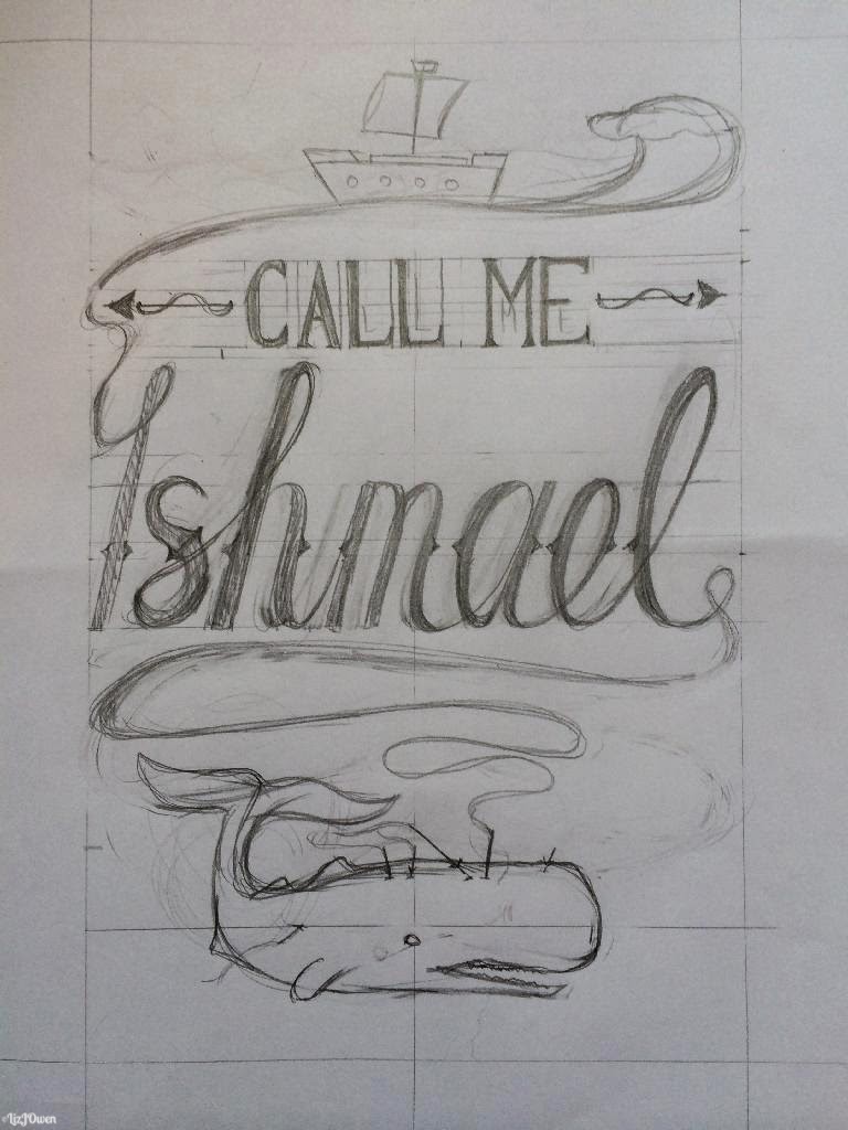
First Sketch
I quite like how well all of the elements work together because there isn't too much decoration and I kept the flourishes minimal. I find that working on a larger scale - this one covered an A4 page - allowed me to focus more on getting the type accurate and making those little details visible. I shall continue to work on larger scales because I could always size them down on Photoshop.
The lettering is interesting and completely different to what I've done before, which provides a nice change as I was getting worried that too many of my designs featured my calligraphic hand-writing. I actually thought of skeleton-bones when I was drawing this lettering out which reminded me of pirates. There are a few changes that I need to make with this such as shifting "s" to the left a little bit but nothing more. I might also change the little detail within Ishmael and remove the little diamond within and replace it with just a line. I could easily experiment with this on Photoshop.
I'm not quite sure how to draw the waves just yet as I had the idea to make them really detailed, but I don't want the design to look too busy. I guess this is something to ask for during my feedback session!
Second Sketch
This has more of an unusual composition and I played with how I was going to link all of the words. Now that it's drawn at a larger scale I think that I might just go with my first idea because the composition is quite similar to where a drew some of my inspiration from [here] and I want to create something completely different. The type is also too similar to what I've already done but I do like how I mixed my hand-writing with my Victorian inspirations.
However the typeface is inspired by the harpoon that is embedded in the whale and what caused Captain Ahab's death, so there is a deeper connection between this and the story. I've also done it so that the swash from the type connects the boat to the whale to show how the whale brought down the whole ship with it.
What I might do is instead use some of the elements such as the whale on the next page where I would display the author's name and book title, because I quite like how it's drawn. If I have the time I might actually draw this out properly so that it's easier to compare the two designs.
Reflective Thinking - Summary
Here I have included my whole sketching process which I actually found more enjoyable than my previous designs (although perhaps not including LOTR quote). I think this might be because I took my time with it and didn't restrict myself or overdo my research process in terms of gathering inspiration. I gathered what I deemed to be appropriate for this 'project' so that I didn't research into something that I didn't use.
I also enjoyed it because I took my time with producing these sketches and didn't force myself to work on them just so I had something on the page. I acted on inspiration, and found that inspiration came to me quickly when I wasn't deeply concentrated on it, and found myself sketching when I had the chance.
My next step is to develop the first, 'final', sketch and line it and ask for some feedback from my lecturers and classmates. At the same time I could try out some Photoshop tutorials such as producing a textured background because I really would like to add that to my design.
Learning Outcomes:
[6] Developed skills of critical thinking, analysis and evaluation.
[9] Developed their ability to work with complex material, analyse problems and identify appropriate solutions.
No comments:
Post a Comment