

As I have mentioned in my last post I would like to add a sort of wax seal at the bottom of the page so that it'll look "official". However when I further investigated into wax seals I realised that they were, quite literally, seals; they were used to seal envelopes together.
This means that I'll probably not be able to use it in my invitation design because they weren't really showcased on the actual letter themselves. Although I did find an image that raised my spirits slightly:
 |
| http://www.bestgiftsforwedding.com/blog/tag/sealing-wax-wax-stamps-wax-seals-and-sealing-wax-letter-stamp |
I used this tutorial here: Vector.tutsplus.com/
I opened up Illustrator and created a new document, naming it "Wax Seal". By using the pen tool I roughly drew a circle with some bumps in, making sure that these "bumps" were smooth as to imitate wax.
I then drew another circle on another layer and filled it in with a light colour, using my colour scheme as a guidance. I then copied this circle, created a new layer, and clicked on "Paste in Front". I then hid the original circle.

I selected the circle and the blob (going to call it the blob from now on) and went onto the Pathfinder tool and clicked Minus Front. This makes the circle "disappear".
While they are still selected I went onto Effect > 3D > Extrude and Bevel and typed in the following details.

I then unhide the original circle layer and shift it slightly so it fills in the gap. On another layer I create another circle but in a lighter shade, made it bigger than the original circle and used the same method as I did with the circle and the blob.

After that I created a new layer with a darker shade and did the same thing but instead of using the Pathfinder tool I went straight onto 3D effect tool.

Now it's time to place the logo, and I did the same 3D effect for it.
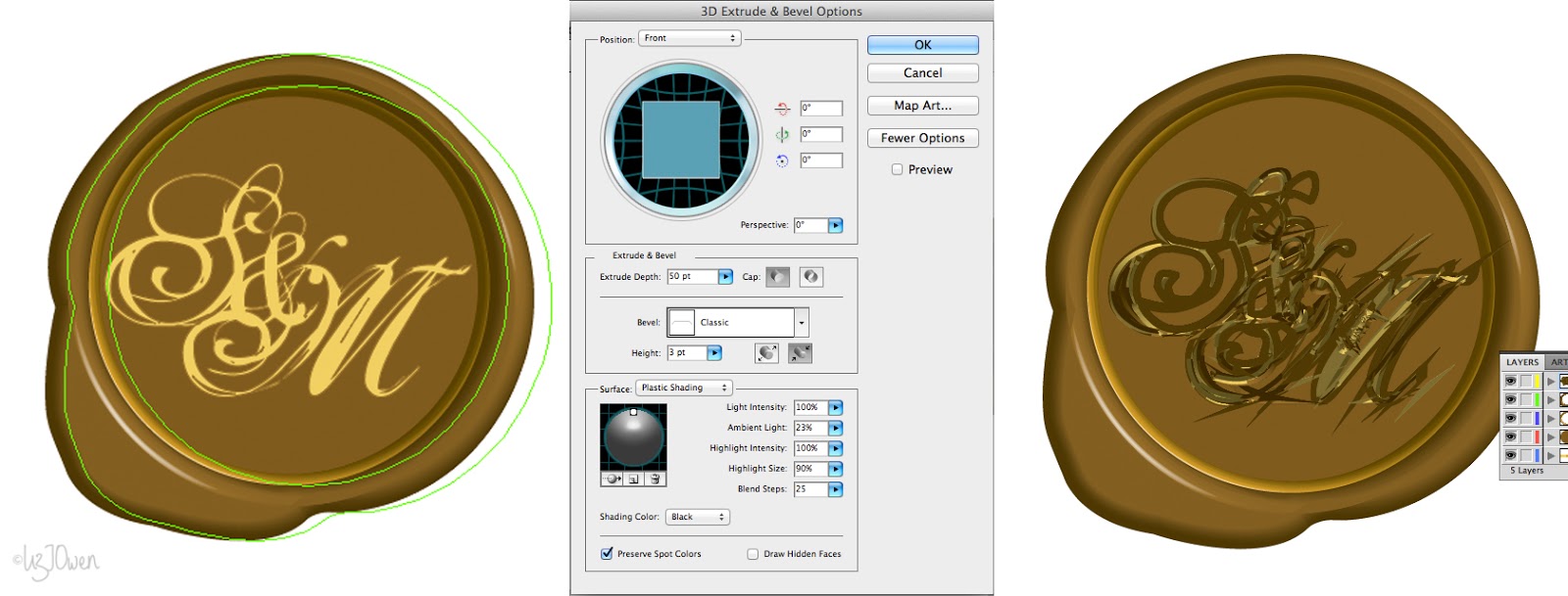
However it turned out really badly so I saved the file as a PSD and opened up Photoshop.
In Photoshop the process to create the bevelled look is a lot simpler; I just needed to Place the logo, and then went to layer options and selected the Drop Shadow and Bevel and Emboss.

I wanted to change the colour so I duplicated the layer, locked it, and by using the brush tool I changed it to make the shade of the blob so that it looks more "realistic".

And then I was done!

As I have mentioned above, this experiment was still quite useful even though I might not be able to use it on the actual invitation design itself. I was able to learn how to use the 3D effect tool in Illustrator which is something I've never done before.
Unfortunately it was a bit complicated to do and I much prefer Photoshop's version as it's a whole lot easier!
No comments:
Post a Comment