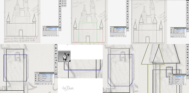
I open up Illustrator and put in the dimensions of an A6 card because that would be the size I'm hoping my invitation to be, and then I Placed my sketch onto it and lowered the opacity. Creating a new layer I then used the Shape tool to start forming my castle (as it really is made out of squares, triangles and circles, if you think about it).
To tweak some of these shapes I used the white arrow to adjust the anchor points of each shape.
I created a new layer for each section of the castle as I have separated it into three parts; the front, the middle, and the tower section at the back.

And after doing all of the shapes and adjusting them, I come up with this:
It's not perfect as I found the triangles weren't perfectly straight, so I took the white arrow to change them.
I then focused on the doorway: I put another rectangle at the top of it, then added three circles that would form the curves. I then deleted this other rectangle at the top once I've positioned the circles. These circles weren't aligned but that was fixed by shifting them upwards.
By selecting all of the circles and the bigger rectangle I then use a tool to join them all together. I don't know the name of this particular tool but it basically joins selected shapes.
Now it was time to focus on the bridge, so I created another point with the pen tool (the one that allows you to add points) and added one in the centre of the top line. I then dragged this upwards to form the tip of a triangle.
By using the pen tool I created a curve and used this centre point as a reference, and then connected it all together as I did for the doorway.
I started adding in all of the other details such as the little "bumps" in the bridge and the towers at the back. I did this by just adding boxes and making sure that they were evenly spread out. I then copied and pasted the boxes from the bridge onto the two towers before adding doors.
I created a new layer named "Flags" and started designing the flags by using both the Shape tool and the Pen tool. When I finished the first flag I copied and pasted it to the other places, although made some variations to the size of each flag so that the ones at the front appeared larger than the ones at the back.
Once done, I switched off the sketch layer to have a little look at my design so far.
I was quite satisfied with the design so I selected all of the layers and copied and pasted the whole design onto a new document of the same size. By doing this I've placed everything on one layer.
I then used a technique I've used for the doorway and bridge and connected all of the sections together so that only the outline would remain.
I missed out the windows because I realised that if I connected them to the other parts then they would disappear, so I drew them on another layer and deleted the originals.
So now I had something like this:
Once I had done with the design, I copied it and then locked it. I then created a new layer and pasted this beneath the original layer.
I selected this new layer and filled it in a different colour, and whilst it was still selected I went to Effect > Path > Offset Path as I want to create an outline around the original. I chose blue because of the saying, "...something borrowed, something blue..." as it's quite a lucky colour for weddings. I then adjusted this outline.
(I had forgotten to take a screenshot of this sketch so I had to use the one where I was experimenting with a black castle).
This brought up another window and I adjusted the thickness of the outline. I then went and played around with the joins and found that if I chose "round" then it made all of the edges smooth!
After filling in the doorway and the windows in blue, I had this as a result:
I really enjoyed this experiment because I was finally able to figure out how to do outlines! I've always wanted to know this technique, but I didn't know how to do it until now... I've definitely learnt something new.
I'm still unsure of whether or not to continue this design and use it as the final piece, so I'm going to try and experiment with other ideas before I make my decision.


No comments:
Post a Comment