
After watching some YouTube videos and looking at Sean Wes’ work I realized that I need to go back to basics with typography and start analysing different type styles, mainly focusing on how each letter sits on the baseline as well as the other lines (mean line and cap height). This will make it easier for me to draw letterforms accurately even though I want that ‘personal’ appearance to show that it has been hand drawn. This means that I wouldn’t stress over tiny details and shall allow for mistakes to show.
I printed out three styles: serif, sans serif and brush script. I want to be able to work with all of these types because I’m not too sure what kind of styles I’m headed for right now. I then drew the lines across them and made a lot of annotations to make it easier for me to remember their characteristics.

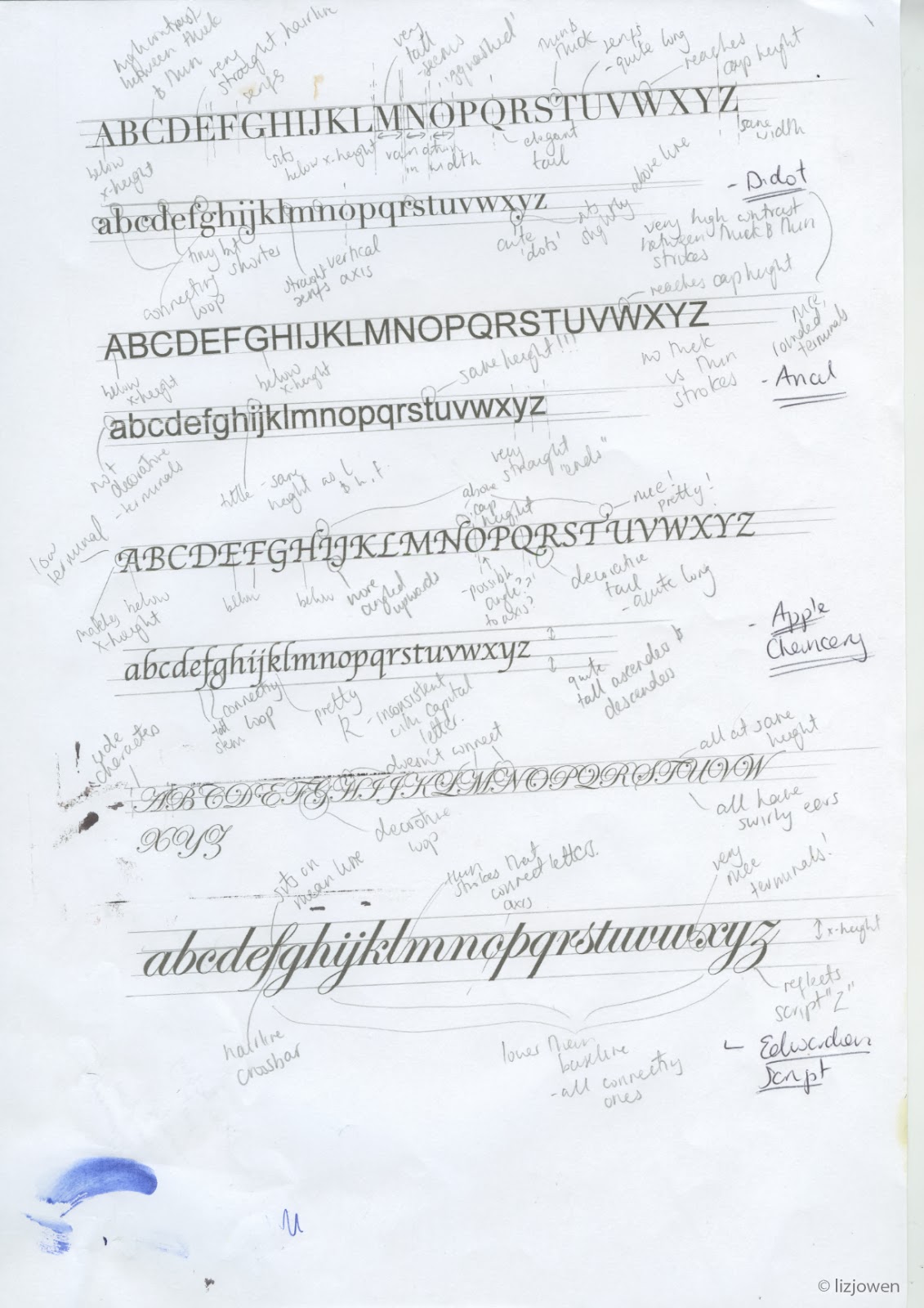
After making as many annotations I could I put these to one side and drew from memory, then took out my annotations to compare them. I wrote little notes on what I needed to change although I wasn’t going to worry too much about it because my main focus is that the sizes of the letters were right and that they all sat on the same level.

I then carried on drawing letters but this time worked on my own handwriting, as my lecturer had pointed that I could just work on my own as it has that calligraphic appearance. I made it a bit ‘fancier’ and tried out one of my old fountain pens as well as a biro pen to see what effects they produced. The fountain pen was a bit scratchy on the surface and worked a lot better on smoother paper, whereas the biro worked well on all surfaces (that I have tried so far anyway).
I also tried out writing lengthy quotes to see how my handwriting adapted and I can tell that towards the end it got a little shaky and the spacing between letters changed so it wasn’t a consistent flow. This has shown me that I tend to work better on shorter quotes and when I took my time writing it.


Conclusion:
I really enjoyed this exercise and have learnt a lot when it comes to hand lettering. Just because it’s done by hand there are certain ‘rules’ like making sure the letters have a similar x-height unless I want to change them deliberately. It’s nice to make some annotations of existing typefaces because of this, and it made it easier for me to produce letterforms from memory.
I want to carry on doing these kind of exercises and maybe print out different type styles, but this might not be needed as I have gotten down the basics.
[n] Learning Outcome
[n] Learning Outcome
No comments:
Post a Comment